Why You Should NOT Justify Your Text
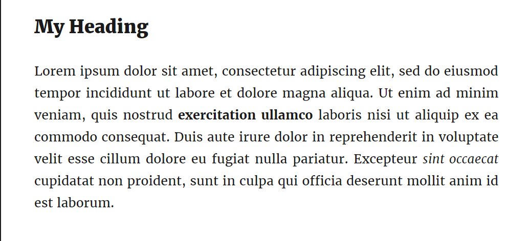
So you think it looks really neat when you justify your text. It lines up on the left and right just like you want.

BUT!
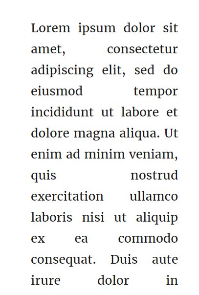
What happens on a mobile device? It may still look fine in landscape mode but in portrait mode - the way people usually hold their mobile phones it looks like this

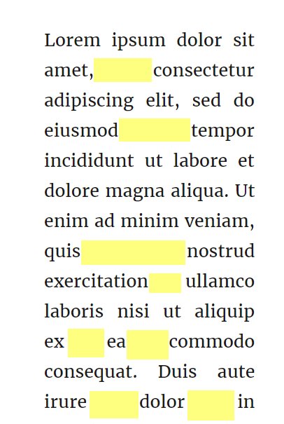
Let me highlight the spaces between the words

Over 60% (yes over sixty percent) of online browsing is done on mobile devices. Do you really want your website to look like this 60% of the time?
It's entirely up to you if you want to continue justifying your text but please think about the 60% who may read your posts on their mobile devices.

As always, I'm here to help you.
Join FREE & Launch Your Business!
Exclusive Bonus - Offer Ends at Midnight Today
00
Hours
:
00
Minutes
:
00
Seconds
2,000 AI Credits Worth $10 USD
Build a Logo + Website That Attracts Customers
400 Credits
Discover Hot Niches with AI Market Research
100 Credits
Create SEO Content That Ranks & Converts
800 Credits
Find Affiliate Offers Up to $500/Sale
10 Credits
Access a Community of 2.9M+ Members
Recent Comments
178
Thanks Marion great tip. I personally never liked how 'justify' looks like anyway so never use it. Seems like I was doing the best thing :)
I always knew that I would find out one day that justifying my text was not the right thing to do!! So many don't justify their text and they are the bright ones. Now I need to follow them, which of course includes you Marion.
Thanks so much for pointing this out. I will go through my sites yet again to correct the error of my ways :)
Great Tip Marion. We are on mobile most of the time as well, and I always check to see how it reads. Rod and Troy
See more comments
Join FREE & Launch Your Business!
Exclusive Bonus - Offer Ends at Midnight Today
00
Hours
:
00
Minutes
:
00
Seconds
2,000 AI Credits Worth $10 USD
Build a Logo + Website That Attracts Customers
400 Credits
Discover Hot Niches with AI Market Research
100 Credits
Create SEO Content That Ranks & Converts
800 Credits
Find Affiliate Offers Up to $500/Sale
10 Credits
Access a Community of 2.9M+ Members
Thanks for the vital tip, Marion. Flush left is easier to read no matter what type of media. Typographical history: before the days of computers and long before the days of mobile devices, there was one book that was set in justified columns. Despite the justification, the relative equality (as much as is possible) of the spaces between the words AND the spaces between the letters has never been equaled or surpassed since this book was published. What was the book? The Gutenberg Bible!
Yeah, much easier to read. And The Bible is still the all-time best seller.