Progressing With Super Wealthy Affiliate Group

blog cover image
14
1.7K followers

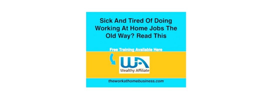
Nobody denies that Wealthy affiliate is filled with information to learn everyday. By the time I am finished here, I can actually be an expert at what I am doing. Assuredly, there is a lot to take in. One of the tasks for this month is to test creating a custom banner using canva.com. I am still learning to use canva, and hope to master it one day.

I have tried creating a few testers, and would like to share one here. Comments are welcome for improvement.

Carol

Login
Create Your Free Wealthy Affiliate Account Today!
icon
4-Steps to Success Class
icon
One Profit Ready Website
icon
Market Research & Analysis Tools
icon
Millionaire Mentorship
icon
Core “Business Start Up” Training

Recent Comments

31

Hi Carol,
That's a great start!

Canva can be very fiddly when trying to position both text and images so well done!


Thanks Jackie, Yeah, I am trying to find my way with canva.

Great looking banner Carol but I agree the small copy just above and below the gold is not easy to read. Maybe just an increase in font size would help. :)

Thanks Mark, appreciated. I will make the correction.

Looks good to me. I dabbled a bit with Canva when we were supposed to do a logo for our sites. I actually liked LogoJoy better and used them to get a banner/logo. Canva seemed a bit clunky to me to use, but I'll try it out again this month.

But I like your banner, especially the colors gold and blue. Very striking and attention getting.

Thanks for your input Susan, appreciated. I didn't try LogoJoy, but I need to look at it too.

I like it. Did you also do the WA on it?
I didn't realize he meant for us to do a Wealthy Affiliate banner.
I thought he just meant to create any type of banner with a link that would take our reader to Wealthy Affiliate.
I did a Turn The Key To Success

This is nice Lee, I like it. I don't think we have to put WA on it, as long as the link takes the visitor to the WA link. Cool

Personally, I like it Carol. That is my next topic. I need something to put on Pinterest, Google +, and Twitter, when I am not publishing. A banner like yours should work. My only suggestion is to make you font a little bigger.

Thanks Harvey, appreciated. I will definitely increase the font.

Might have to steal it from you, no just kidding, looks great! The smaller text could be the next size bigger, gotta keep us seniors in mind! Good Stuff Wayne

Thanks Wayne, I am up there in the senior bracket too. I will increase the size as suggested. Appreciate your feedback

I think it looks great, but I agree with Hennie that the white text is difficult to read. And, in my opinion, the words 'Free Training' should be very easy to read. These are the words that are going to attract people to take a look.

I am still learning to get to grips with Canva. It looks like you have come a long way...you will soon be an expert!

~ Isabella

Thanks Isabella, appreciate your feedback. I agree, the text in white needs to be more conspicuous. I have a copy with that text in black too.

It looks great and I think you have done a great job. I’ve made a couple but am not over pleased with yet.
With Grace and Gratitude
Karen

Thanks Karen, keep working at it.

Well done, Carol. It looks great. Only the white text is difficult to read. Maybe you can take it back to standard and not bold letters.
Otherwise, it is good. I like the CTA.
Hennie

Thanks Hennie, appreciate your feedback. I have a copy in standard text too, also without the white text.

Hi Carol; a great job that looks very good and the copy speaks volumes, congratulations. Canva is an excellent resource thanks for sharing

Thanks Alex, appreciate your feedback.

See more comments

Login
Create Your Free Wealthy Affiliate Account Today!
icon
4-Steps to Success Class
icon
One Profit Ready Website
icon
Market Research & Analysis Tools
icon
Millionaire Mentorship
icon
Core “Business Start Up” Training