The Emotion Of Color in Web Design
Hey Folks,
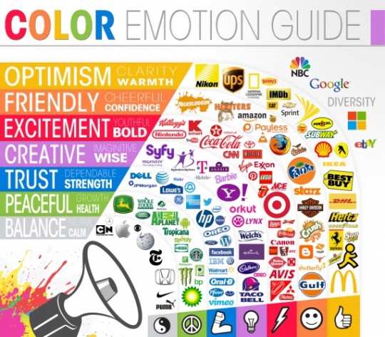
As an addition to the Design in Wordpress WAbinar, I have created this color emotion guide for YOU. This is merely a guideline on how you can target the right emotion by using some appropriate colors for your site.
Just remember the KISS theory when creating your sites!
- Gray -- unsettling, moody, dull.
- Yellow -- cheerful, happiness, optimism, playful, sunny, warm.
- Black -- authority, power, somber, evil, easy to overwhelm, bold, empty.
- Red -- energy, excitement, symbol of life, aggressive, passionate, vigor.
- Green -- conservative, wealth, nature, good luck, fertility, generosity, sickly.
- White -- purity, clean, sterile.
- Pink -- calming, gentle, delicate, feminine, tranquil.
- Blue -- cold, uncaring, focused, dependable, loyal, serene, sedate, trustworthy.
- Purple -- royalty, religious, superficial, spiritual.
- Brown -- reliable, stable, earthy.

Join FREE & Launch Your Business!
Exclusive Bonus - Offer Ends at Midnight Today
00
Hours
:
00
Minutes
:
00
Seconds
2,000 AI Credits Worth $10 USD
Build a Logo + Website That Attracts Customers
400 Credits
Discover Hot Niches with AI Market Research
100 Credits
Create SEO Content That Ranks & Converts
800 Credits
Find Affiliate Offers Up to $500/Sale
10 Credits
Access a Community of 2.9M+ Members
Recent Comments
29
I know colors can make a huge difference in conversions with your website as well. Nice to see an actual breakdown of the color scheme.
Yeah, red, orange and yellow can typically have some of the highest conversion numbers for call to action buttons.
I surely wasn't optimistic about my health last time I went to McDonalds!
Nice add Jay, this is great. I also read that Pink evokes laziness so if you are trying to get someone to take action, don't use pink.
I've used color emotion guides to help me create optimal learning environments in my elementary classrooms. Now I get to use these same concepts to design the optimal IM website -- COOL! Thanks, Jay!
Blue has always been my favorite color. It's what I select for about everything. Now I know, your chart says trustworthy, loyal, serene (then it says cold and uncaring). I'm not sure how the cold and uncaring fits in here but I like the rest and I really like blue!!! Thanks for the information.
I agree I don't see how cold and uncaring fit in with loyal and trustworthy. I also am a fan of blue and I use it a lot in my sites. Good information here
See more comments
Join FREE & Launch Your Business!
Exclusive Bonus - Offer Ends at Midnight Today
00
Hours
:
00
Minutes
:
00
Seconds
2,000 AI Credits Worth $10 USD
Build a Logo + Website That Attracts Customers
400 Credits
Discover Hot Niches with AI Market Research
100 Credits
Create SEO Content That Ranks & Converts
800 Credits
Find Affiliate Offers Up to $500/Sale
10 Credits
Access a Community of 2.9M+ Members

I typically will choose Blue as a background on my sites. I try to give my reader a sense of trust in my online sites. I do use Green on my dog site though since it is a natural color and fits nicely with my header pic.
Adding splashes of color in the focus picture can have a good effect on the tone of the article though.
This is just how I try to use color in my sites. I'm not finding it overwhelmingly effective though. Every little bit helps.