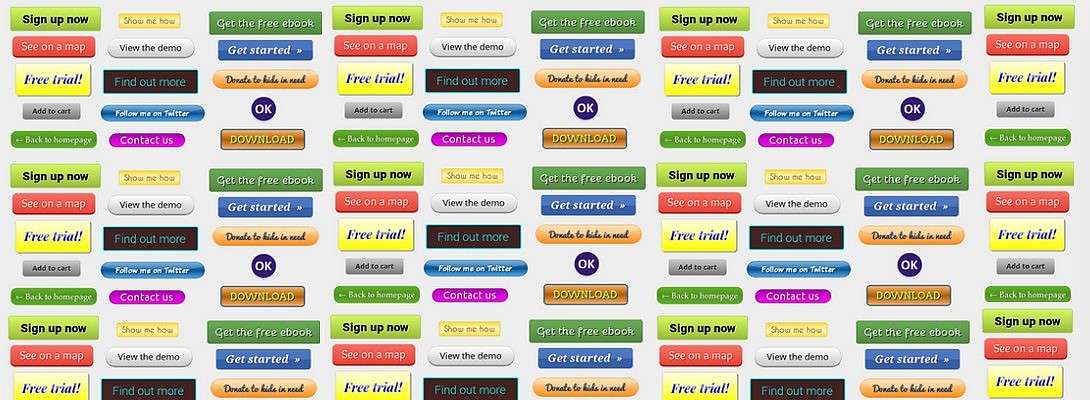
Call to action, how does it really work?
When you add a call to action button to your website, and you want people to click it, be aware of these 3 points.
1. Add value and convenience for the customer
Avoid the impression that the customer has to do something.
Your visitor always wonders, is it worth it? Accompany the button with information that suggests value and convenience.
Super simple, with one click, ready.
Everything to prevent that your visitor has to do something by clicking on the button.
So, do not say:
![]()
That suggests that your visitor has a process to go through, and that scares him away.
Say instead:
![]()
That suggests that the visitor gets something without having to do anything for it.
Use a direct approach, speak in the imperative way.
2. Be super relevant and concrete.
Provide added value, convenience and relevance.

3. Use reassuring language and exclude any risk
A call to action that does not reassure, which does not exclude all risks for your visitoris like a big black hole.

Reassuring sentences:
No credit card needed
No strings attached
Always cancelable
Wrong
![]()
(No accompanying sentence, and no reassurance)
Good
Take a free look around, always cancelable
![]()
(No credit card required)
I hope this will help you to formulate irresistible call to action buttons.

The buttons are made on Da Button Factory.com/ and Imagefu
Recent Comments
99
I need to save this. I have to think about this and apply it to my website.
Thank you so much, Loes! You're the best!
See more comments

I am always open to new approaches for my CTA. Thanks for the tips.
You're very welcome:)