Weekly Challenge: Create an Awesome Logo Using DsgnPop
Hey WA Family,
Your logo is more than just a design, it’s the face of your brand. The first impression. The identity that makes your business stand out.
This week, we’re challenging you to put our brand-new Designpop Studio: Logo Creator (you can find this in the main menu, under "DsgnPop" as well) to the test and show us what you can create.
What to Do:
- Head to Designpop Studio (Premium & Premium Plus+ members only).
- Create a logo for either:
- Your current brand, or
- A completely new brand idea you invent.
- Share your logo in the comments:
- Attach your logo image.
- Explain the brand name and the concept behind it.
The Prize:
Top 5 logos (based on likes) will each receive:
⚡ 20,000 AI Credits ($100 value)
Key Details:
- Available to Premium and Premium Plus+ members only (upgrade here if you are Starter)
- Challenge Dates: Wednesday, September 3 – Tuesday, September 9, 2025
- Make sure to post your logo early so it has time to gather likes!
Why This Challenge?
Because every successful business needs a face. Because creating a logo gives you momentum and clarity for your brand. Because with Designpop Studio, you can create professional logos instantly without paying hundreds or thousands of dollars.
Jump into Designpop Studio, unleash your creativity, and share your best logo with us below!
Join FREE & Launch Your Business!
Exclusive Bonus - Offer Ends at Midnight Today
00
Hours
:
00
Minutes
:
00
Seconds
2,000 AI Credits Worth $10 USD
Build a Logo + Website That Attracts Customers
400 Credits
Discover Hot Niches with AI Market Research
100 Credits
Create SEO Content That Ranks & Converts
800 Credits
Find Affiliate Offers Up to $500/Sale
10 Credits
Access a Community of 2.9M+ Members
Recent Comments
360
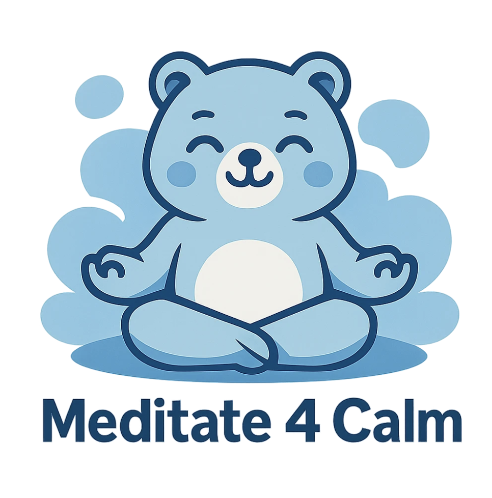
Meditate4Calm is a brand dedicated to helping men and women overcome anxiety through the power of meditation. For the logo, I envision a fun and approachable character in a meditative pose — such as a chubby cat, panda, bear, or frog. The design should capture a sense of calm, balance, and relief, symbolizing how meditation can ease anxiety and bring peace of mind.
🌿 Brand Name: ChicChat Minimalist
Chic → Elegance, style, and a sense of modern sophistication.
Chat → Conversational, approachable, and personal; it signals that this space is not about lecturing but sharing and dialog.
Minimalist → Anchors the philosophy: simplicity, intentional living, and clarity.
Together, ChicChat Minimalist conveys “a stylish, friendly conversation about living minimally.” It balances refinement (chic) with accessibility (chat), making minimalism feel both aspirational and relatable.
🏡 Brand Concept
The logo (a simple home with a leaf) and your narrative combine to deliver a strong concept:
Simplicity with Warmth
The clean lines of the house show minimalism.
The leaf signals vitality, growth, and sustainability.
The palette (muted greens and warm neutrals) evokes calm, grounding energy.
Intentional Living
Focus on quality over quantity.
Streamlining routines, products, and spaces → freeing energy for what truly matters.
Sustainability
Integrating eco-conscious choices into everyday living.
Minimalism framed not as deprivation, but as mindful alignment with the earth.
Everyday Clarity
Through skincare, wellness, routines, and decluttering, you’re showing how small, mindful actions ripple into a more fulfilling lifestyle.
💡 Positioning
ChicChat Minimalist is not just about aesthetics—it’s a guide and community for intentional living.
Tone: Conversational, encouraging, real.
Audience: People overwhelmed by clutter, consumerism, or hustle culture, who want approachable ways to simplify.
Promise: Living minimally will not reduce joy, but enhance it—by making room for the essentials: health, relationships, passions, and peace.
Your logo suits your brand perfectly. We moved house a year ago after having lived in the previous one for about 45 years. You have no idea how much clutter we had accumulated that we needed to get rid of before selling the house. We now live in a bungalow determined not to buy anything we don't really need.
My logo name is Rowena's Ink-Express it a my brand for my publishing site in KDP.
Why is my brand name is Ink-Express it simply symbolized for quick responding book publishing site that if order a book from my site it will be published right away provided with high quality books.
Here is a very simple design. I was having trouble with DsgnPop misspelling the words, but now it appears the WA tech team have addressed the spelling glitch.
I’ll play with it more in the coming days to create more complex and visually stimulating logos for comparison.
However, my business is in the financial sector so a simple logo with a clear cut message may be better than an artistic masterpiece of a logo.
Suggestions and/or comments are appreciated .
That's quite a lot of difficult words for an image creator. Not surprised you were having a bit of difficulty.
See more comments
Join FREE & Launch Your Business!
Exclusive Bonus - Offer Ends at Midnight Today
00
Hours
:
00
Minutes
:
00
Seconds
2,000 AI Credits Worth $10 USD
Build a Logo + Website That Attracts Customers
400 Credits
Discover Hot Niches with AI Market Research
100 Credits
Create SEO Content That Ranks & Converts
800 Credits
Find Affiliate Offers Up to $500/Sale
10 Credits
Access a Community of 2.9M+ Members

Brand Name: Dr. Horwitz Eye Health
Concept Behind the Logo:
This logo represents my new YouTube channel focused on eye health education. As a practicing optometrist with 20+ years of experience, I wanted a design that immediately establishes medical credibility while being instantly recognizable.
Design Elements:
Central Eye Symbol: The eye is universally understood and directly represents my specialty area
Professional Badge Layout: The circular design with "Dr. Horwitz" prominently displayed creates immediate trust and authority
Strategic Color Palette: Deep navy conveys professionalism and reliability, while the teal accent adds a modern, approachable touch
Clear Hierarchy: My name and credentials are the primary focus, with "Eye Health" clearly defining my niche
Brand Strategy:
The logo intentionally avoids being too specific (like dry eye imagery) because I plan to cover all aspects of eye health - from dry eyes to glaucoma, cataracts, and computer vision syndrome. This flexibility allows my brand to grow with my content.
Target Impact:
When people see this logo on YouTube, they should instantly think "credible eye doctor who explains things clearly." It's designed to stand out among generic health channels while building the trust essential for medical content.
The Dsgn Pop Studio tool made it easy to create a professional medical logo that perfectly represents both my expertise and my educational mission!
Well done, Mark. It's nicely designed.
Paul.
Thanks Paul!
You are welcome, Mark.
Paul.
Nice work Mark!
Thanks Kyle!
Awsome
Thank you Henry!
Most welcome Markh
Nice work mark