Take the "Pinterest" Challenge


Are you ready to Take the Pinterest Challenge?


Recent Comments
157


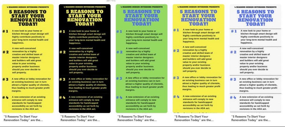
#5 is the easiest to read, if you want a color, the next easiest on the eye to me is #3. Hope this helps.

As a fervent pinner I can only betray my own habits: I’d be repinning number four. Blue titling on yellow BG.
As a very fervant pinner (and me still as a novice pinner!), I will have to look to your Lead, Ivy! Thank You!
I will be looking at #4 differently now!

White with a blue background. The others look like a commercial to steer away from in my opinion. The others are hard on the eyes. The white background looks cleaner, and more eye appealing, compared to the yellow and black or black and yellow.
Sandy
Wonderful, #5 it is. Thank You Sandy this is very valuable to me. You have surely opened my eyes!


When looking at all five choices in a row above the black one is the strongest but if you put this in context on a Pinterest page there may be loads of other colours surrounding it so it's a difficult one to answer without seeing your post in this situation.

Hi Kaju
I like the yellow background/blue text combination
Hope you benefit from the seminar. Where is it being held, by the way?
Terry
#4 it is. The seminar was held at the Science Industry and Business Library in NYC Terry,
Thanks for your answer, we will see in a few hours!

That's a fourth #1 consecutively. Thanks Dadriaanse!
Let's see what the fina tally will be.
See more comments
#1 because yellow is a popular pin color and black text is easier to read.
Excellent reason Glen, I appreciate the feedback.We are getting MANY different opinions here so far!
#1 it is.