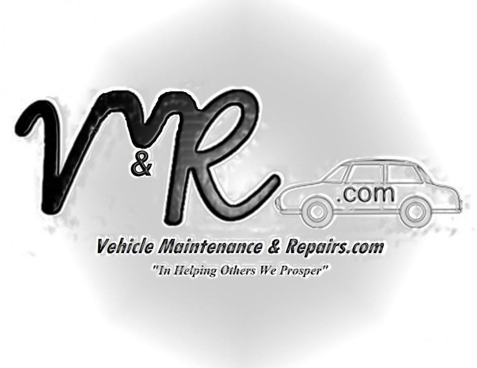
Please Help Me Decide2 Logo's


Hello Fellow WA Afiliates
I have a dilemma, once again, and again I would like to call on your valuable help, I have 2 logo's which I designed myself, one from scratch and the other in logomaker.
Now I cannot decide which one I should use or should I keep both, the problem with keeping both is, I do not want to confuse my visitors, I also use my logos on my YouTube channel.
As a wide audience, I call upon you, my fellow WA Affiliates to give me your valuable opinions, good or bad, I can take both.
As you all know we try hard to establish our brand online and a logo is one of the most important website tools at our disposal, so getting it right is important.
Logo 1 Designed from scratch by me for free.

Logo 2 designed in logomaker by me for free


So which one do you think.Go ahead, don't be shy, your opinion is very valuable to me.
Thanks in advance All the best to all of you.


Recent Comments
99


Gary
I think the second one is a little to skull and crossbones? May be if you could put some text around it, it may enhance it more?
On that basis, number one!
The first one took a couple of looks, I though MR what but I did see it. I am only viewing on a small phone so that didn’t help.
I hope this helps a little and not to negative.
Wayne

Thanks for visiting Wayne, your input is useful and not negative in any way, thanks for the suggestion about adding text to the 2nd one, strangely I have not considered that option.
All the best Wayne.
Gary

The first one is better, is gives the name and .com. the second could be anything mechanical.
Thanks for taking the time to pop in Connie and share your insights, a good point, which I pondered over and over again, but cannot come to a conclusive decision.
All the best to you Connie, Thanks again.
Gary

I like the second one. Although you might want to add some color.
I agree that the text is nice, as it tells folks what you are about. However, there are times when you just need a logo...so having that as it's own image is a good idea. I also find that text is almost always better as actual text, not an image. It will be sharper and scales better on different devices.
So, I would recommend two images. One of just the image icon. One with the image icon and your text. You can then mix and max with non-image text to get the different looks like need. This will become more important for social media and email as you'll want the logo in different sizes and layouts.
All the best!
Thanks for dropping in Kim and your insights it is very helpful especially the part about having the same logo, with or without text, when it comes to color I get nervous as folk are fickle, black and white seems to be more neutral and seems to fit most places.
All the best and thanks again Kim
Gary

Hi Gary
Assuming you business is vehicle repair related, the first one is more appropriate.
The second one could be any type of engineering and is not specific enough (in my opinion)
Terry
Thank you for taking the time to visit and share your insights with me, Terry, you have a valid point about the specifics of the business, but I feel a simplistic logo, given time and the right amount of exposure, could also be effective and associated with a specific website.
All the best and thanks again Terry.
Gary


The first is better because it shows what you do, and the name of your company, meaning in effectively giving more information about what you do.
Thanks for taking the time out to share your insights and to help me out Lanu,
I agree about the more info part, but if one looks at corporations such as Apple, Nike,Amazon, their logos are so simplistic, it is just that they have marketed the H#@! out of it and became household names.
All the best and thanks again Lanu.
Gary

The first one look a bit blurred I will go for the second one because of the minimalistic look.
Thanks for taking the time to give me your opinion and help me choose,
So you are saying less is better, hard decision, will update when I decide, thanks again, it is greatly appreciated.
Gary


See more comments
I think 1st is more suitable as it tells people exactly who you are and what you do..
Good luck!
Thanks for dropping in Moni, yes the 1st one is the obvious choice and it says what my website is all about and carries my motto, I just thought changing it up may do something unexpected.
All the best Moni, and thanks again for your input
Gary