Option A or B


Last week I put up a blog asking if anyone had used Business Cards and the response was very encouraging.
I was playing about on Vistaprint and have come up with two different ideas. I really just wanted to ask what one you think is better and is there anything I have missed out. Also do you think it is adviseable to put a mention of Wealthy Affiliate on them somewhere.
Here are my 2 options, please feel free to say if you think they are rubbish, I will not be offended lol.
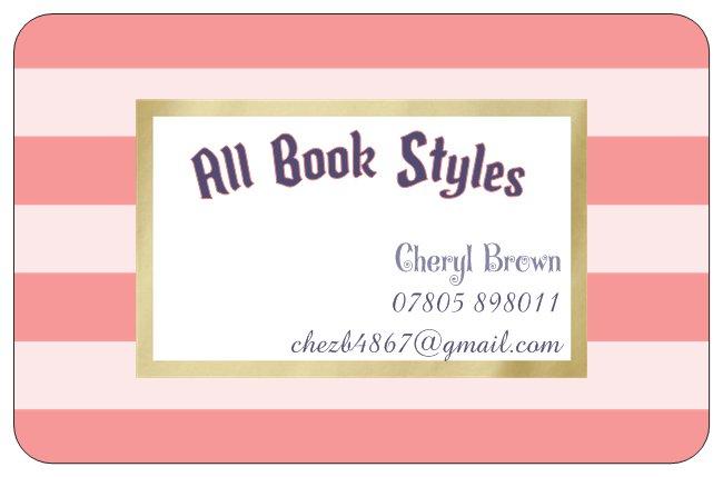
Option A - Front
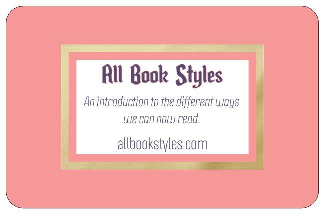
Back
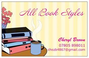
Option 2 - Front
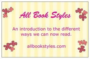
Back

As before, I will appreciate all comments and advice given thanks.
Everybody


Enjoy the rest of your week as we are half way through already,


Recent Comments
65


Thank you Mike, that's the one I liked and everyone seems to be of the same opinion thankfully. xx

Hi Cheryl
I liked the second card of option A - it looks clean and professional
and
the first card of option B - the graphics with the mug of tea were inviting.
Lol! Perhaps to match them, you could add the pink and gold frame to the first card of option B and change the fonts it to see how it looks.
The font on option A second card is cleaner.
The other cards have got too many different fonts.
:-) that's my two pennies worth!
Thank you, I have changed the font to make it all the same both front and back but unfortunately I can't mix them so I can't change the back. xx


Thank you Loes, that was my favourite too. How are you today? I left you a message on messenger. xx
Looks very nice. Very good, I went out for my voluntary job, and now I have to fetch the daycare kids, catch up with you later

I like option two much better.
However, I think the slogan on the back is a little weak. It offers little incentive to actually go and visit your blog.
Why not tie it into an offer, such as a discount coupon, or a free ebook offering some kind of advice or something, with an opt-in form on your blog so that people can join your mailing list to access the freebie?
I don't think you need to mention WA on the business card.
Thanks David, I will certainly see what else I can do with the slogan. I might actually change it altogether. xx


Cheryl, I think your Business Cards designs are great. I particularly like Option 2.
Perhaps it depends on who you are marketing to, but Option 2 has a warm and fuzzy feeling which would draw me your books, more so than Option 1.
I'm not sure about mentioning Wealthy Affiliate.
Wishing you all the best with your Business Cards.
Valerie xox
Thank you Valerie, that was the one I preferred as well as I think it looks more professional. I just wondered about WA but can leave it off. xx

Hello Cheryl
Option 2 looks great, the artwork pertains to the subject at hand and all relevant contact information is included, well done.
Ps. and I love your BEAR.
All the best
Gary
Thanks Gary, I preferred Option B as well. Do you think I should put my email address on the front and have nothing on the back or leave it as it is. xx
See more comments
I like the second card with the books and a cup of coffee on it. It looks professional and relaxing to me. I love to read and it always relaxing when I do.
Thank you, that was my preferred one too. xx