We know how inspect something now, and it's no different to inspecting the header; right click on it and choose 'Inspect'.
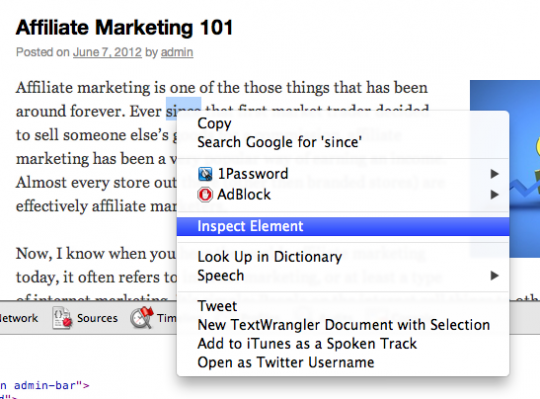
As before, scroll down until you find the code that's controlling the parameter that you want to change. Let's find the colour first:
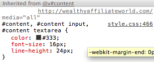
We can check that this is the right code by changing something in it and seeing what happens on the screen:
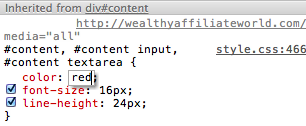
And we can see what happens:

Lovely.
Things are a little different here, there are actually several CSS classes being instructed here. It doesn't matter though, we can copy all of them.
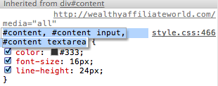
And paste them into our theme and add the curly brackets:
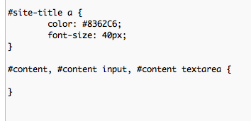
Now we can add the code that will adjust our text. I want to make it black rather then the dark grey that it currently is, perhaps adjust the line height and make the text slightly larger:
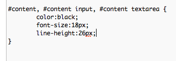
They're not big changes I know - I quite like the appearance of the text in this theme, but you get the idea anyway.

The only other thing I really want to adjust is the font. We can try adding it to the current class we've got, and if it doesn't work we can hunt out the correct class in the Inspector. Let's try it though.
Fonts are a bit different on the web to what they are on the computer. There are a series of 'Universal' fonts that web designers use.
There is a list here if you're interested.
For now I'm just going to add in the following:font-family: Arial, Helvetica, sans-serif;
What this does is tells the computer first to try Arial, then Helvetica, and if it doesn't have either of those fonts to use a sans-serif font (a sans-serif is a font like the one you're reading now - no little twiddly bits on the ends of the letters like in the TwentyTen theme).
So let's type it in:

Update the file and see what happens to our website:

Ahhhhhhhh... that's a lot nicer!
The text is perhaps a little huge, but we can change that easily by changing our child theme.
Thanks again for doing this tutorial.
Charlie


