Without this, your site WILL die.
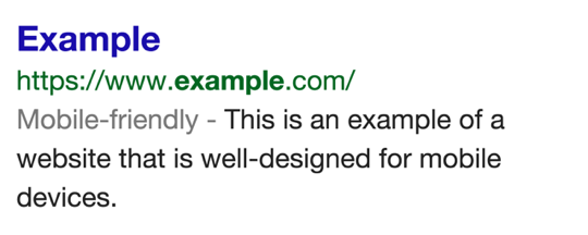
I have mentioned in past posts about the importance of having a mobile optimized version of your Website. Some of you may have already started working on that. At the same time some of you may be waiting for the right time to move to a mobile friendly theme. Well, let me tell you that you should not be waiting any longer. The Google team announced back in November the launch of a new label in search results which will show if a webpage is mobile optimized or not. This will undoubtedly have an affect on click-through rate by a great percentage for users using mobile devices to browse the internet. With more mobile devices than desktop in use, what do you think will happen? This is an example of how the new search return will look like for web-pages which are mobile optimized:

“We are also experimenting with using the mobile-friendly criteria as a ranking signal.”
and
"We hope to see many more mobile-friendly websites in the future."
As you are designing your site, here are some of the factors which you need to consider while making your mobile friendly:
- Avoid using flash or any other software which is not common on all mobile devices (Apple, Android, Windows).
- Text of the webpage should be readable without zooming.
- Size the content to the screen so users don’t have to scroll horizontally or zoom.
- Links should be placed in a way so that they can easily be tapped, and have enough space between two links.
If you are using a modern theme, chances are your website is already mobile friendly. Though you should also check the Google webmaster tool for pages which are not mobile friendly. Here is the link to mobile usability report that you can get from GWT. In my own case I didn’t have any errors return on my site. However, doing some digging I found these to be the most common reported so far:
- Touch elements too close
- Flash usage
- Content not sized to viewport
If you get any errors on your GWT dashboard, make sure you spend time to make changes to remove all the errors.
Test Your Website
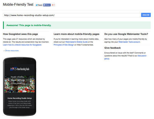
If you are wondering if your website is mobile optimized or not, you should use the mobile friendly testing tool that Google offers. Simply enter your website link in the URL field and click on Analyze to see if your website passes or fails the test. Here is what the result looked like for one of my sites:

I’m not a WordPress person, but talking to a WordPress expert you can make your WordPress Website/blog mobile friendly with your theme. The one recommend to me as the best responsive WordPress theme was Thesis WordPress theme (by DIYTheme) with a customizable responsive skin. If Thesis is too much for you then there are alternative approaches.
one of these is to use a WordPress plugin like WP Touch or you can use Jetpack plugin mobile theme to offer mobile optimized view. You can find the Mobile optimization under "Category" in the "Features" area of the site.
The Google mobile friendly badge will be rolling out globally very soon, and I recommend that you ensure that your website is mobile friendly before this happens. If not, it will affect your click-through rate, and may affect your search engine ranking over the time.
I've given you some tools so that you are not left totally unprepared. Don't get left out in the dark wondering what happened. Get your site mobile ready.
Best to everyone.
Join FREE & Launch Your Business!
Exclusive Bonus - Offer Ends at Midnight Today
00
Hours
:
00
Minutes
:
00
Seconds
2,000 AI Credits Worth $10 USD
Build a Logo + Website That Attracts Customers
400 Credits
Discover Hot Niches with AI Market Research
100 Credits
Create SEO Content That Ranks & Converts
800 Credits
Find Affiliate Offers Up to $500/Sale
10 Credits
Access a Community of 2.9M+ Members
Recent Comments
28
Quick update, just checked my 2 sites and they both got the green light, YAY.
Thanks again for sharing. :)
Now I am worried, I got the message it is not mobile friendly:
Text too small to read
Links too close together
Mobile viewport not set
There are instructions on how to deal with this though.
You can correct most of your problems with some CSS if you know how to update the files. If not try the WPTouch or Jetpack links provided. Those should take care of you problems. If not get back with me and I'll see what I can do.
Go to main page and scroll midway down to features. Then click category button. Scroll down again and you will find mobile.
Thank you for sharing. I was very worried. Do I have to make my site all over again? But no worries. My site was mobie friendly. :)
Best to find out now rather than later. I had a site that wasn't mobile friendly. Took weeks to rebuild with the correct CSS. I never want to do that again.
It's so great that we got this information from you. This is giving everyone the time to make their sites mobile friendly in time.
See more comments
Join FREE & Launch Your Business!
Exclusive Bonus - Offer Ends at Midnight Today
00
Hours
:
00
Minutes
:
00
Seconds
2,000 AI Credits Worth $10 USD
Build a Logo + Website That Attracts Customers
400 Credits
Discover Hot Niches with AI Market Research
100 Credits
Create SEO Content That Ranks & Converts
800 Credits
Find Affiliate Offers Up to $500/Sale
10 Credits
Access a Community of 2.9M+ Members
Great post,I checked it and I am OK