WA New Design of Personal Profile


Hey Folks,
Have you noticed the NEW design changes in your Personal profile here at WA?
At first I had to do a "double take" but couldn't help but noticing these design changes, and they are on all the profiles now:
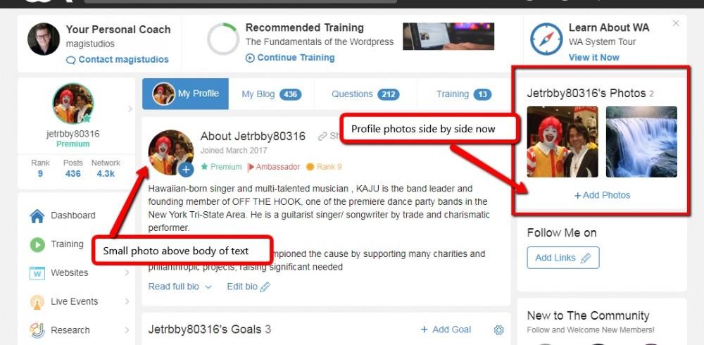
Everyone's top right side personal profile pic area now has 2 or more photos arranged in squares side-by-side, in horizontal rows. This makes the pics you visually see at first smaller.
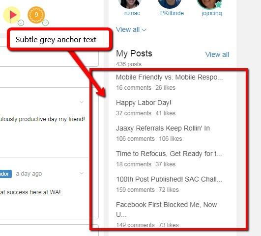
There is also a small round profile photo above the main text area. And the "My Posts" anchor text links on the right side is now a light grey.

Also your Personal "Money Goals" that you wrote in Kyle's Comment post from "way, way, way" back when you first joined WA is now right, front, and center smack in the middle of your "About Me" personal description.

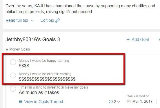
Totally forgot about this. As you can see, I was rather excited when I first joined! Lol!
I personally prefer the prior WA Personal Profile design layout, and the dark blue anchor text for "My Posts", but we all have to get used to change.
For "change" is the only constant in life and business!
Cheers,
Kaju


Recent Comments
47


Cool new features indeed, Brenda. Not sure though, about the "Money Goals" I would have left it out.
Kaju


WE all were, can't you tell by my "$$$$" Denis..Lol!
And its still leading us to new places!
Kaju


Hi Kaju - when I first saw it earlier, I thought maybe I was on the wrong page - but I double checked and discovered it was real. It looks good, once you start getting used to where everything is at.
Thanks Isaiah, yes we just need to get used to it. All the functionality is all the same, only the design is slightly different.
Best,
Kaju

Thanks for sharing Kaju. I have been working from my cell phone and I haven't noticed any changes on my mobile device. Everything still looks the same to me.
I'll take a look at it when I'm home using my laptop.
I looked at it. I have to say I like it a lot! It even had my answers on what I would like to make monthly and yearly when I first started.
And the newcomer's questions are right under that.
I think that's really convenient. I don't have to search to help the newcomers.
👍

Good afternoon my brother, yes I did I seen it yesterday and I thought that was kind of cool. I got to add a couple more pictures now, like I said wa is always doing things that are better for us all. I love this place have a great night my brother.
Change is good now and then, and I agree WA is always trying to change for the better!
Have a great night brother E:)
Kaju

I had not seen the changes yet. Thanks for pointing this out. I agree. I don't like the money goals right smack in the center.
However, I really, really like that the Follow Me On section is now above the post list.
So many new members don't understand where the Follow Me On section is and therefore don't know where to post their links appropriately and where to find other's links. This should help with that common point of confusion!
I definitely agree about the "Follow Me" section Jessica. Overall, I don't like the look as much, and neither do I like the "Money Goals".

Thanks again Luigi:)! Here's a great Tokyo story for you on my new YT channel:) Send me your YT link and I will Subscribe. You can Subscribe to my channel here:)
http://bit.ly/2T21P2N
If you don't yet, I will happily return the favor when yours is up.:)
See more comments
Thank you so much for your post! I checked my personal profile. It is different and a good motivational reminder as to why I am here at Wealthy Affiliate!
Yes, there would always be change. Let’s embrace change and keep moving forward!
Have an awesome day!
It's great that you have that attitude Wawaa, you will go far with that! Change is always a good thing, and the new design changes are looking pretty sharp!
Kaju