What is the Best Font for a Website?


Published on February 6, 2021
Published on Wealthy Affiliate — a platform for building real online businesses with modern training and AI.

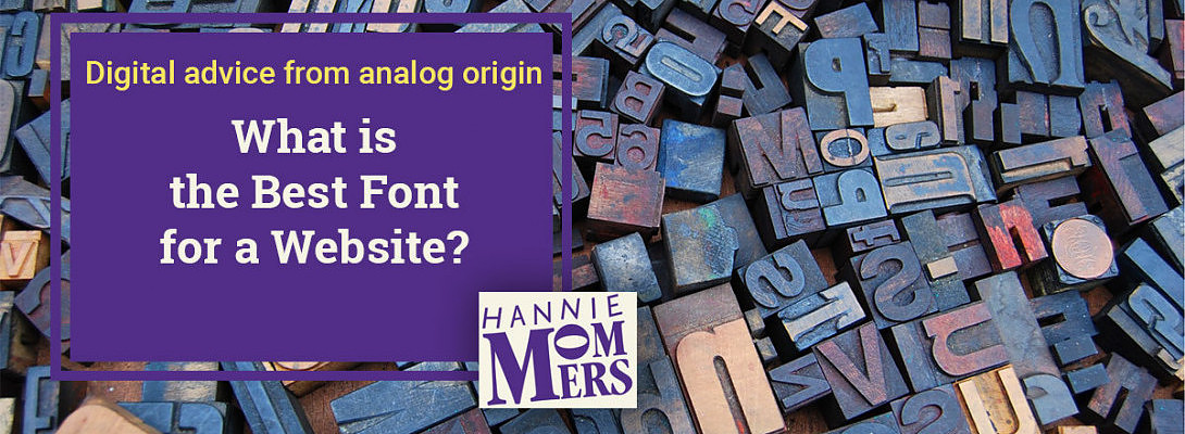
Digital advice from analog origin (6)
"What is the best font?", a much-asked question when I was having my graphic design studio. My reply usually was: “What impression do you want to make?”
The character of your website dictates the kind of font that is best. And even then, there are so many different fonts that you have plenty of choices. Nothing wrong with choosing a font that you like, as long as you take into account what your audience expects.
In one of my other articles, I explained the fundamentals of letters:
https://my.wealthyaffiliate.com/hmommers/blog/fundamental-text-design-for-a-website
And in this one, I have told more about the way fonts are categorized in serif, sans-serif, etc:
A typographer is a craftsperson
 Keyboard characters
Designing an alphabet costs a lot of time. All letters must be in balance with each other. Letters can have accents. Every language has its own alphabet.
And then I am only talking about the languages with a Roman alphabet. There are also languages with a Cyrillic alphabet. Hebrew. Chinese.
Then there are the numbers. Characters such as $ and €.
And when letters were still cast in lead blocks, each font size also had to be drawn separately.
Understandably, most fonts are not designed for all the world's languages. Yet, there is ample choice.
As many effects as possible?
 I guess you can understand my huge admiration for typographers. In logotypes, I did make some changes at times or adjust the letter-spacing, but only sparsely and always with a reason.
For instance, because there would be an unbalance in the total image of the word. Or a descending part of a letter was crossed by an ascending part of another letter.
 That’s how designs of amateur designers are easily recognized: they add too many effects. For instance, a logotype gets a shadow AND is extended AND skewed.
Ready to put this into action?
Start your free journey today — no credit card required.
(Oh, and I can't help but remark: a logotype is definitely different from an image. I know that in the current idiom, figurative marks are also referred to by the word logo. But logo comes from the Greek word logos, which means word.)
The best font for a website
Is it obliged to choose the same font for a website as is used in the logotype? The answer is no, not necessarily. Sometimes the letter font used for the logo is so specific that it is even better to choose a different font.
This leaves the question of what the best font is. It depends on the character of your business - which is for a big part determined by what your audience is used to and expects - and your own taste.
A contractor will choose a different font than a fashion designer. Women may be more likely to choose a lighter font, while men will go for a more robust one.
Have a look at the websites of your competitors. What kind of font did they choose? Don’t copy what they do blindly. "Because everyone does it that way" is bad counseling.
If you want to know exactly what the name of their font is, you can look that up on What the font. Another useful tool is Font Picker, an extension for the Google Chrome browser.
Google fonts
 You can either choose a serif or a sans-serif font. Display fonts are meant for posters. As you can see the legibility in a small size is better with the first 4 examples.
Your WordPress theme often offers a choice of various fonts. If not, or if you don't like them, you can install a font on your website using a plugin or a code.
Google Fonts has a choice of more than 1,000 fonts and also gives you the option to filter by language, font properties, and type:
- Serif
- Sans serif
- Display
- Handwriting
- Monospace
A note about conventions
One of the mottos throughout my life was, you have to know the rules to deviate from them. This does not mean that you should know you can't steal to become a thief. It means no professional rule, for example, the rules of design and typography, is set in stone.
If you know what your audience expects and you know what the competition uses, it might be a great idea to be a bit different. Not too much, because that will set people off, but just enough to arouse curiosity and interest.
Aspects of a well-chosen font
- Legibility is more important than beautiful;
- Choose a clearly drawn letter, not too bold, not too light;
- Do not make the leading (line spacing) too small;
- Make sure the color has enough contrast with the background;
- Do not place photos behind the text.
Let me know if you have any questions about this topic. I’ll be happy to answer!
Related
My other blogs on what we can learn from using traditional resources in contemporary design:
https://my.wealthyaffiliate.com/hmommers/blog/what-does-above-the-fold-mean
https://my.wealthyaffiliate.com/hmommers/blog/fundamental-text-design-for-a-website
https://my.wealthyaffiliate.com/hmommers/blog/invisible-grid-in-a-wordpress-blog
https://my.wealthyaffiliate.com/hmommers/blog/optical-illusi...
xxx
Hannie
Share this insight
This conversation is happening inside the community.
Join free to continue it.The Internet Changed. Now It Is Time to Build Differently.
If this article resonated, the next step is learning how to apply it. Inside Wealthy Affiliate, we break this down into practical steps you can use to build a real online business.
No credit card. Instant access.