Fundamental Text Design for a Website


Published on October 25, 2020
Published on Wealthy Affiliate — a platform for building real online businesses with modern training and AI.

Digital advice from analog origin (2)
Text consists of letters. Words are formed by the distances between letters. In addition, there is the distance between the lines. In fact, we can read because there is space, positive and negative space.
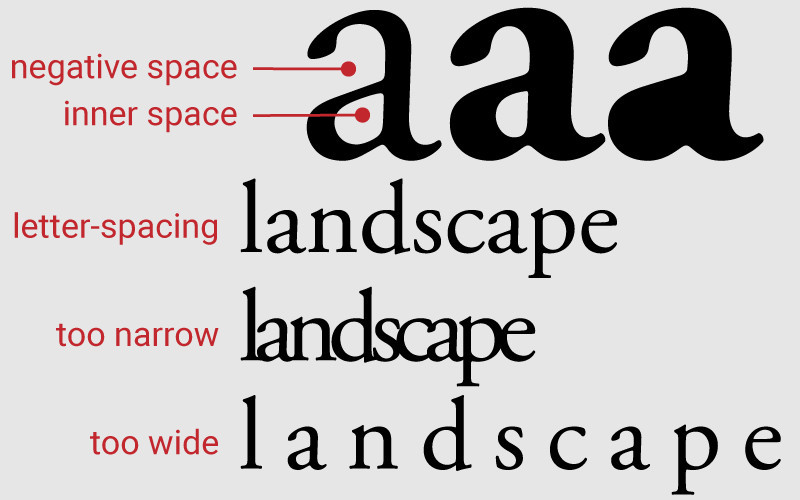
- Space within and around a letter. A well-designed letter has a balance between positive and negative space, giving an even ‘grey’ image;
- Letter-spacing (tracking), the distance between letters. A letter spacing of 0 is the most comfortable to read. Too close together will cause the letters to merge. If the spacing is too wide, words break up into separate letters;
- Word spacing, the distance between words. Proper word spacing makes the text easier to read;
- Leading (line-spacing or line-heigth), the distance between the lines. Leading can be used to enhance the legibility of a page or block of text;
- Columns. Words and sentences are formed into columns.

Alignment
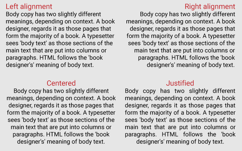
In the West we read from left to right. Chinese and Japanese are read top to bottom. Arabic from right to left.
Since we usually read from left to right, we are used to text that always starts at the same point. The left 'line' guides our eye. Therefore, right-aligned and centered texts are more difficult to read.
To give more emphasis to a small piece of text, for instance headings or quotes, this can be used as an accent.
Learn from tradition, adjust to the new
When it comes to my profession, I often ride my hobbyhorses.
Ready to put this into action?
Start your free journey today — no credit card required.
For example, I think you shouldn't lose sight of tradition. If you don't know where you come from, you don't know where to go. But you also have to be open to the new.
For lead typesetting it was necessary to make justified text. The technique made it impossible not to. In addition, the old typographers knew very well how to make a good 'gray image' of the text.
Justified text is still applied in books. Words are hyphenated when necessary. Unfortunately, some web pages also have justified text, but without the hyphenation. Which produces a horrible type-image.
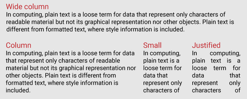
Column width
Research has shown that the optimal width of text lines, the width of a column, is between 45 and 75 characters. The general ideal is set at 66 characters per line of text, which is approximately 8 to 12 words.
This applies to books, magazines and newspapers, but also to web pages. Translated to measurements it means that the best column width is 480 to 600 pixels wide.
More will turn reading into a tennis match where people have to move their heads side to side and back. Less puts the risk that long words won't fit on a line. Especially in too small columns you can see where justified text leads to.
Responsive themes
“Real” ebooks, meaning they are in the Kindle or EPUB format and not the PDF format, are responsive. This means the text is fluid. It adjusts to font size and width of the column. Compare it to responsive web design, where the design scales with the dimensions of a screen, without compromising on readability of text.
Most Wordpress themes are responsive. A sidebar is shifted below the text, when the column will otherwise be too small on a tablet or phone.
Without a sidebar the text column is usually too wide on a computer. Check your analytics on how visitors look at your website. When it’s 100% mobile adjust the theme choice accordingly. If not, and your theme has no sidebar, then set your column width to an appropriate maximum.
Related post
My first blog about what we can learn by looking at traditional sources to use in contemporary design:
https://my.wealthyaffiliate.com/hmommers/blog/what-does-above-the-fold-mean
Let me know if you have any questions about this topic. I’ll be happy to answer!
Share this insight
This conversation is happening inside the community.
Join free to continue it.The Internet Changed. Now It Is Time to Build Differently.
If this article resonated, the next step is learning how to apply it. Inside Wealthy Affiliate, we break this down into practical steps you can use to build a real online business.
No credit card. Instant access.