Optical Illusion - Straightening Lines that Should be Bend?


Published on January 26, 2021
Published on Wealthy Affiliate — a platform for building real online businesses with modern training and AI.

Digital advice from analog origin (5)
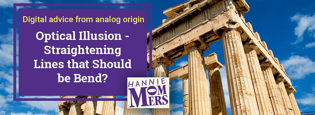
The builders in ancient times already knew it; something that is exactly right does not look right in our eyes. Especially admired in the old Greek temples is the technique of building. Which is absolutely spectacular. With drag slopes, slaves, and later cranes, the huge stone blocks were put in place. (Mind you, I don’t consider the use of slaves as a spectacular fact!)
But equally important is the insight that the Greek architects had in the way our eyes fool us. They took that very smartly into account. Although all directions in such a temple seem horizontal and vertical, there is not one exact straight line.
Parthenon-secrets

Perspective Sketching was intended for learning to draw buildings by hand.
The course at the Academy in Tilburg, where I did my major in art, was given by a very enthusiastic man, always full of stories.
He had specifically traveled to Greece to gather evidence for the statement that no straight line in the ancient temples was really straight.
To prove it, he put his hat on top of the stylobate (the last step of the base) and then walked to the other side. And indeed, when he held his head close to the top step, his hat was no longer visible. The floor was slightly convex!
Is there a link between this Parthenon phenomenon and typography?

Ready to put this into action?
Start your free journey today — no credit card required.
A similar optical illusion occurs in typography. When I was still a graphic designer in the Netherlands, I often blogged and expressed my annoyance about the really bad lettering that could be found on some buildings.
I found the example of “Fortuyn” at an office building in Breda, my hometown. Some amateur constructed them with a (digital) compass and a ruler. If you compare them with a well-designed letter, it almost seems as if the straight lines run inwards. Especially the transition between round and right is badly made.

An example of bad typography
I guess you too can see that the thickness of the O in the curves is not correct. By using only a compass and not WATCHING, a mistake like this is easily made.
If I put both letters on top of each other, another visual trick of the typographer is clearly visible: round letters extend slightly further than the baseline. If the letter designer fails to do this, round letters seem to be smaller than straight letters.
The right knowledge increases your possibilities

If someone who puts letters on a facade has knowledge of these and other visual challenges in typography, he or she will make different choices. He can still choose to draw the letters himself with a compass and a ruler, but curve the vertical lines slightly. Or she can choose to use an existing font.
Good typography
Everyone uses letters nowadays. Your computer is packed with them. Fortunately, you do not have to design them yourself because of a wide choice in your Office program or on Google Fonts. So mistakes, as mentioned above, will hopefully not happen anymore. :)
Happy lettering.
Let me know if you have any questions about this topic. I’ll be happy to answer!
Related
My other blogs on what we can learn from using traditional resources in contemporary design:
https://my.wealthyaffiliate.com/hmommers/blog/what-does-abov...
https://my.wealthyaffiliate.com/hmommers/blog/fundamental-te...
https://my.wealthyaffiliate.com/hmommers/blog/fascinating-fa...
https://my.wealthyaffiliate.com/hmommers/blog/invisible-grid...
xxx
Hannie
Share this insight
This conversation is happening inside the community.
Join free to continue it.The Internet Changed. Now It Is Time to Build Differently.
If this article resonated, the next step is learning how to apply it. Inside Wealthy Affiliate, we break this down into practical steps you can use to build a real online business.
No credit card. Instant access.