What does Above the Fold Mean?


Published on October 10, 2020
Published on Wealthy Affiliate — a platform for building real online businesses with modern training and AI.

Digital advice from analog origin (1)
In my working life I was a graphic designer. Nowadays I am officially retired, although I don't think a designer really retires - I just don't take on assignments anymore. Also, I guess that no expert forgets about her or his expertise after retirement.
Sometimes it's even to my own annoyance that I can't put my formal education aside. I see (almost) every typo, even in English, that is not my native language. And I still cringe when I see bad design.
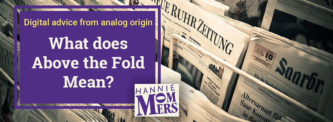
I cringe a lot, so let's not discuss that part. What I do want to discuss is an old-fashioned term: "Above the fold".
Old-fashioned doesn't mean out-of-date
I got my formal education 45 (!) years ago. As a graphic designer that is, because 50 years ago I studied for my art teacher's degree. (I know, I started young, I am 67 now).
Computers existed somewhere far away and were certainly not available for everyday work. I learned my craft with pen, pencil, drawing hook and triangle. Oh, and of course with scissors and glue.
One of the subjects was making lay-outs for newspapers and magazines. A rule that the teacher hammered into us concerned the top half of the first page of a newspaper.
Ready to put this into action?
Start your free journey today — no credit card required.
 Above the fold
The name of the newspaper, the main content, heading of the main article and accompanying picture. All this had to be in the top half to entice buyers who walked past a newsstand.
Newspapers were all the same size and folded the same way to fit the racks and stands. Either the buyer wanted his 'own' newspaper, the one he or she always bought, so that was made clear by the design. Or an irregular buyer was triggered by the heading and/or picture.
Applicable to webdesign
Readers don't want to guess what the newspaper is about and don't want to search for the familiar. Website visitors want to know what to expect.
Both groups are equally impatient. If they can't find quickly what they were looking for, they're gone.
Of course, a web page is not a newspaper. And the way both groups read differs. Although also newspaper readers can be 'headhunters'.
What to learn from newspaper design
- The name of the website is clear and doesn't take up too much space;
- Design, lay-out and color give form to the signature;
- The content (navigation bar) consists the highlights;
- Title and picture(s) make clear what the article is about;
- Headings and subheadings divide the text in bite-sized chunks;
- A font that is easy to read;
- It's clear right away what the article is about - it is not necessary to scroll first because there is only a picture to be seen.
The differences with a newspaper
- A newspaper will use it's paper from top to bottom and from left to right, because paper costs money. In web design it's a breeze when there is breathing space. Meaning line space, blank lines and empty space at the sides;
- It's not a problem if a newspaper article has several columns next to each other. Web pages have one column for the article. Another column can be used for the side bar;
- You can touch a newspaper and a fresh one gives you dirty hands. A web page is more distant;
- Better not use large pictures on a website as the loading time will increase. A newspaper can - in theory - put a picture on the whole page;
- Newspapers cost trees. Web pages use energy as well, but in a different way.
What do you think? Can you add more similarities and differences between (paper) newspapers and web pages?
Share this insight
This conversation is happening inside the community.
Join free to continue it.The Internet Changed. Now It Is Time to Build Differently.
If this article resonated, the next step is learning how to apply it. Inside Wealthy Affiliate, we break this down into practical steps you can use to build a real online business.
No credit card. Instant access.