Get Noticed on Pinterest: Dazzling With Sparkle and Color!
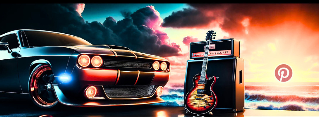
(Title image by DALL-E 3)
Hi WA Friends!
Just a quick point for Pinterest pinners, which can also apply to any graphics you design for your site or other platforms.
Every once in a while, why not create a pin that practically jumps off the page and just screams: "CLICK ME, CLICK ME!"? It's a fun way to grab attention, don't you think? Lol 😃
Start By Checking Out What's Happening In Your Pinterest Niche
A little research shows that people love to pin color-matching combos! Did you know that many of the colors of vintage Fender electric guitar bodies come from cars of the 1950s and 60s?
You can be sure that any player who likes or owns a particular vintage car is going to buy the matching color guitar! I do it all the time, and way before Pinterest even existed! Hahaha
Check out this color chart for cars and guitars!:

Making Your "Clickbait" Pins
Here's an example of a pin I created using DALL-E 3 AI for my guitar website that's part of my "Cars and Guitars" Pinterest board. See how the car and guitar colors match and pop??
Its bad-ass and started getting noticed almost immediately with clicks, saves, and outbound clicks from people who pin cars and/or guitars!
Just add a little AI-generated text to your pin, and you're in business!
Look at how well all that negative black space helps make the image pop!
 Speed Meets Style!: Lamborghini & Gibson SG
Unleash the roar of the Lamborghini and the electrifying riffs of the Gibson SG! Both masters of performance and handling!
Which do you think would win in a race of style and performance: the Lamborghini's speed or the Gibson SG's sound? Share your thoughts!
#Lamborghini #GibsonSG
Sometimes, you just have to put on a little Z Z Top, let yourself go, and have some fun with the process. It's my "secret formula for success!" Now you know! Lol 😎
Tell Me What You Think!
Are you creating some pins or other graphics that dazzle your audience and beckon them to take a closer look?
How does graphic razzle-dazzle work best for your niche?
Tell me what you think in the comments, AND ...
Keep On Rockin' It! 🤘⚡️🤘
Frank 🎸
100% Human-written content
Recent Comments
69
I have a quick question, Frank :-)
The Pinterest pins I started putting in my blog are HUGE, and they don't resize for mobile. I'm using the recommended size from Canva, but I don't like that it has bars on the top and side to move it around so mobile users can see it. Do you have any thoughts?
TIA
Hi Kerri
1000 X 1500 pixels is the recommended pin size for a pin on Pinterest, but you can then scale that down in size for adding it to your blog as a clickable image. Ideally, you should not change the aspect ratio.
I thought you were having a transient ischemic attack, but then I realized you meant "thank you in advance." Lol 😵💫
Rock On! 🤘
Frank 🎸
LOL I don't know what that transient thingy is but that is too funny.
SO having mobile users fiddle with the side and bottom bar is no bidg deal ?
It looks horrible to me, but like i was saying to Kyle in his post, I don't have my phone stuck to my face, and im not addicted to it... so there may be the rest of the world that is used to that .. and don't care that its annoying :-)
Hi Kerri
Scale the pin down in Canva before you add it to your blog, and the side & bottom bars will disappear.
Try scaling it down from 1000 X 1500 to 300 x 450.
The "transient thingy" is a forerunner to a stroke. Lol (was jk) 😎
Frank 🤘🎸
Lol, for some reason, my brain didn't come up with that solution :) thanks, Frank, you are the best. I will try that.
A big fat red heart emoji - someday I'll figure that out, but at least for today you have solved my problem :-)
You're still the best, thanks for taking the time read and answer me :-) Rock on!
I think that you have nailed it here Frank!!
You certainly know how to sparkle and dazzle with your pins.... I am getting better though (I think)!!!
Rock the start to the new week my friend!
👍🎸😎🍹🤣
Thanks, Nick! 🙏
I think the key is to have fun with it, even if you’re in a serious niche.
Most people don’t look at a Pinterest feed the way they look at the page one results from a Google search.
They quickly scroll through a hundred pins or so until something visually grabs their attention.
Enjoy your holiday! 🥳🍹🍻
Frank 🎸
Cheers buddy, that is the truth... and you know that more than most here!!
Rock On!!
👍😎🎸🍻🍹
Yeah, Nick. Imagine what would happen if I didn't practice medicine as an absolute perfectionist! Yikes! Lol 😱
Rock On! 🤘😎
Frank 🎸
There would be a few unhappy families out there to say the least Frank!!
Fortunately, that will never be the case with you my friend!!
👍😎🎸🍻
I am Raymond and I took great advice. I have been following instructions step by step but still very confused. The great advice I took was at this time in my new career I should start off with 1 hub not to worry about more at this time, so I deleted one of them. The hub I have now is niche: college students seeking side income. Website: smart – strides.com. my question now is where I go from here what my next step, I really need to get this rolling ASAP for financial reasons and to help as many people as I can. I will take some money every paycheck and reinvest it. Please help me get started from this point. I need to know what to do next whoever could help I appreciate. Warm regards Raymond
See more comments


Hey Frank, this is an excellent idea, you got it spot on!
I came to this article through The Catherine's post, who was highlighting you as an example, in how to OOMF up your Pinterest pins!
You are right, be in their faces!
I do Canva animated posters, jazzing up my articles and I add links within the posters, hopefully, someone will be curious enough to take a look!
I am getting views, through followers, but need to expand more in that area, from a minor handful,😕to a fistful and more!!! 😀
It would be super cool, if say all the followers we have established here at WA would follow us via, Pinterest as well, can you imagine that, it would be amazing!!!!!🥳🤩🥳
Thanks, Julia! 😎
You need to be careful about having people on Pinterest follow you if they don't have the same/similar niche. You could get dinged in the Pinterest algorithm, especially if your site is only about things in your niche.
The average Pinterest user does not have a business page, so they pin whatever interests them.
Rock On! 🤘
Frank 🎸
Your right there, I have come across all sorts of odd things, that people are interested in, but I am hoping those who do follow me are like minded, and maybe I can have some control over that.
It's the first I've heard about getting dinged in the Pinterest algorithm, I might have to check that out!
Thanks for the heads up!
Rock on to you too!
Julia.😊
You're welcome, Julia. 😎
Have a great weekend! 🥳
Frank 🎸