How to get the speed sorted
Hi guys and Gals
I have been working for the past few hours with the new addition to the site speed and have found out the best way to handle it so thought I would share -
The first thing is to look at the tool and see what to change - see below
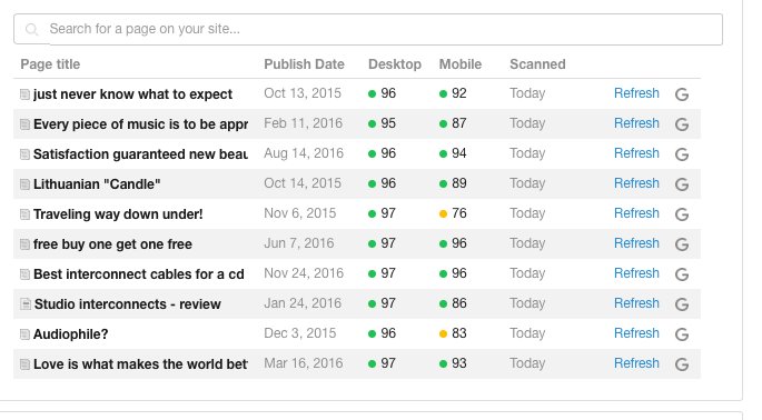
As you see desktop is 96 but mobile is 83 and I want to get it better Ok
This was a very old post and not the best - see below
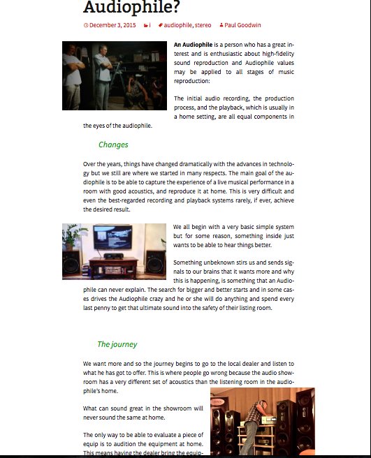
I have five pictures on the post and they are staggered so what I will do first is make them all in the centre by using the pic centre tool and see what happens OK
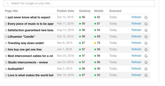
That is all I did centered up the pics and for mobil the result went from 83 to 90 so that was a quick fix - I also cleaned up the text a bit - see below
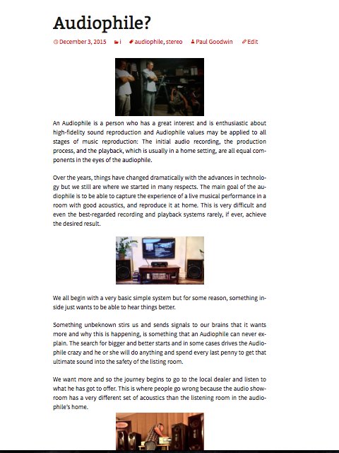
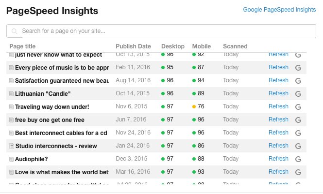
From what I have found on my site the thing to do which makes the BIGGEST changes for the mobile is to get pic entered!
Also reduce image size
Hope this helps
Paul
Join FREE & Launch Your Business!
Exclusive Bonus - Offer Ends at Midnight Today
00
Hours
:
00
Minutes
:
00
Seconds
2,000 AI Credits Worth $10 USD
Build a Logo + Website That Attracts Customers
400 Credits
Discover Hot Niches with AI Market Research
100 Credits
Create SEO Content That Ranks & Converts
800 Credits
Find Affiliate Offers Up to $500/Sale
10 Credits
Access a Community of 2.9M+ Members
Recent Comments
40
Hi Paul, thanks.
I only had 4 yellow results they were in the 70% range.
For 2 of them I adjusted the images, both are in the green now.
The others I need to reduce the % for my logo banner and the sidebar banners. This I wrote a blog post for yesterday for help with no answers so far.
P.S. 26/26 is now 76/78 and 36/37 is now 76/78
I will continue to improve but at least it is not red anymore.
Definitely much better! 76/78 is still very good and sometimes depending on plugins you have and widgets you have serving on your website (like Amazon widgets, social widgets, etc) there is no way around this.
This is still much better than most websites.
Good afternoon Paul,
When I checked my 2 sites this way, pages and posts I nearly had a heart attack. 1 month ago both sites were 85 mobile and 99 desk
Now one of the sites had completely changed. 1 Post was 36/37 and an other post was 26/26, you understand I was in shock.
It is mainly the pictures so I will do some finetuning, a bit smaller to start with and try the centre more. I hope it helps.
Greetings from the south of Spain, Taetske
See more comments
Join FREE & Launch Your Business!
Exclusive Bonus - Offer Ends at Midnight Today
00
Hours
:
00
Minutes
:
00
Seconds
2,000 AI Credits Worth $10 USD
Build a Logo + Website That Attracts Customers
400 Credits
Discover Hot Niches with AI Market Research
100 Credits
Create SEO Content That Ranks & Converts
800 Credits
Find Affiliate Offers Up to $500/Sale
10 Credits
Access a Community of 2.9M+ Members
Thanks for sharing, Paul.
Nice to see you again and you are always welcome buddy
Paul