User Experience (UX) Design. Is it Possible to Make Everyone Happy?
Published on March 15, 2018
Published on Wealthy Affiliate — a platform for building real online businesses with modern training and AI.
Last week Carson alluded that we are going to be delivering a BRAND NEW design here at Wealthy Affiliate (see post here), something that we have been working on for close to a year. The Wealthy Affiliate headquarters have been working around the clock getting this brand new platform ready to rock, so come April you as a member are going to be able to work within our new environment.
I can tell you we have been working on some really brilliant technology, new platforms, new training, and ideas that are going to drive the community, platform, and your businesses for many years to come.
When we make changes, we do them for a reason and with purpose. To make our service better and to make your processes much more efficient as an online Entrepreneur. We have an unrelenting desire to achieve perfection, knowing that we will never be able to accomplish this impossible goal. But as we reach for it, our service here at WA takes drastic leaps and bounds of improvement and we truly feel our next UX (User eXperience) update is the biggest one yet.
But we are very careful about being too rash with our decision-making. It is important that we deliver what we intend to and actually improve our service here. The last thing we want to do is to make things more complex to you as a user.
One thing that we are very reluctant to update too frequently, is the interface here at Wealthy Affiliate. It can pose several problems, one being that all the training needs to be updated (which can be a huge undertaking), but another reason is that people don't like change.
Why People Don't Like Change.
To be honest with you I don't like it when things change. It takes me out of my comfort zone, it makes me less productive (at least so I think), and it has the tendency to overwhelm me. That is why we tend to do the same processes out of habit, even if they are not the most reliable or efficient, rather they are the most comfortable.
Can you relate?
It is human nature to do the same thing if it is comfortable, then to move outside of the comfort zone even if we know it might lead to lot more efficiency.
We also do this out of laziness and also out of "procrastination". Have you ever had something in your house that needed fixing, or perhaps need the batteries changed and it took weeks to accomplish? Well that is because it is a break in habit.
In terms of user design and interfaces with software, the same thing happens. I remember a few years back when Facebook made some significant changes to their design and user interface. There was a huge uproar. People left en masse from Facebook and promised never use it again. These were blank promises, because years later these same people are using Facebook more than ever.
Facebook as a company is smart, calculated and made this design update based on empirical data because they need it to evolve and innovate. It made sense for the future of their business and likely future releases they had planned for the platform.
You can only build a house of a certain size if you are operating on a 1,000 sq/ft foundation. The same goes for technology companies, sometimes it is important to undergo a significant design change and/or update to build a bigger "house" (that is, a bigger, more advanced and sophisticated business).

Facebook is one example of a good design update, sometimes there are complete flops. Sometimes there are also companies that are not willing to change, because they are doing well and for some this creates a stagnant environment (think Craigslist).
Let's Look at a Recent Design Flop, or Maybe Not.
Ready to put this into action?
Start your free journey today — no credit card required.
In a world where users don't owe you a thing, don't have time to waste on interfaces they don't understand and where they have many options, you better get a significant update RIGHT.
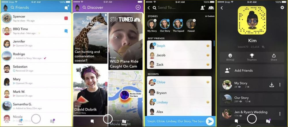
In just the past month, Snapchat went through a redesign. Although I am not a huge Snapchat user, I read a lot about the industry and about design. I also know many people, including family, who were avid Snapchat users and no longer are using it. People have options like Instagram, WhatsApp and Facebook that can easily be a replacement (along with a slough of others).
When people opened their Snapchat app, they were confused as heck when they saw these new designs.

People fled en masse and you even had some of the most prominent social media figures like Kylie Jenner tweeting about the horrible design ("sooo does anyone else not open Snapchat anymore? Or is it just me... ugh this is so sad").
What could have Snapchat done differently? Did a large corporation really miss the mark with their design ideas? Was it too much of a surprise to their user base when the logged in and saw something completely foreign? Probably a combination of all of these and we absolutely want to avoid this with our upcoming launch.
And a Company That Refuses to Change.
One company and one that you probably USED to use (maybe you still use it, maybe not) is Craigslist. They were once the "go to" website for classified, some avid users will still claim it is the best. To me, they were the ubiquitous website for classified ads here in Canada, the same goes for pretty much every country they operate.
Let's look at their design in 2018, which looks very classic, but they have stuck to their guns in terms of their design.

I would argue that they are starting to lose (although their financial statements may not indicate this), to some companies putting out more granular classified websites. Companies like "Varage" are taking over in the buy and sell of used goods.
There are many popular companies and apps that are taking ownership of the dating world (one which Craigslist used to own), and there are a slough or real estate classified sites out there that continue to gain traction and reputation in the online/mobile classified space.
Craigslist refused to update, they were doing well and still are doing good enough, that the founder Craig Newmark hasn't seen reason to change. Maybe it is his own personal case study, and maybe they lost a lot of money as a result, but keeping the design simple and consistent has lead to their usership having a sense of familiarity every time they use the service.
A Brand New UX is Coming Soon at WA, We Are Amp'ed.
One thing we don't want to do is treat a new design like a launch, because it is isn't. We would like to warm you up to this new design, explain our decision-making, and why we truly think that including you in this process is not only important, we owe it to you. We want you to be familiar with it by the time it is actually released.
Offering our ideas and why we made the changes that we did is also going to offer you some unique insight into how design processes works and "why we do what we do" from a technology and design standpoint. Also, you have the opportunity to offer us preliminary feedback is of course going to be very important and has played a role in our overall design up to this point.
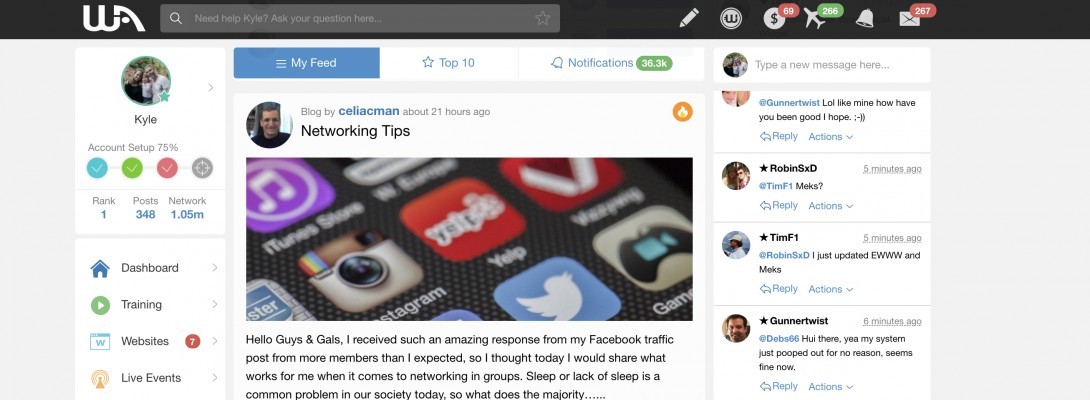
Below is an example of my dashboard (albeit, still in beta, it is going to look very close to this).

The design change isn't radical, but in terms of the technology and the thought that has gone into it, it is quite radical (and we think radically improved).
Our goals with the new design are actually very simple:
- Make things easier to find
- Make your user experience more efficient
- Make the navigation more intuitive
- Show people what they have access to through the design
- Use terminology and labels that make sense
- Make it FUN to use
- Make it more interactive
- Make getting help more efficient
So coming next week, we are not only going to be showing you what the different aspects of our new design look like, we are going to explain the current drawbacks of our existing design (from several perspectives) and we are making the shift.
Although you may detest change, I can assure you that our current design just doesn't allow us to evolve and innovate in the incredible ways we have planned. We have already received some "beta" feedback, and we are warmly surprised that there was little to no resistance on the new design.
Our hopes are that you will share the same sentiment. :)
I would also love you to leave a comment here sharing your thoughts on design, what it means to you, and what causes issues with you whenever you are faced with a new design update. Your comments and feedback are how we improve our platform/service/community here at WA and mean the world to us!
Share this insight
This conversation is happening inside the community.
Join free to continue it.The Internet Changed. Now It Is Time to Build Differently.
If this article resonated, the next step is learning how to apply it. Inside Wealthy Affiliate, we break this down into practical steps you can use to build a real online business.
No credit card. Instant access.
