The Importance of Good Website Graphics by Kelli Brink


Published on August 27, 2018
Published on Wealthy Affiliate — a platform for building real online businesses with modern training and AI.


Hey there, it's Kelli Brink, your resident graphic design geek!
Today I just wanted to talk for a moment about your website graphics, how important they are, and WHY they're important.
FIRST OFF...
Sorry I haven't added a blog post for such a long time! I AM on Wealthy Affiliate daily, but I've been super busy managing my websites. :-)
Since joining Wealthy Affiliate, I've learned SO MUCH. Not only have I gained knowledge and made connections, but my affiliate sales are at an all-time high across all my websites.
WHY?
Because my Wealthy Affiliate training taught me WHO my customer is, where they're at in their search, all about the sales funnel, and how to catch those fish - get the bite - and reel them in!
ON TO GRAPHICS...
I've been blogging for 5 years, and I knew nothing when I started out. I knew very little about graphic design, or specifically how to create beautiful graphics for my sites. It took a lot of trial and error, a lot of learning, but I've finally gotten to a point where I feel like a pro.
I use a web-based graphic design program that is under $100 per year, and I have been very pleased with the results. This program allows me to edit photos, and add layer upon layers of design elements to achieve lovely custom graphics.
WHY ARE GOOD GRAPHICS SO IMPORTANT?
Beautiful, professional-looking graphics are what makes your website or blog stand out from the rest.
When your photos and graphics are cheap-looking, or appear to be just generic clip art, it prevents your site from looking its best. Even if you have absolutely amazing content, cheap-looking graphics are going to hurt you.
Honestly, NO graphics are better than BAD graphics.
Here are a few examples of how I use my favorite graphic design program to really stand out.
Example 1, A Blog Post Graphic:
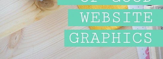
This photo below is my example of a bad graphic.
Why is it bad? First, it is just a flat, low-resolution, shadowy photo. Second, it just has some writing slapped on top of it. There are no additional elements or embellishments to add interest.
Besides the visual elements that are lacking, the title on the graphic just says, "How to make spaghetti"...it's not catchy at all!
Ready to put this into action?
Start your free journey today — no credit card required.

HOW CAN WE IMPROVE IT??
LIKE THIS! Let's add a catchy title that will make your Twitter and Pinterest followers want to click on it! Let's add multiple photos, colors, and embellishments.
This image below is A LOT better, don't you think?? This improved image actually contains about 20 different elements all put together and layered. The "bad" graphic had only 2.

EXAMPLE 2, A Website Header:
If you were looking for hair extentions and stumbled upon the website below with this header graphic, what would you think? It doesn't exactly portray anything exciting, does it? It's very blah. HOW CAN WE IMPROVE IT??

LIKE THIS! This header below for this website commands attention and really shows what it's all about. The use of fonts, colors, and images adds interest. You can tell it is a beauty website.

EXAMPLE 3, An Ebook Cover:
Below is an image that COULD be used as an ebook cover, but it's a little bland and boring. It doesn't have much interest or dimension. It's not the worst graphic ever, but, HOW CAN WE IMPROVE IT??

LIKE THIS! The image below makes a much better ebook cover because it has multiple high-res images. It has a few different fonts in various colors. It is pretty and inviting, and it looks like a book you'd want to read.
 ---------------------------------------------------------------------------------------
EXAMPLE 4, A Website Bio Graphic:
Most bloggers like to include a pretty bio in a widget on their website. This usually includes a nice photo of themselves, and a little bit of info welcoming visitors to their site.
The photo below is a nice picture of a blogger, but HOW CAN WE IMPROVE IT??

LIKE THIS! Here, I used a shape cutout on her photo, added a cute background, and typed in a bio below her photo. This is a nice all-in-one graphic, all the elements are layered in one rectangle for easy insertion into a website widget, page, or post.

SO...
As you can see, there's a big difference between a good graphic and a bad one. They can make or break the look and feel of your website. Since we humans are very visual creatures, visitors to your website want to look at graphics that are appealing to them.
It takes some practice and playing around with graphic design programs, but with a little bit of effort, YOU can create really great graphics!
And if you can't or just plain don't have the time...would you like some help? I have graphic design experience creating website logos, blog post graphics, ebook covers, bio graphics, website buttons, and more.
Ask questions below if you have them! Or private message me! If I take a little while to get back to you, don't worry...I will for sure answer everyone.
In the spirit of paying it forward (which Wealthy Affiliate is all about), I'd like to create a free graphic for the first 5 people who reply below.
You tell me what you need, and I'll make it for you.
~Kelli Brink

Share this insight
This conversation is happening inside the community.
Join free to continue it.The Internet Changed. Now It Is Time to Build Differently.
If this article resonated, the next step is learning how to apply it. Inside Wealthy Affiliate, we break this down into practical steps you can use to build a real online business.
No credit card. Instant access.