Best Use of Images in a Post


Published on January 26, 2018
Published on Wealthy Affiliate — a platform for building real online businesses with modern training and AI.
6 Ways to Maximize Images in Posts
Pictures can be distracting!
You have heard it and you live it. You should add lots of images to your post - less is more, unless it's adding images to a post. Right? Not so fast.
Sure your knee jerk reaction is to think that lots of images convert better. The more bight bold images you can stack your website with the better your sales will be, the more authority your site will gain, and the more traffic your site will have.

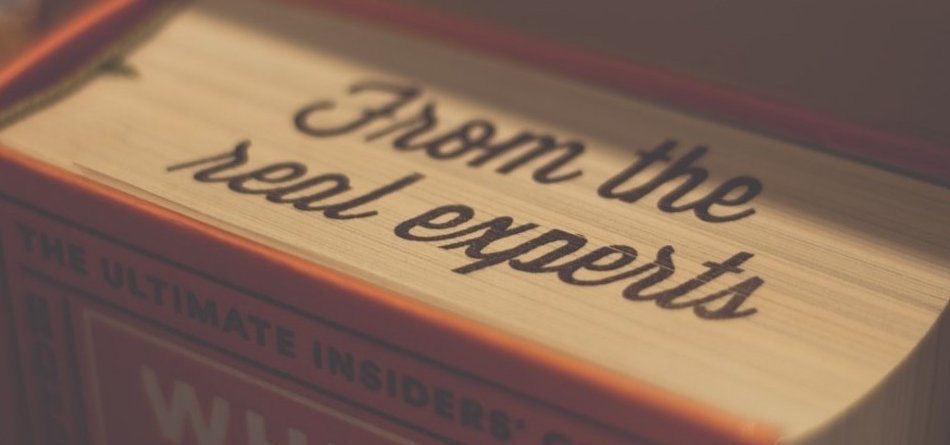
If a picture paints a thousand words, why shouldn't we use a lot of them?
It appears that there is some research out there that shows too many images CAN actually hurt the readability of posts. "Holy Buckets of Images," you say! This can't be! We love our images. They are pretty, they are fun to find, we love to decorate! But... how much value do they add to a post and what do they give the reader?
Pictures help you explain the perspective and description, so it stands to reason the more you use, the better, right? Yes, and no, too many pictures randomly sprinkled into a blog post can actually hurt readability and cause your reader to feel distracted from the content.
Neil Patel, offers very interesting information on this topic. He used a tool called Crazy Egg to test the impact of images on the readability and engagement of the images on a post. According to Patel:
“By running a few scrollmap tests on Crazy Egg, I found that posts containing more than three images tended to get read less by roughly 15% than those with fewer than three images. Interestingly enough, the time on site for posts with three or more images was also shorter by 26 seconds, which is roughly 15% of the average time you spend on my site.”
Another advertiser David Ogilvy did research on the use of images and its impact on reader response rates. Of course, the conclusions were for advertising, but one could argue that this can apply to readership overall.
1) Placement of images
Viewing images and reading headlines follows a natural order. The reader will look at the image first if one is available, then the reader will read the headline, and finally, they read the body of the text. This finding suggests that if you are placing an image at the top of your post, it should be placed above your headline.
Ready to put this into action?
Start your free journey today — no credit card required.
2) Add captions to your post
Have you ever been too busy to read an article or post and just zeroed in on the captions under the photos? You may skim the body, and with the two bits of information, you come away feeling pretty informed. I was amazed to learn that captions are read 300% more than the body. Given that statistic, captions are probably a critical point bearing in mind how many readers merely turn away if there are no captions.
3) Maintain the left margin
(Lets pretend this image is right justified)
What does this mean for your reader, and why is it essential for your images? How manyimages do you run down the left margin and then cleverly flow text around the right side of the image?
Flowing text in this manner forces the reader to interrupt their eyepath and they lose the natural movement from one sentence to the next. Images should be justified on the right so they do not interfere with the left margin.
4) Images should be relevant to your topic
Don't waste time and space with irrelevant pictures that have nothing to do with the post. Pictures plunked down just to fill space will end up confusing and distracting your reader and in the end, will hurt your conversion.
- How to tell if your images are relevant
- Tell a story
- These images draw a reader in and beg the reader to seek more information - it plays on the reader's curiosity. These are perfect for the top of your post.
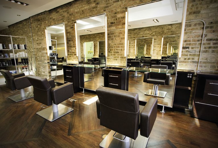
New Modern Hair Salon
- Demonstration
- These images demonstrate in pictures what your blog post or segments of your post are all about. These are good to place at critical points in the post to emphasize the material.
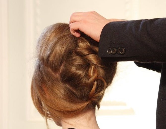 Demonstration of first class hair styles.
5) Image weight (the file size)
First and foremost your page load time is the most important to your reader. If the reader has time to peel an orange while they wait for your pages to load, they will be more annoyed with your bedazzled pictures than enamored. Page load time is another reason not to fill up your post with huge, heavy, and sparkly images. Some files will hit your load time harder, such as .tiff and .png. Using image optimizers can help compress these heavy files but much will come from the choices you make when adding images.
6) Don't use images that are a big turn-off
So what do these turn-offs look like and could you be using them right now?
- Stock imagines - Oh no, could that be those free image!
- Poor quality images - Does that mean I have to give up my sideline photography! Not all of us are professional photographers - right?
- Big headshots - I don't think anyone likes those giant face shots - who uses those?
- Historical - Historical photography has a time and place but needs to be used when specific to the topic, so it not seen as a bunch of boring pictures.
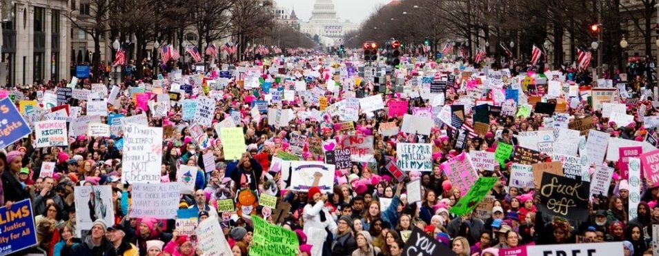
- Crowds of anything - Using a single shot of your subject is better for emphasis rather than a picture of the masses.

I hope my use of more than three images has not proven distracting, and that they were relevant.
See below if you'd like to read the full article.
Share this insight
This conversation is happening inside the community.
Join free to continue it.The Internet Changed. Now It Is Time to Build Differently.
If this article resonated, the next step is learning how to apply it. Inside Wealthy Affiliate, we break this down into practical steps you can use to build a real online business.
No credit card. Instant access.