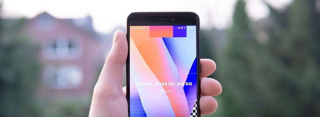
How does your website look on a Smart Phone?


Published on January 2, 2019
Published on Wealthy Affiliate — a platform for building real online businesses with modern training and AI.

My website Theme (Weaver Extreme), has many customizing features that I love. One of them is a tool where I can see any chosen Post or Page in a Tablet or Mobile phone format. I have largely ignored this function because my Theme was supposed to be 'Responsive'. What does responsive mean? It basically means, how does your website Theme adapt from Desktop mode to Tablet or Mobile views. This is very very important!
Ocasionally I check up on my Traffic in Google Analytics, to see where Traffic is coming from, and from what devices people are accessing my website. I noticed that traffic from phones had increased greatly recently and I wondered how my website looked from that view.
I was horrified to see that many of my Posts and Pages did not look the same as my Desktop view. On some, content was wrapping on the sides of photos in wierd ways, not very attractive at all. Yikes! I was embarressed that this is what many of my readers were seeing. I wondered if this might in fact be why my conversion rates were low and bounce rates high.
I immediately went to work on EVERY single Post and Page. I also noticed that what looked like nice paragraphs in Desktop mode, were very long looking paragraphs in Mobile views. I decided to shorten almost all my paragraphs to 3 sentences, so they looked better in Mobile.
Ready to put this into action?
Start your free journey today — no credit card required.
I had to move photos to different positions, and in some cases had to delete photos and choose new ones. It was lots of work! Check out each of your Posts and Pages on your phone, to see how they look from there. If they look terrible in that mode, chances are pretty high that any reader that finds your website on their phones, is going to move on.... and not continue to read your article and certainly not click on any of your links!
My advice is to click on your CUSTOMIZE button at the top of your dashboard, then when your Theme is in the Customize mode, on the very bottom (at least on mine), you will see three icons, one is desktop, one is tablet and the other is mobile. Click on the mobile mode and suddenly your page or post will shrink and show you how it looks in that mode.
You could simply do a search on your mobile phone too, going to each of your Posts and Pages to see how it looks there. I kept many tabs open on my Desktop, so I could see and fix any problems... and there were many.
Whew! I got one website fixed, and now I have to go to the other one, which is much larger! On the plus side, by doing this, I found some links or videos that were not working or even found some typos. From now on, I will be checking mobile view on each new Post or Page before I Publish. In Tablet view, there did not seem to be any problems. Lesson Learned!
I took a short break to Blog this lesson to you all. Back to work on the other site. Have a productive day everyone.
EDIT- After my initial panic attack LOL! my husband reminded me that most people have smart phones these days and can simply change their vertical view to horizontal view. The Horizontal is much kinder. After completely making my website mobile friendly, I realized that the customizer function only deals with how it looks in the vertical view. That aside, I will make my paragraphs shorter anyway, going forward.
Share this insight
This conversation is happening inside the community.
Join free to continue it.The Internet Changed. Now It Is Time to Build Differently.
If this article resonated, the next step is learning how to apply it. Inside Wealthy Affiliate, we break this down into practical steps you can use to build a real online business.
No credit card. Instant access.