Premium Plus+ Dark Mode
Published on January 30, 2021
Published on Wealthy Affiliate — a platform for building real online businesses with modern training and AI.
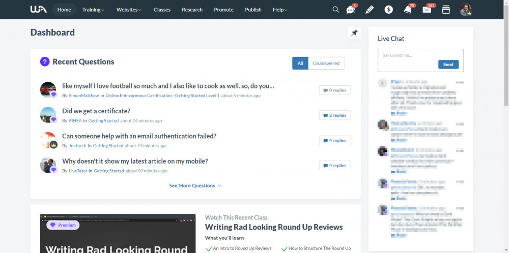
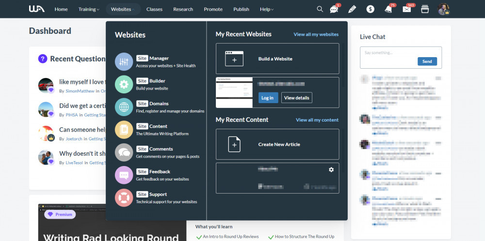
A few members have been intrigued as to what the dark mode is like that comes with the Premium Plus+ Membership.
So here's a sneak peek if you haven't seen it yet.

Ready to put this into action?
Start your free journey today — no credit card required.

You will notice from the two screenshots above, that this is not a full dark mode, but instead, just the top menu bar, and the drop down menus.
I'm not sure if Kyle and Carson have plans for a full dark mode capability, but this is a start for those of you who like a dark screen.
I personally don't use the dark mode, but I know a lot of members do, and that they love it.
Hope you enjoy the rest of your weekend.
Share this insight
This conversation is happening inside the community.
Join free to continue it.The Internet Changed. Now It Is Time to Build Differently.
If this article resonated, the next step is learning how to apply it. Inside Wealthy Affiliate, we break this down into practical steps you can use to build a real online business.
No credit card. Instant access.
