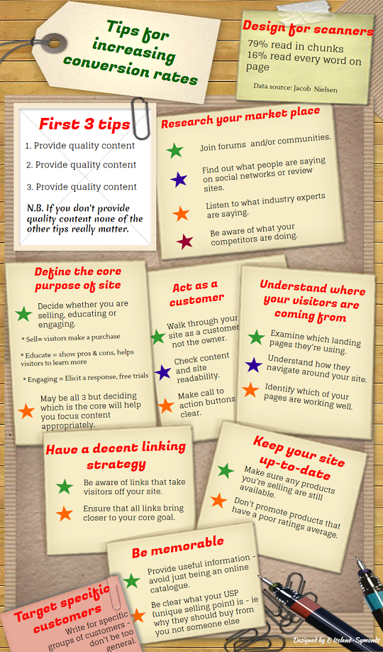
Tips for increasing conversion rates (Infographic)
A common theme in the Live Chat or blogs are people worrying about poor conversion rates (ie number of visitors compared to those purchasing items). Having been asked to look at some people's sites and see if I have any suggestions how they could improve their sites - these are just a few things that I have seen
1. Lack of quality content. Kyle, Carson, Jay and others consistently tell members that they must provide 'quality content'. Keywords may get visitors to your site, but they won't stay if you're providing sloppy content or insufficient content.
2. Insufficient engagement - Quite a few members are promoting Wealthy Affiliate which is great. However, it's not enough to just say what WA provides. What will be the benefits to the specific customers you're targeting. You have to draw them in.
3. Poor calls to action. I can't tell you how many people moan that no one is buying, when it's not actually obvious what they should do to buy. Also remember that if everything is below the fold line (eg people are having to scroll down) they may not bother.
4. Unrealistic expections. Conversion rates will vary - but if you're expecting rates of 50, 60% - think again. Too many people are being unrealistic expecting fantastic rates a couple of weeks after having started their sites. Concentrate on providing quality content and your rates will go up.
As some of you know I have a bit of thing about infographics at the moment - so I produced this one with some tips of things to think about to increase conversion rates.
N.B. This is not the ultimate list - it's just a starter.

Join FREE & Launch Your Business!
Exclusive Bonus - Offer Ends at Midnight Today
00
Hours
:
00
Minutes
:
00
Seconds
2,000 AI Credits Worth $10 USD
Build a Logo + Website That Attracts Customers
400 Credits
Discover Hot Niches with AI Market Research
100 Credits
Create SEO Content That Ranks & Converts
800 Credits
Find Affiliate Offers Up to $500/Sale
10 Credits
Access a Community of 2.9M+ Members
Recent Comments
16
I always love anything new from you as it is always guides me towards success in spite of me constantly getting in the way of progress!. I do appreciate your patients in helping me up "The Hill".
Thanks Todd. I know you're going to get there and in the long run your persistence and patiences is going to pay off.
Your infographic was fun to read and loaded with excellent advice. I actually read every word. I haven't tried infographic yet but it looks like fun.
See more comments
Join FREE & Launch Your Business!
Exclusive Bonus - Offer Ends at Midnight Today
00
Hours
:
00
Minutes
:
00
Seconds
2,000 AI Credits Worth $10 USD
Build a Logo + Website That Attracts Customers
400 Credits
Discover Hot Niches with AI Market Research
100 Credits
Create SEO Content That Ranks & Converts
800 Credits
Find Affiliate Offers Up to $500/Sale
10 Credits
Access a Community of 2.9M+ Members
Thank you - I changed a standard template - so I can't claim much credit for the look - but I do enjoy creating infographics.