Join FREE & Launch Your Business!
Exclusive Bonus - Offer Ends at Midnight Today
00
Hours
:
00
Minutes
:
00
Seconds
2,000 AI Credits Worth $10 USD
Build a Logo + Website That Attracts Customers
400 Credits
Discover Hot Niches with AI Market Research
100 Credits
Create SEO Content That Ranks & Converts
800 Credits
Find Affiliate Offers Up to $500/Sale
10 Credits
Access a Community of 2.9M+ Members
Recent Comments
8
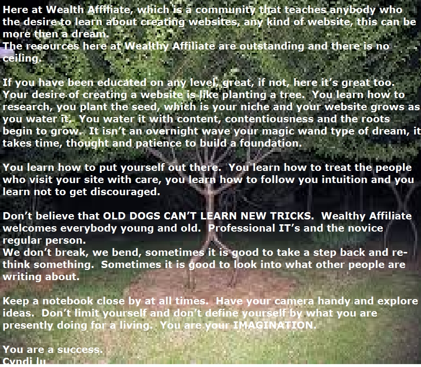
I agree with Eddy, I understand the tree image but maybe you could place the image to the right of the article!
Exactly, this sort of goes in line with my article here:
https://my.wealthyaffiliate.com/eddysalomon/blog/is-your-blog-a-coloring-book
ok guys i really love the feedback, but come on, you got to try new and different things from time to time. and i thought playing with the paint thing would be just that. it is different, love ya all. :))
Cyndi,
There are certain things to experiment with that make sense. Experiment writing with topics. Experiment with different mediums, doing a video instead of writing text. Experiment with what you promote. It makes sense to experiment there. But usability is pretty straightforward. The rule is don't make it difficult for people to read your content. Don't distract from your content. That's basic stuff. You think I'm just being hard on you but I'm not. I'm just trying to break you from a habit that can really adversely affect your business. People visiting your site have a short attention span, if they have to struggle to read your content, you've just left money on the table. There are a lot of ways to be different and experiment and they don't have to detrimental to user experience. But feel free to ignore the years of experience from people that have been doing this for a few moons. LOL
I just want to see you doing the right things.
See more comments
Join FREE & Launch Your Business!
Exclusive Bonus - Offer Ends at Midnight Today
00
Hours
:
00
Minutes
:
00
Seconds
2,000 AI Credits Worth $10 USD
Build a Logo + Website That Attracts Customers
400 Credits
Discover Hot Niches with AI Market Research
100 Credits
Create SEO Content That Ranks & Converts
800 Credits
Find Affiliate Offers Up to $500/Sale
10 Credits
Access a Community of 2.9M+ Members

Love the article >> unfortunately with my eyes it was very hard to read