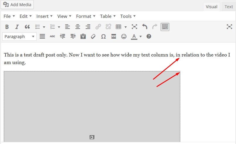
Once you have clicked on "Preview Post" an unpublished page will appear in a new window, that shows you how your post and video will look together. For this example, my preview looked like this:

Notice that the text length is much wider than the video, which, to me, looks unbalanced, and lopsided on the page. Two options I usually consider are, either making the video much smaller, so it does not really compare to/compete with the text width, or, as in this case, enlarge it to match the paragraph width,
To do that, observe where the text ends at the right end of the text line above the video. In this case my editor clipped my sentence right after the word, "in" ... and began a new line with the work, "relation".
Observe where that line break is in your example, then close out the preview window, and go back to the post in your editor, in Visual Mode.
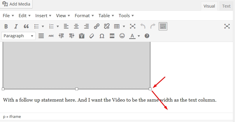
Once there, click on the video (gray box) to make the sizing tabs appear - they are at all four corners, and midway along all sides; grab a corner arrow with your mouse by left clicking on it, making a directional arrow appear. Holding the mouse left click down, pull in the direction of the arrow until the gray box is the same width as the place where you observed your editor makes a line break in the Preview Page window of your post.

In my example, I needed to pull it until it lined up straight down from the "in" word above, like this example below:

Now click again on "Save Draft", then again click on "Preview Page" ... check to see if your video is indeed resized to match your post's paragraph width.
When I checked mine just now (I am performing this process as I write this tutorial), mine still wasn't perfectly sized, so I had to fiddle with it a couple times more, each time saving the draft and then previewing the page, so you may have to do that as well.
But you should fairly easily accomplish resizing your video so it aligns nicely with your paragraph width like this:

And that's it! You are done. As soon as you are satisfied with your overall post or page article, just publish away, confident your video will appear well balanced within the content.
Some closing notes:
1. Again, you could size the video down, and work your content around the video, that's also an option, using the same technique, just pulling the cornerinto the gray box, not away.
2. I have not found the "align center" feature in editor to work with YouTube videos. They always remain stubbornly left-aligned in Preview Page window. It could just be my theme, you can try that, certainly, but if "centering" doesn't work for you, then this technique should help you out.
3. This does not work with, or apply at all, to videos you have made yourself and are uploading to your blog or page yourself. That is not a good idea in the first place, because directly uploaded home-made videos will bog and slow your site down. Always best, if you want to make a video for inclusion in your site, to upload it first to YouTube (there are others, too, like Vimeo and Stickam) and then use the embed code from there to place in your posts or articles.
I hope this tutorial was helpful to some newbies, if so please "like" this tutorial, and please comment.
Chow, Y'all,
Your Friend,
Marvin Wilson (aka The Old Silly)
p.s. - yes, for those of you who caught it, I did a tad bit of self- promotion with the use of one of my own YouTube videos in this example, the book trailer for one of my novels, Beware the Devil's Hug. Hey - call me shameless, I just couldn't help it, teehee.


