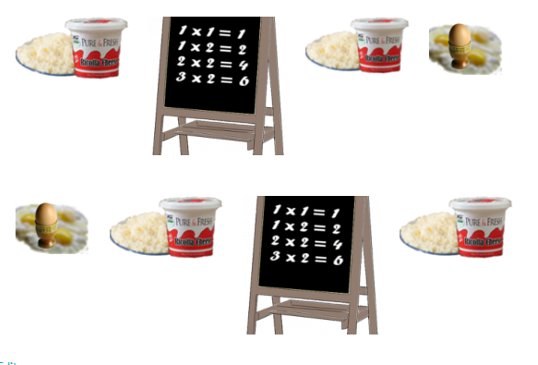
In the example in the first lesson you saw how every image was exactly the same width and height. In this, the final lesson, is an example of images the same width but different heights. I prefer the first example as it looks neater and more professional, but that is up to personal choice.
Whether the first example or the one below, both are inserted into your grid in exactly the same way. If you find the space between rows is too large you can reduce it by copying and pasting the following code in each row after the <div class="column">: <p style="margin-top: -00px;"</p> (don't forget to change the 00 digits). If the space needs increasing use the same code without the - sign.
Here endeth the six lesson. Good luck!

Join the Discussion
Write something…


