Subheadings - Something Small Makes a Big Difference
I keep saying I learn something new here every day. In today's news, I was working on a blog post and I really wasn't happy with how it looked. I felt like it was really 'wordy' but try as I might, I couldn't seem to pare it down.
Then I took a look at my Yoast SEO commentary (see my earlier blog to see how much I like Yoast SEO!) Yoast SEO was complaining because I didn't have any subheadings. "Subheadings?" I thought..."What are those???"
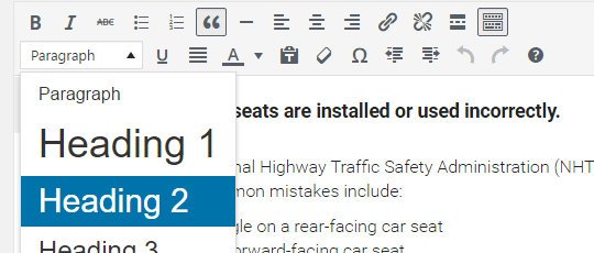
So I took a stab and broke out my text and changed some of the format to be 'headings' instead of just paragraphs. For newbies, here's where you find it - make sure the button on the right top row (toolbar toggle) is pushed so you can see the second row of options:

Wow what a difference it made!
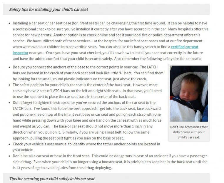
Here's the before...

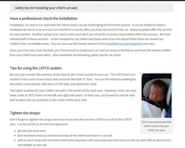
and here's the after...

Notice how much more readable it is? I also made my paragraphs smaller. You know you're reading about safety tips for installing a child's car seat from the blockquote, but the subheadings tip you off to what each paragraph is about! And there's logical breaks to give your eyes a rest.
Critiques are always welcome - let me know what you think!
Join FREE & Launch Your Business!
Exclusive Bonus - Offer Ends at Midnight Today
00
Hours
:
00
Minutes
:
00
Seconds
2,000 AI Credits Worth $10 USD
Build a Logo + Website That Attracts Customers
400 Credits
Discover Hot Niches with AI Market Research
100 Credits
Create SEO Content That Ranks & Converts
800 Credits
Find Affiliate Offers Up to $500/Sale
10 Credits
Access a Community of 2.9M+ Members
Recent Comments
11
Teresa, that is so much more readable. I think readers get bored really quickly when there are monolithic columns of content to read. Short paragraphs with catchy headings are the way to keep readers focused.
Thanks so much for the feedback! Now I think I'm going to go back and fix my earlier blog posts so they look more like this. There's always work to be done!
See more comments
Join FREE & Launch Your Business!
Exclusive Bonus - Offer Ends at Midnight Today
00
Hours
:
00
Minutes
:
00
Seconds
2,000 AI Credits Worth $10 USD
Build a Logo + Website That Attracts Customers
400 Credits
Discover Hot Niches with AI Market Research
100 Credits
Create SEO Content That Ranks & Converts
800 Credits
Find Affiliate Offers Up to $500/Sale
10 Credits
Access a Community of 2.9M+ Members
Teresa, it looks much better. More professional. Also, gives it more authority. Great job! s
Thank you so much! I'll bet some people are like, "yeah...and???" but I was so thrilled to discover subheadings. It's the little things. LOL
It is the little things. I have a problem with subheadings on mine because it is more like writing a letter or just chatting with someone and hard to do subheadings for that. Looked kind of goofy when I did. I guess for SEO goofy is good. s