I Need Your Vote!

11
1.4K followers

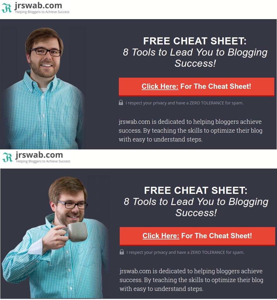
Got a pro to cut out some the background of a photo (i could do it but why not get a pro eh?) I need to know do you like the top or bottom better?
Login
Create Your Free Wealthy Affiliate Account Today!
icon
4-Steps to Success Class
icon
One Profit Ready Website
icon
Market Research & Analysis Tools
icon
Millionaire Mentorship
icon
Core “Business Start Up” Training

Recent Comments

56

I like the 1st picture with the 2nd's layout/text

so moving image one closer to the text?

Haha yeah, that's what I meant. The text looked different to me, until I put my glasses on :)

Thanks sir!

I like the one on the bottom.
Rob

thanks Rob!

I like the one on top best.

Top one looks more inviting, and authoritive.

Thanks Alexander

I like them both. However, the top is more professional looking. But the bottom one is more relaxed and people who are blogging are more relaxed and probably having coffee too. So my vote is the bottom one.

thanks for your vote!

Bottom one.
:)

Thanks Deb!

I agree. You look happy.

bottom, you look more approachable. you look stiff and uncomfortable in the first one.

Thanks, Liz!

no 2. you look more relaxed.

Thanks!

Top, more pro in my opinion :)

thanks!

See more comments

Login
Create Your Free Wealthy Affiliate Account Today!
icon
4-Steps to Success Class
icon
One Profit Ready Website
icon
Market Research & Analysis Tools
icon
Millionaire Mentorship
icon
Core “Business Start Up” Training