Tip 29 : to float or not to float
13


A dilemma we all face.
You know, the pop-ups, the floating social media sharing, the call to actions...
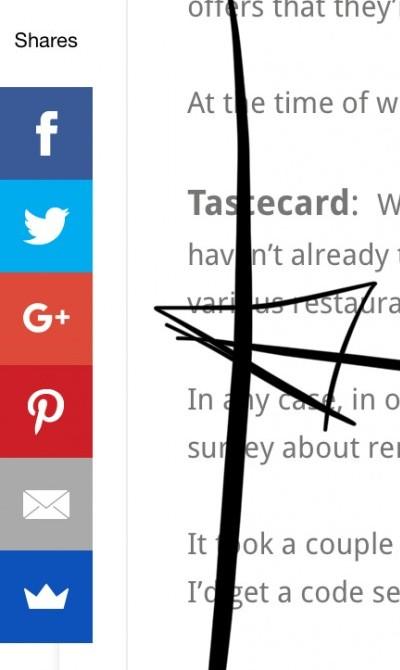
And before we know our screen becomes a flashing one covering text and images.
Not really nice to look at, especially if they are not aligned.
Look at this one:

A good example:
- with correct alignment
- Enough space
- And no overlapping for a better reader experience
At your marks...


Create Your Free Wealthy Affiliate Account Today!

4-Steps to Success Class

One Profit Ready Website

Market Research & Analysis Tools

Millionaire Mentorship

Core “Business Start Up” Training
Recent Comments
13


I was on one website today with so many ads popping up you couldn't read the content. Not a WA person for sure.
Me too... hence my post... the site i saw was so flashy, you could not read the text... one pop-up and slide-in after the other... all flipped after that... not lol at all
And... before you know
You click the wrong place
And more of that stuff
Hard to get out
See more comments
Create Your Free Wealthy Affiliate Account Today!
4-Steps to Success Class
One Profit Ready Website
Market Research & Analysis Tools
Millionaire Mentorship
Core “Business Start Up” Training
That is some good advice for all of us. Thanks
Wayne
Yes, and hard to fix
BEtter no flah than bad flash
yep, agree!!
Wayne