My Poor Eyes
Published on February 7, 2017
Published on Wealthy Affiliate — a platform for building real online businesses with modern training and AI.
There's something that has been on my mind for awhile now and It's time to get it off my chest. While I love checking out other folks' blogs and see what they are up to, I do have a pet peeve about some blogs. What is it you might wonder? Well, it's the ones where the print on their blog is so light that I can barely see it. I know some of these are even top rated blogs and they have tons of followers, but when their pages look like my printouts do when my printer is almost out of ink I just have to pass it by.

What's the deal now days? It seems like more and more websites are using print so light that older people with poor eyesight can't even begin to read it. I try to make sure my websites have dark enough print to be able to see it without causing anyone eye strain.
Ready to put this into action?
Start your free journey today — no credit card required.
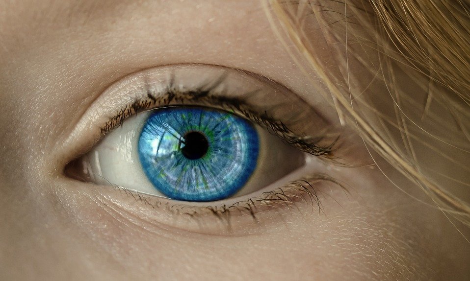
I'll admit my eyesight isn't the greatest. I've worn glasses or contacts since I was 12 years old and today I am nearly blind in my left eye, which makes it even more difficult to read.
In the case of choosing a font for your website, keep in mind those of us who strain to read your posts. "Lighten up" is not always a good thing!
What are your thoughts? Does anyone else have trouble with the light print on websites or is it just me? Would love to hear your opinion. Thanks for reading!

Share this insight
This conversation is happening inside the community.
Join free to continue it.The Internet Changed. Now It Is Time to Build Differently.
If this article resonated, the next step is learning how to apply it. Inside Wealthy Affiliate, we break this down into practical steps you can use to build a real online business.
No credit card. Instant access.