Image sizing and Selection


Image size
There have been questions about images on websites. I'd like to clarify a few things.
Images on a website are categorized into three main sizes.
WordPress automatically sizes each image into each of the following. That means, there will be three images for each image.
Thumbnail - the smallest view. Best for profile, widget and header icon.
Medium - Best used for your blog or article 'Feature' image
Full Image - Best suited for Large header images or Background images.

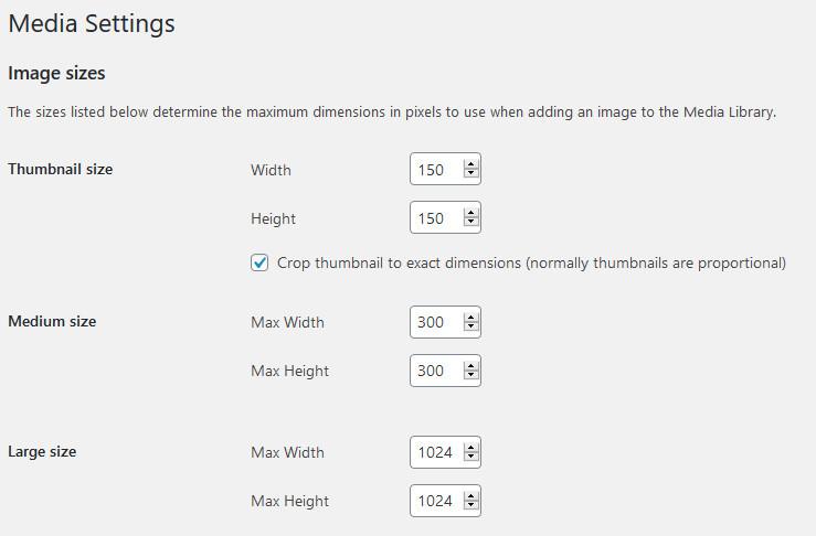
(from WP admin - Settings>Media)
The above sizes are the MAXIMUM size needed. Bigger images will not fit properly.
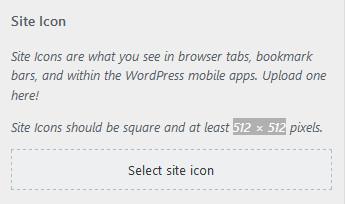
Thumbnail - When you customize your theme, In the ‘Site Identity’ you will name your website, and add a tagline (if desired). Some themes will ask for a small icon image.
Note: Highlighted setting is 512 x 512. (GeneratePress theme)
A Featured Image size is determined by your theme’s settings. GeneratePress uses a large image setting for the ‘featured image’. That may or may not be something you can adjust. You may spend some time juggling between actual image size, and featured image settings, to find the best fit.
Background – To add a background image, you will need a large size. 2400x 2400. If the image is detailed with a pattern or design, the larger the image, the better. Too small, and when you set the image to ‘cover’ the background, you will see an image that is pixelated.
Again, it will depend on your theme and editing plugins, whether you can adjust image settings, or placement. For example, with Elementor, I can adjust any image added to page, featured or background. This includes options including range of px sizes, directional placement (center, bottom left, etc). And how much background with the image fill, using the cover, contained, or custom options.
Fixed or scroll position is another image option, one that I like to use. This occurs when you set the image as ‘fixed’. This holds the image in place, as you scroll the page up or down.
Size does matter – ways to measure
Whether it is your image, or font type, the size of either can be modified to fit the page better.
Px font type was used in print and carried over to online. Yet, the px is absolute, restrictive
With mobile devices, websites are adapting to em sizes. This is because the em value is relative, not a fixed unit like the px. Not a straight trade, one for the other, more of a blending.
To convert the px into em size, use the formula of 16px is equal to 1 em. (16px = 1em)
With certain page editors, like Elementor, there are options to use px, em or percent (%).
Adapt your screen size by using a percent value. This is helpful when configuring your website to work properly on mobile devices.
Where are your Images found?
If you download your images from free-images or pexels websites, select the size image that works for you. You won’t need the biggest image for everything. Use the Medium size image, this will be large enough for your featured image, no matter the theme settings.
If you want a suitable image for the background, download the large size.
Note: when you need a smaller size, REDUCE image to retain shape, before cropping. Guaranteed your image will look much better.
Have you ever taken a picture, cropped it so it looks good, then decide to make it your screensaver on the computer? What happened?
Chances are the image grew to fill the background. Now your little perfect picture looks monstrous. When you take a far away picture, and try to bring it up close, the image distorts. Same thing when fitting an image. A larger image shrinks better than a small image grows.
Hope this helps answer some questions…


Recent Comments
37


Thanks for sharing your ideas, it does really help to the community I do believe. Blessings to your journey.
You're welcome! I'm glad you enjoyed this. I wanted to provide a little clarity, and learned something in the process!
See more comments
Hey Rudy,
Thanks for putting this post together.
I have been going back and updating my site the last little while, and have been making all of my feature images 600 pixels wide, and all of the images in my posts 430 pixels wide.
Did I screw up?
At least the file sizes are smaller...
Are you seeing a problem? If so, what is happening?
Two image sizes...600x 800 for feature images, and 480x640 for gallery images.
If you combined or mixed the sizes, you might have issues fitting the image properly.
Hey Rudy,
I haven't had any problems, but I just wanted to see if there was something I was unaware of that could affect the renos I'm doing on my site right now.
Your recommendations are very specific. When I find an image and crop it, each one has unique dimensions.
For example, I might crop a featured image and then resize it to 600 pixels wide, keeping the aspect ratio the same.
So one feature image might be 600 pixels wide, and 540 pixels tall.
The next one might be 600 pixels wide, and 750 pixels tall.
Is this OK as long as they are within the 600 × 800 range?
The image sizes are specific for a reason....those sizes are dynamicall set to fit properly. If you go to your admin settings,>Media, the page will show you maximum size limits..
Thanks Rudy,
I'll check that out.