Opinions on logo :) ?


Hello,
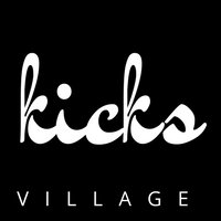
Still at the beginning of the course but I been having a little paly with the logos :) Which one do you like guys? My niche is urban footwear (might dive into streetwear fashion as times go on) blogs, reviews, deals etc. Thanks for your advice in advance :)
Join FREE & Launch Your Business!
Exclusive Bonus - Offer Ends at Midnight Today
00
Hours
:
00
Minutes
:
00
Seconds
2,000 AI Credits Worth $10 USD
Build a Logo + Website That Attracts Customers
400 Credits
Discover Hot Niches with AI Market Research
100 Credits
Create SEO Content That Ranks & Converts
800 Credits
Find Affiliate Offers Up to $500/Sale
10 Credits
Access a Community of 2.9M+ Members
Recent Comments
6
Join FREE & Launch Your Business!
Exclusive Bonus - Offer Ends at Midnight Today
00
Hours
:
00
Minutes
:
00
Seconds
2,000 AI Credits Worth $10 USD
Build a Logo + Website That Attracts Customers
400 Credits
Discover Hot Niches with AI Market Research
100 Credits
Create SEO Content That Ranks & Converts
800 Credits
Find Affiliate Offers Up to $500/Sale
10 Credits
Access a Community of 2.9M+ Members
Really like the second one. Nice Job!
Thank you! :)
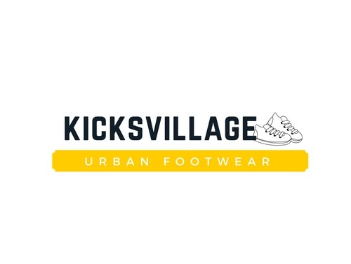
Ay thoughts on this version? :)
I think it would be great as your avatar across all social media platforms. The square format will fit where the #2 format won't. The #2 would be perfect on your website, #3 as avatar across social media.
Thank you hmmm would it be better to stick with one design? Or using two for different platforms is an option? I think maybe sticking with one would be better?
I don't think that is necessary, as one design won't fit both platforms. But I would come up with a colour scheme that works for both, and for your brand. Use that colour scheme throughout everything to tie it together.
Perhaps you could change the yellow to black, that ties them together. I agree with Craig about the use of both logos.
Good designs, both of them.
Yes Steve I think that’s what I’m gonna do thank you :)
That’s great idea Craig thank you !