Tips That Could Make Your Site Aesthetically Pleasing


Published on February 26, 2015
Published on Wealthy Affiliate — a platform for building real online businesses with modern training and AI.
When it comes to the overall development of your site, one of the most significant aspects is definitely its appearance. Keep in that mind that if, throughout the first couple of seconds of looking at a site I see that the logo, fonts, color schemes or pictures make my eyes want to explode

— I probably will not want to move forward with looking at it. Design equals credibility. With that thought in mind I thought that I would write down some tips that might help you out with your sites design. Here are some of my tips:
Try choosing images that are germane to what you are discussing which are also very appealing in terms of the design
Having images that aren't very appealing and irrelevant can definitely hurt your sites image. Choosing the wrong images is something that I see people do a lot nowadays with their sites. If you plan to have pictures on your site, please take some time to carefully select that ones that you think are both relevant and appealing to your site.

Since some images can be rather costly if you want to have them professionally taken by a photographer yourself, I suggest using images on google that have very great quality or photoshopping. There are definitely a lot of quality sites out there that offer very creative and unique images for free, that you might find interesting as well as great assets to your site. There are also some really superb sites that offer photoshopping services on a free trial, but photoshopping can be a little complicating. You could also try Instagram which is a great way of getting really nice images for free. There are also sites like Stock Xchng or Wikipedia Commons where you could also find really high quality images for free.
Picking the Right Font

Choosing the right font is also significant, professional and above everything, determines the legitimacy of your site. If you are really itching to get people to read your content, you first have to make sure that it is even readable. Usually Arial is the most common, but some people also love to use Helvetica and Georgia because it is so easy to read. These 3 font styles are work well with all browsers. If you don’t consider yourself to be an experienced designer, and your font looks monotonous, that’s probably the easiest way to recognize it as being a good font. You could also try Google Fonts, exlibris Font Foundry, veer.com, and FontDeck.
Adding Colors to make your site more appealing
Ready to put this into action?
Start your free journey today — no credit card required.
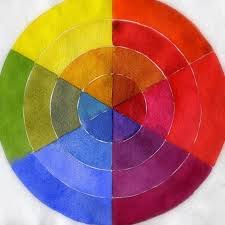
Before doing this, please bear in mind that if you aren’t very familiar with coloring principles, it is probably not best for you to get too inventive with the color scheme on your site because in the end, you may just end up ruining it’s design. This is definitely something that you want to avoid for sure. If coloring isn’t really your thing and in all honesty never really was your thing, you can always just use 2 neutral, contrasting colors (ideally shades of black and white are great) with the scant usage of 1 highlight color along your site.
If you are aspiring for an even better color scheme though, try using a palette from ColourLovers. Be sure that your colors match with your theme though.
Try to keep your options minimal though, remember you don’t want to have a messed up color scheme all throughout your site.
Try adding a logo
A logo can serve as more than just some icon that is on top of your site — if you create the right one, it can be the new face for your website. With the internet becoming more versatile as time passes by you can rest assured that you can definitely find a great logo for free. If you simply type in the right keywords into the search engine, I'm sure that you will find a ton of sites that can help you create really amazing logos that look absolutely fantastic. If you have no prior experience with logos though, try making your logo as simple as probable. If you really want to invest a little bit of money towards your logo though, you can always buy a logo and tweak it a bit. There are definitely a lot of sites out there that sell logo designs that I’m sure you could find by doing a simple google search.

Try not to have avoid a disarrangement
When a site has too many its credibility is lost.
When I say disarrangement, I'm really talking about:
§A lot of Ads placed on your site
§Newsletter Forms that Pop-Up all the time
§Having too many social media Icons
§Unanticipated Animations
§Music or Video’s that play on their own accord
§Anything that you think will make it harder for people to navigate through your site
Even though people sometimes need ads for monetizing their site, having too many can really take away the overall value of AdSense in the first place. Usually people know what it is and are always trying to avoid clicking on it, so having too many will only make things a lot worse. If you are someone who is looking to have a great Bounce Rate and unique visitors that would purchase from your site, then don't be place ads everywhere. Be smart about the ads you pick and where you put them on your site. However, if you are just a started, then you should definitely be placing your efforts towards your site’s content the focus because there is no such thing as being successful overnight.
Share this insight
This conversation is happening inside the community.
Join free to continue it.The Internet Changed. Now It Is Time to Build Differently.
If this article resonated, the next step is learning how to apply it. Inside Wealthy Affiliate, we break this down into practical steps you can use to build a real online business.
No credit card. Instant access.