From Flatland to Landscape


Published on September 6, 2026
Published on Wealthy Affiliate — a platform for building real online businesses with modern training and AI.

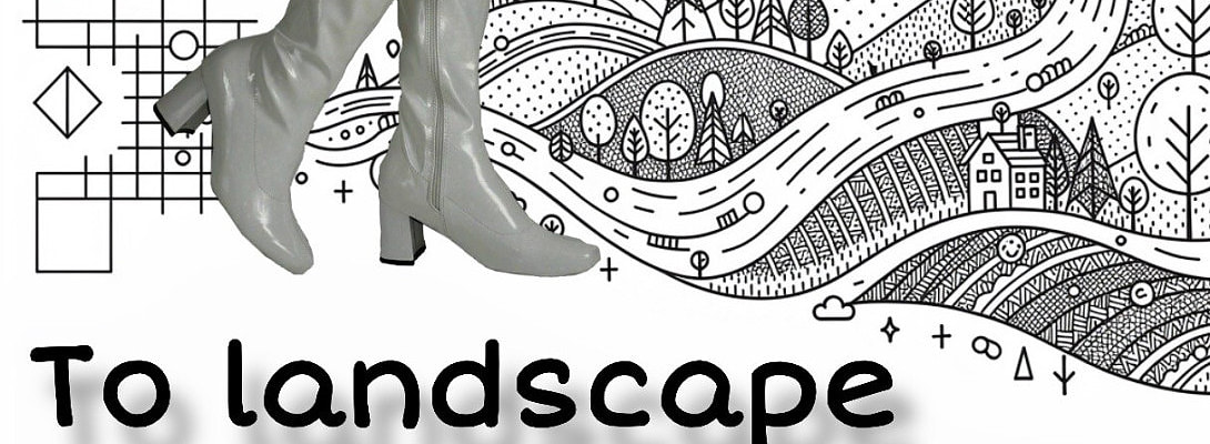
From Flatland to Landscape
How to Format Text People Actually Want to Read..
You have written the thing.
The ideas are there. The sentences work. The spelling has survived inspection.
And yet, when you paste it into WordPress, something feels wrong.
It looks like a wall.
A large, grey, perfectly respectable wall of text.
Welcome to Flatland.
Good writing is not automatically good reading
We often treat formatting as decoration...
The final bit of tidying after the “real” writing is finished.
But formatting does something much more important.
It gives the reader a landscape.
A heading says, “You are entering a new place.”
A paragraph says, “Stay here for one thought.”
A list says, “These things belong together.”
Bold text says, “Notice this.”
White space says: “Rest for a moment.”
Formatting does not merely make writing prettier.
It helps people understand where they are.
The paragraph is a room, not a warehouse
A paragraph should contain an idea, not everything you happen to know about the subject.
On paper, a long paragraph can sometimes feel thoughtful and substantial.
On a phone, it can resemble a hostage situation.
So give ideas room.
When the thought changes, consider a new paragraph.
When something deserves a moment of its own, let it stand alone.
Short does not automatically mean good. Long does not automatically mean bad.
The useful question is: How much should the reader carry at once?
Headings are road signs
Imagine driving through an unfamiliar country where somebody has removed all the signs.
Beautiful scenery.
Terrible journey.
That is what a long article without useful headings can feel like.
Headings help readers understand the structure before they understand every sentence.
Compare: Some Additional Considerations Regarding Formatting
with: Give the reader somewhere to look
The second heading actually tells us something.
A good heading is not merely a label. It is a promise about what comes next.
Use bold like a highlighter, not a paint roller
Bold is useful because it creates contrast.
But if half the paragraph is bold, nothing is really being emphasized because everything is competing for attention.
The same goes for italics, CAPITAL LETTERS, exclamation marks!!! and every other device asking the reader to LOOK HERE.
Emphasis works because most things are not emphasized.
Choose the few words or sentences that deserve extra weight.
Then leave the rest alone.
Lists are excellent... when you actually have a list
Lists help when readers need to scan, compare, remember, or follow steps.
For example, formatting can help a reader:
- find the important idea;
- understand how ideas relate;
- pause between sections;
- scan for something they need; and
- return later without starting from the beginning.
Ready to put this into action?
Start your free journey today — no credit card required.
But not every collection of sentences needs bullets.
If the ideas form an argument or story, paragraphs may serve them better.
A list creates separation.
Sometimes you need separation.
Sometimes you need flow.
White space is part of the writing
Here is one of the cheapest improvements available on the entire internet:
Nothing.
A little empty space.
White space reduces visual pressure and helps important elements stand apart.
It gives headings authority.
It gives images room.
It gives the reader permission to pause.
You do not have to fill every available centimetre of the screen.
Silence is part of music.
Space is part of design.
And absence is sometimes part of writing.
Think about the person holding the screen
Your article does not live in WordPress.
It lives in somebody’s morning commute.
It lives between two meetings.
It lives on a cracked phone screen while dinner is cooking.
It lives in 14 browser tabs, three notifications and a rapidly disappearing attention span.
That does not mean everything must become short, simplistic or breathless.
It means the reader deserves landmarks.
If the subject requires 2,000 words, write 2,000 good words.
Then help people travel through them.
Links should tell people where they are going
“Click here” makes the reader do unnecessary detective work.
Instead of:
To learn more about typography, click here.
Try:
Read our guide to choosing readable typefaces.
The link now has meaning even when somebody encounters it while scanning.
That is useful for readers, accessibility and navigation.
Images need a job too
An image should not appear simply because several paragraphs have passed and the page seems to be demanding one.
Ask what the image contributes.
Does it:
- demonstrate something?
- provide evidence?
- make a comparison clearer?
- establish a place or person?
- give necessary visual context?
If it does, excellent.
If its only job is “blogs have pictures,” perhaps the article is better without it.
And when an image carries meaning, give it useful alt text so readers who cannot see it are not excluded from that meaning.
Formatting cannot rescue weak structure
This is the slightly inconvenient part.
If an article does not know what it wants to say, adding headings will not solve the problem.
You will simply have confusion in bold.
Before formatting, ask:
What should the reader understand when they leave?
Then arrange the article so each section moves them toward that understanding.
Formatting should reveal the structure... not disguise its absence.
Before you press Publish
Give the article one final journey.
Do not read it only as the writer. Travel through it as the reader.
Can you tell what the article is about from the title and opening?
Can you scan the headings and understand the route?
Are the paragraphs carrying manageable ideas?
Is bold reserved for genuine emphasis?
Are lists doing useful work?
Do links make sense?
Do images earn their space?
Is there somewhere for the eye to rest?
And, perhaps most importantly: What can you remove?
Delete the repeated explanation.
Cut the introduction to the introduction.
Remove the heading that says nothing.
Lose the decorative image that adds nothing.
Give the surviving ideas more room.
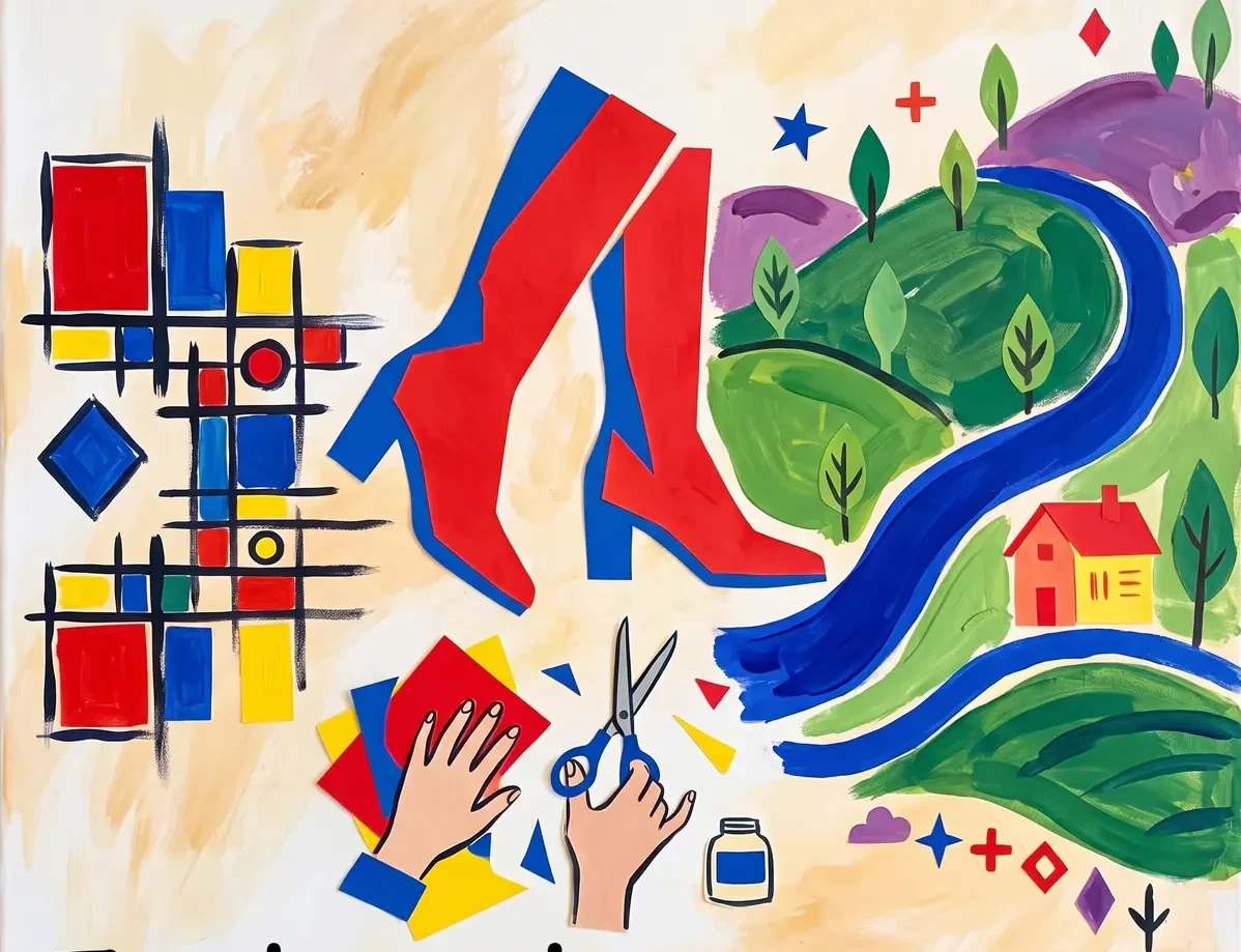
Turn the page into a landscape
Text begins flat.
One word follows another. One paragraph follows another.
Formatting introduces terrain.
There are entrances and pathways. Signposts and viewpoints. Open spaces and places where the reader slows down.
The goal is not to decorate the page until it looks “professional.”
The goal is much simpler: Help another human being find their way through what you have to say.
That is when a block of text stops being Flatland.
And becomes a landscape.
✨ Fleeky
Thank you for reading, likes, comments and shares!
As for me, depending on the style and topic, I try to maintain a certain frame....
Share this insight
This conversation is happening inside the community.
Join free to continue it.The Internet Changed. Now It Is Time to Build Differently.
If this article resonated, the next step is learning how to apply it. Inside Wealthy Affiliate, we break this down into practical steps you can use to build a real online business.
No credit card. Instant access.