Brand Yourself?


Published on July 17, 2015
Published on Wealthy Affiliate — a platform for building real online businesses with modern training and AI.
Hi Fellow WA'ers.
I wanted to touch on the subject of self branding. Some may ask, "self branding?" what is he talking about. I will try to keep this short and sweet. When I say self branding I am talking about your logo firstly, which I think is of real importance. It is the difference between your site looking tacky or professional. There are so many permutations to this regarding font, layout, color etc. Just think about some of the biggest brands in the world. Coca Cola would not look right in any other color than blue now would it?
OK so you are now all shouting at the screen it is RED! Point made. A script text in red. Recognized by the entire planet. We all need to project what we want our logo to say about our business. Do you pick Red - Coca Cola OR direct opposition Pepsi - Blue. Both primary colors. Color is only one element to think about. If your site is about health, eating well, nature obviously you should be thinking about the color...........
green. etc.etc.etc.
Another element to consider is the subliminal. Again you might say Darwyn "excuse me?" (The Term Subliminal Meaning Hidden Meaning/Message)
I want to give you two prime examples..
#example 1
FedEx. How many parcels have this company delivered all over our planet?
Ready to put this into action?
Start your free journey today — no credit card required.
A very recognizable logo of course?
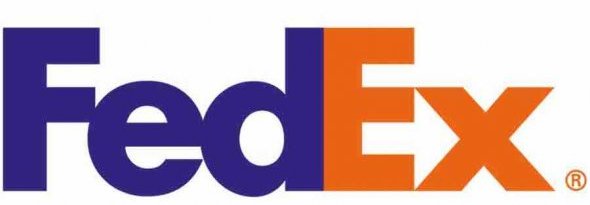
Two complementary colors. Able to touch each other without a space between the d and E which are still gentle on the eye. It is like one is supporting the other? Here's the cool part. Maybe you know this, maybe you don't. Have you ever noticed the negative space between the E and x? The letters and the font chosen make an arrow. This clearly shows the worldwide symbol for direction. Once you know it's there it will always be there, right? Well sorry it is now?
#example 2
For all you aspiring Amazon Affiliates out there this one is for you. Have you ever really looked at the amazon logo?

Have you ever noticed the dimply, slightly raised orange smile beneath the very clear visable simple black text? Good. Have you ever noticed that it is also an arrow? Have you ever noticed that it is actually pointing from A - Z? This thinking was based on their offering an a to z service of products! Genius right?
Hopefully this has given you some food for thought regarding "branding yourself" and perhaps you will now look at corporate identity with a whole different point off view?
Hope you liked this.
Cheers
Darwyn
Share this insight
This conversation is happening inside the community.
Join free to continue it.The Internet Changed. Now It Is Time to Build Differently.
If this article resonated, the next step is learning how to apply it. Inside Wealthy Affiliate, we break this down into practical steps you can use to build a real online business.
No credit card. Instant access.