How To View What Your Website Looks Like On A Mobile, Tablet Or Desktop


Whilst reviewing members websites here for Google's PageSpeed test, and advising members on how they can improve their page loading speeds. It has become apparent that although we are working together to improve the speeds for Mobile views, that a lot of members have not designed their websites with mobile users in mind.
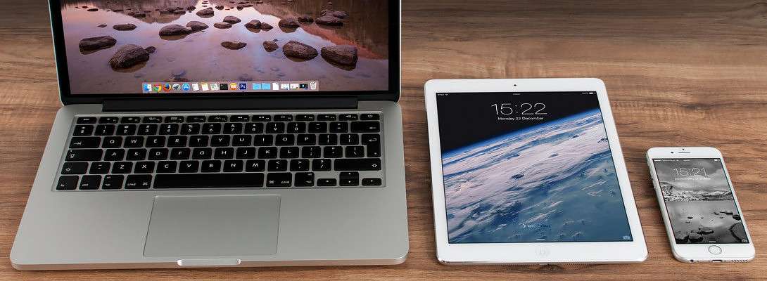
Considering Google has gone Mobile First for ranking websites within its search results, and that more than 60% of websites are now viewed on mobile devices, it is not just the page loading speed that we need to be optimising, but we also need to be optimising how our websites look on mobile devices.
Personally, I always design a website with mobile's in mind, then afterwards, I'll go and check to see how it looks on a desktop. Rather than what I'm seeing a lot of members do, which is designing their websites for desktops, then panicking that it doesn't work on a mobile. Or worse still, have no idea how it looks on a mobile device.
I'll apologise now, but I'll include a quick how to below, as I still haven't been here 3 months yet, so I'm still unable to create any training modules.
I'm going to demonstrate two quick methods that you can use to test the various views out. The first one will be using WordPress, which will give you a good idea, bearing in mind you're still logged in, so some elements may appear slightly differently. The second one is using your browser, such as Google Chrome, that will allow you to control the width of the screen, allowing you to see your website exactly as it will appear on other devices.
Quick caveat, these demonstrations are based on a Responsive WordPress Theme. If you are using a plugin to serve a different theme for mobile devices, such as the AMP plugin or WP Touch etc, then this method will not always work.
How To View Your Website On A Mobile Using WordPress

The first thing to do is to log in to your WordPress Admin area, a.k.a. your WordPress Backend, and go to Appearance -> Customise

When that view has loaded, you will find three icons at the very bottom of the left-hand menu. These are for Desktop (default), Tablet and Mobile.
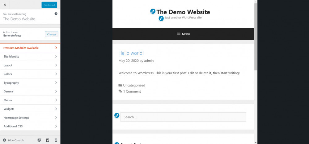
When you click on the Tablet icon, you will see that the preview screen on the right reduces in size. You will also notice that the Site Title, Menu and Sidebars have altered, so that it fits better on the screen.

If you click on the Mobile icon, you will see that the preview screen on the right goes even smaller this time. This is a typical size of a small mobile (cell) phone, allowing you to see how your website will appear on smaller screens.
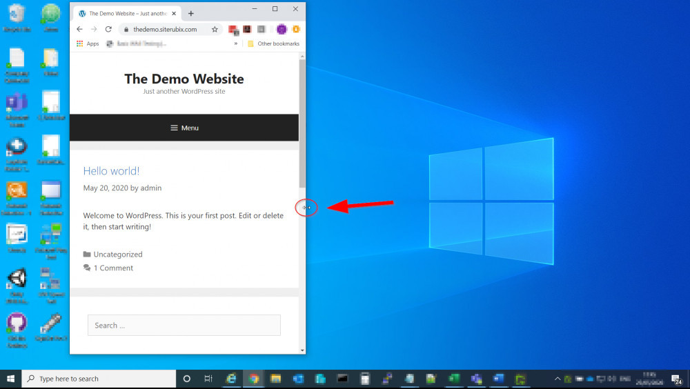
How To View Your Website On A Mobile Using Your Browser
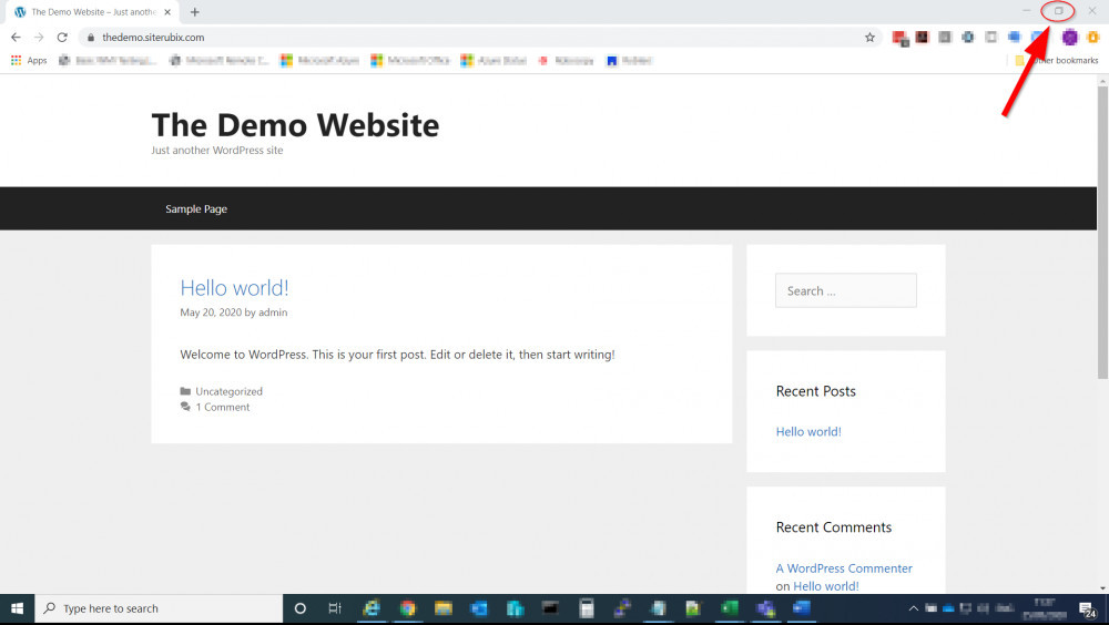
To check your website as if it were on a mobile device from your desktop, the first thing to do is to ensure that you have logged out of WordPress, so that you can see your website exactly as a visitor would.
Most people use their browser in Maximum mode (Full Screen), so the first thing to do is to click on the middle icon located at the top-right of your browser, which usually has a tooltip saying "Restore Down".
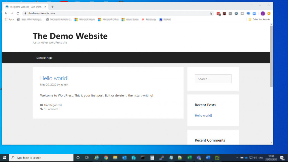
With your browsers window in the smaller state, which allows it to be moved around the screen, you can place your cursor on either side of the window, which will display a double-headed horizontal arrow. You can then click on this and drag the window inwards, to resize the screen, a.k.a. the viewing port.
You will see your website change shape as the window gets smaller. This also allows you to see exactly where the break points are for your theme. I.e. as you bring the window smaller, from the full desktop view, you will first see that elements get slightly smaller, so that they fit within the screen. Then you will see the first break point, which is usually either the menu and/or sidebar that get repositioned, so that it fits comfortably on a tablet sized screen. As you get smaller, you will more than likely see another break point, where the elements are realigned allowing you to see how it will look on smaller screens, such as mobile/cell phones.
Hope the above helps you with designing and optimising your websites for smaller screens :-)


Recent Comments
101


Hi Chrystopher,
This is good information. In my first couple of weeks, Jay showed very briefly and I must have hurried over to do the same thing as my website looks good. But this right here is superb details for me for the next time around:-)
Thanks again for another valueable post.


Nice article and tips.
My site is full mobile and I took in consideration many things but I stopped trusting site speed insights.
It was driving me nuts and distracting me a lot with very low scores for mobile whether from the WA backend or directly at their page.
I been shifting around SiteSpeed and plugins for image compression and caching to get the results I consider good.
My website pages open fast enough, below the 2 second mark for desktop and mobile and yet site speed still giving me crappy scores but it doesn't make me crazy anymore. I dont know what the tool is looking at, although I do understand the issues pointed, they dont seem to be as indicated.
So one thing to consider for everyone.
You're welcome Pablo :-) As long as your scores are above 50, then you're classed as average, you just don't want them in the red (below 50). I know you say you're ok now, but if you want me to work with you and to take a look, feel free to PM me.
See more comments
As a newbie, I was just last week almost going bananas ..wondering while going back and forth between Wordpress & WA's platform to adjust my website to be more mobile-friendly and like magic you've added a key tip of insight I needed.
I haven't read all the way to the end of the blogpost yet because I gotta go at a pace even enough for my understanding to process & apply the much needed knowledge..
Meanwhile.
I wanted to say thank you for the simple breakdown on how to find & view in on the making a website more mobile-friendly.
I will now be following you! No doubt!
All the best,
WaltM
You’re welcome WaltM :-)