You Spoke, We Listened - New Labels & Discussion Updates!
Published on November 3, 2022
Published on Wealthy Affiliate — a platform for building real online businesses with modern training and AI.
Hello Wealthy Affiliate!
Today I'm excited to post about some updates that have taken place just moments ago within the platform. We are always working diligently around the clock to bring the best possible experience to all members of WA, but the past 6 weeks we've just gone bonkers and put things into an even higher gear!
In mid-September 2022 we released a large update to the Member Blog, Questions, Profile platforms here in WA (you can read about that here). The shift to the new codebase was our biggest code update to date. Upon release the feedback was nothing short of incredible and I thank everyone for their feedback!
With the release came some changes to platforms that we were all very used to using. The surrounding feedback to these highly used platforms allowed us to dive into the details and pinpoint some of the things that we needed to update.
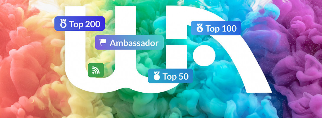
Member Labels
As you read the comments on this post you will notice that there are some new labels within the discussion area.
- Ambassador
- Top 50
- Top 100
- Top 200
- Follow/Following

As you go through the system it's now very easy to determine a few things about who you are communicating with, mainly their member rank in WA, and whether you are following them or not.
If you are not following someone, you'll see a nice button that reads "follow". Click this and you'll be following them instantly and you'll see the button change from "Follow" to a green broadcast looking icon. We chose the broadcast looking icon to describe the following status because following folks in WA subscribes you get notifications from their activity.
You'll be notified by email when someone you follow posts a blog or asks a question. It allows YOU to create their own personal network here at WA, and control what kind of content you are notified about via email.
New Mobile Design for Discussions
Ready to put this into action?
Start your free journey today — no credit card required.
There's a brand new mobile design that helps with differentiating between top level comments and replies. Lines now indicate when conversations start and stop, and the overall design of comments on mobile is more...well functional!

Menu Backgrounds
A subtle update, but a meaningful one is that we now illustrate open menus with a BLUE background on the icon in our top floating menu. On both Mobile and Desktop devices, when a menu is open, the icon or link associated will be a nice BLUE color.
To close the menu, simply click on the icon. It's now easier to understand that opening and closing a menu is done with the same action :)

Live Chat on Mobile opens in same window (Finally).
On mobile, the live chat finally opens in the same window and allows you to quickly pop it open then close it without leaving the browser tab. Previously this opened in a new window and it made for folks having numerous live chat windows open at a time, and losing their place in WA in general.
We hope that this update will enable those on mobile devices to open and close chat with ease for an overall better chat experience.
The past few weeks have allowed us to roll out many changes, from tweaks and updates to the members area, to marketing updates and adding clarity to the Starter Membership, to a change in our initial coupon offering where we now offer a FREE domain when moving from Starter to a Paid membership.
A lot of awesome things are going on at WA and you can expect to see many more projects released in the very near future!
I hope that the new user labels and functionality to follow one another improves your experience while you're interacting within the WA platform.
Please let me know what you think in the comments below :)
Carson
Share this insight
This conversation is happening inside the community.
Join free to continue it.The Internet Changed. Now It Is Time to Build Differently.
If this article resonated, the next step is learning how to apply it. Inside Wealthy Affiliate, we break this down into practical steps you can use to build a real online business.
No credit card. Instant access.
