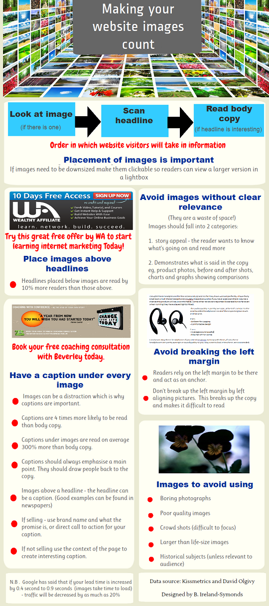
Tips for making your website images count (infographic)
Published on June 7, 2012
Published on Wealthy Affiliate — a platform for building real online businesses with modern training and AI.
Personally the general appearance of website pages have always been important to me. As a visitor or potential customer I''ve always been aware that if I don't like the visual look of a website, I will leave immediately. Colours, type and size of font and images all have a huge impact on me - let alone what is actually written.
My best friend tells me that I'm extreme and very fussy. I prefer to say that I'm creative and visual appearance is important to me - but I suspect on occasions that she's right.
However - this week I've realised that I'm not entirely mad and I'm far from being alone in being affected by such things. But what I hadn't realised as a website owner just how getting some of these things wrong could affect your sales.
This week I've been doingf a little bit of research on website images and despite my own tastes I have been surprised and shocked by the possible impact they can have. So I've put together this infographic with some tips which I hope you may find useful.
As I'm just about to launch a new site promoting WA - I shall be putting this new found knowedge to good use and thinking very carefully about the images and captions I'm going to use.
I shall also be reviewing my coaching site - but as it has over 100 pages I am not just going to start changing all the images. Any changes need thinking about.
My advice - if you're going to make any changes to your own sites- proceed with care. It's not a rush job.

Share this insight
This conversation is happening inside the community.
Join free to continue it.The Internet Changed. Now It Is Time to Build Differently.
If this article resonated, the next step is learning how to apply it. Inside Wealthy Affiliate, we break this down into practical steps you can use to build a real online business.
No credit card. Instant access.