Need help with deciding on my website look.


Hey everyone,
Thanks for stopping by to help me with the right direction for my website. I want to choose the right background, one that isn't going to drive everyone's eyes crazy.
My website is a cake decorating site and these backgrounds were a couple that I found that I like, though I may scrap them all if I find a better one. Until then, I just wanted to know your opinion on which you prefer. Their titles are below each screenshot so if you could please comment below with which one you think looks best, then I'd appreciate it.
If you leave me a link to one of your website posts then I will be happy to return the favor with comments and feedback.
Thanks,
Amanda
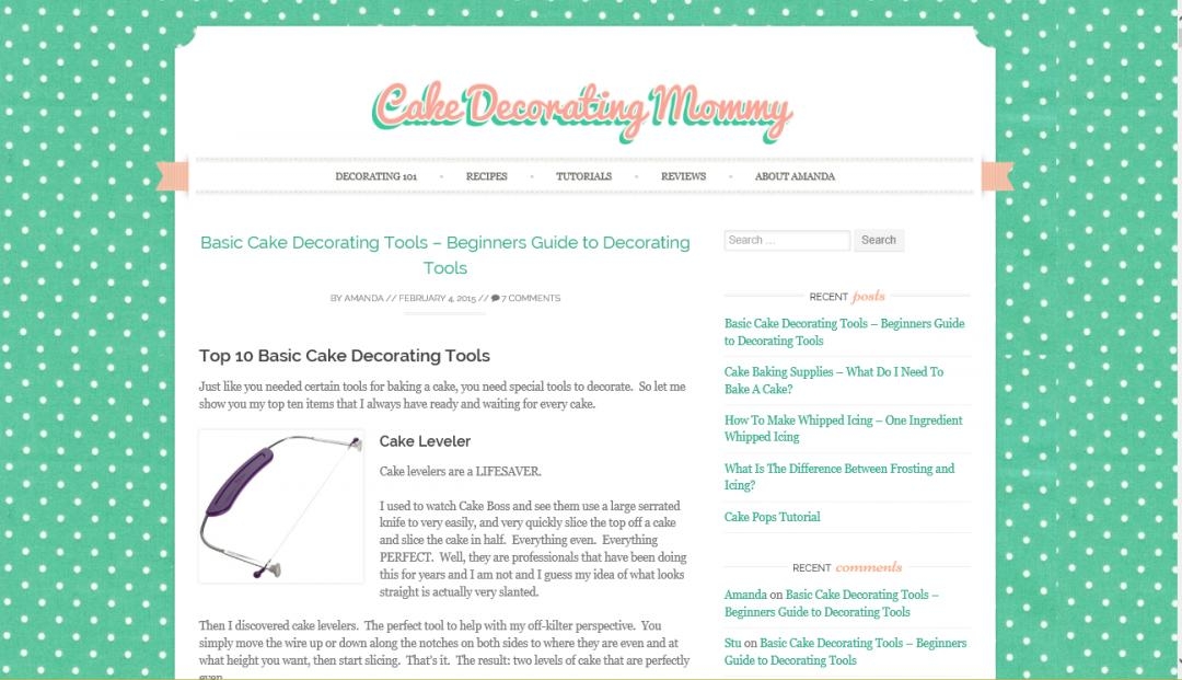
White Polka Dot

Cupcake
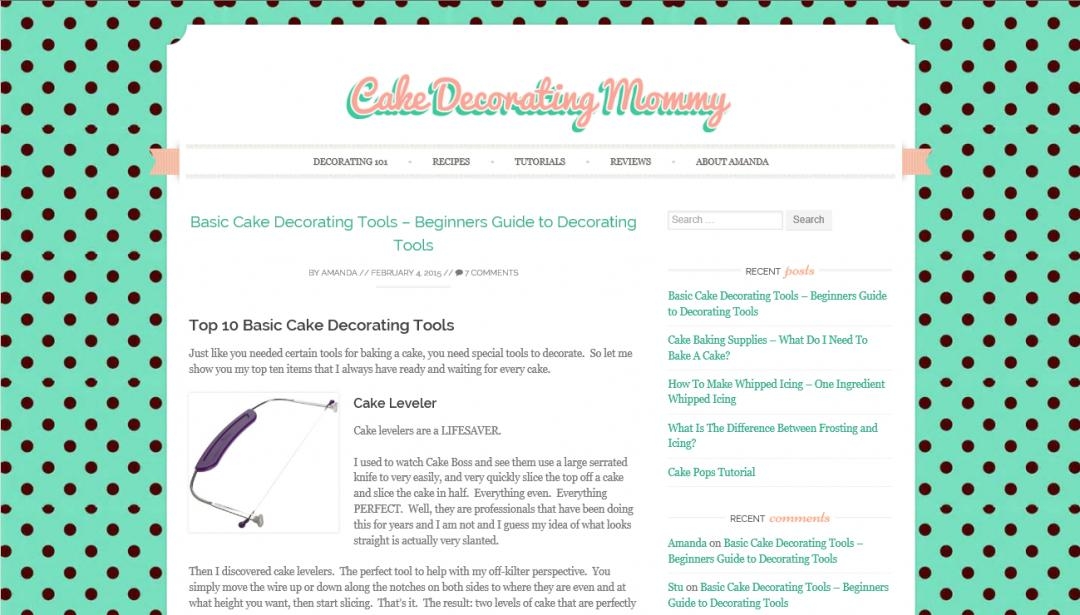
Brown Polka Dot
Join FREE & Launch Your Business!
Exclusive Bonus - Offer Ends at Midnight Today
00
Hours
:
00
Minutes
:
00
Seconds
2,000 AI Credits Worth $10 USD
Build a Logo + Website That Attracts Customers
400 Credits
Discover Hot Niches with AI Market Research
100 Credits
Create SEO Content That Ranks & Converts
800 Credits
Find Affiliate Offers Up to $500/Sale
10 Credits
Access a Community of 2.9M+ Members
Recent Comments
15


The one with the cupcakes is really cute but a bit too busy in my opinion.
The first one is my favorite but it has to be edited a bit because you can tell where the pattern repeats.

Hi Amanda
I would kill the background too.
I generally keep the background plain white or you could use a very light colour if you need to emphasise the content area. White looks clean and professional, Backgrounds can be distracting, cause the page to load more slowly and are more likely to be associated with a hobbyist site. Also, chances are it will not display on a mobile (Cell) device either. The background that is not the page.

I think the first one is best. I believe the second one, while incredibly cute, will make your site too busy once you get it up and have content with images, text, graphics, etc. competing with it. When you design a website, you need to think about where YOU want the user's eye to go. Ultimately, that's to your affiliate links and images which will be making you the money. You don't want the background to compete with that.

Maybe everyone will disagree with me but if I was in your shoes I would keep the background clean, I mean white, coloured backgrounds distract the user. Keep it SIMPLE is the best way;-)

The second one is indeed fun and good color match, but I find it way too vibrant and busy, hard on the eyes and distracting from the content. On a smaller picture like here, it might not be a problem, but if I imagine this on full screen, I will want to close your site within 3 seconds, with an "Ouch!"
If you want to keep this design, maybe you can tone it down a little bit, with less contrast.
From these three, I would choose #1.

Thank you to everyone that chimed in today to help me out. Everyone had very valid points. Honestly, I kept getting comments that I NEEDED to put a background on my site but I was thinking the same thing that it might be too distracting. I want my site to be professional looking, not like a free blog with just "chatty" content. I want it to be seen as serious.
I have a lot to think about. Thank you again :-)
Amanda
Hi Amanda
I hope I didn't sound too harsh, it was not my intention, just wanted to be honest. The current trend is for very clean open style pages usually with simple plain backgrounds usually white. This is being driven a lot by the increase in mobile device usage. If you can, try and get a view of your or any site on a mobile device.
I always view a website design from the mobile or tablet standpoint 1st these days as there use is not going to decrease any time soon.
This WA site is a perfect example of good design. What would you think of this page if the background was filled with Dollar signs?
Another element people often don't think about is font's. Again these should be easy on the eye. You don't want your reader to suffer eye strain half way through a blog post if you want them to return anytime soon
The current trend is 2 to 3 different fonts on a page maximum .
Don't stress about it, the main thing is to build your content. Themes and designs etc can always be tweaked later in wordpress.
All the best
Dave


I definitely like the second one with the cupcakes. It maintains the same color scheme while keeping the reader focused on your niche.
All the Best,
Will


See more comments
Join FREE & Launch Your Business!
Exclusive Bonus - Offer Ends at Midnight Today
00
Hours
:
00
Minutes
:
00
Seconds
2,000 AI Credits Worth $10 USD
Build a Logo + Website That Attracts Customers
400 Credits
Discover Hot Niches with AI Market Research
100 Credits
Create SEO Content That Ranks & Converts
800 Credits
Find Affiliate Offers Up to $500/Sale
10 Credits
Access a Community of 2.9M+ Members
Hi Amanda
For your chosen theme. "cake decorating", I think that number three, the brown polka dot one appeals to me most. The brown polka dots almost look like little chocolate buttons. I think that the other two are not as 'eye catching'. Live long and Prosper!