One Way to Create Better Amazon Review Posts
Published on February 22, 2015
Published on Wealthy Affiliate — a platform for building real online businesses with modern training and AI.
I like many of you was looking for the best post format/layout to use on my Amazon site. I see many discussions wondering how to make Amazon review posts that convert. I will show you an approach that I and some fairly experienced Amazon marketers use.
First I think you need to understand you will get better results with subtle nudges to your call to action (CTA) buttons and boxes. If you try to be too aggressive in your approach it will form a bit of distrust with the person. For example big yellow "Click Here To Buy This" buttons don't work. You have to earn some trust first before you ask for a CTA.
Here's a simple example and keep in mind this is only one of hundreds of ways to format a review post.
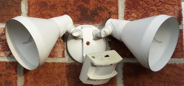
First start out with an image and list some pros and cons. This helps with the trust factor. (by the way the product image should be linked and clickable too).
Acme Double Blaster Motion Light Review

- compact design
- quality components
Cons:
Ready to put this into action?
Start your free journey today — no credit card required.
- fairly expensive
- newer model available
This is an optional place to insert a YouTube directly related to the product (but not another affiliates video).

(***insert a small nudge to the amazon review of the product)
Click here to see what others are saying...
Why You Need the Acme xyz Product(H2 title)
This is can be one or more paragraphs where I talk about why I would buy the Acme light fixture.
The Benefits of the Acme xzy Product(H2 title)
This is a paragraph where I say what are the best attributes of the product. You can also write other headings as necessary where it would describe the strong points. For example How the Acme xzy Saves Power.
Summary
A few lines to summarize why they should buy, the benefits, other peoples options, your opinion why you think it's a good purchase, etc.
(***call to action Amazon buttons or text here)
Click Here to buy this awesome light before it's out of stock.
As you see I am not just filling the post with a bunch of call to action boxes and big flashy buttons. Your click through rate will be much better if you gain trust first before you ask them to click a CTA button or purchase.
Share this insight
This conversation is happening inside the community.
Join free to continue it.The Internet Changed. Now It Is Time to Build Differently.
If this article resonated, the next step is learning how to apply it. Inside Wealthy Affiliate, we break this down into practical steps you can use to build a real online business.
No credit card. Instant access.