Demonstrating Image File Format
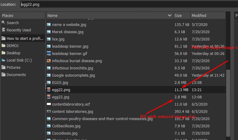
I have decided to show by using a screenshot from my desktop. Below are 3 images, the first 2 show screenshot of same area space saved on Jpeg and Png respectively. The third is a screenshot of GIMP (my image tool) showing the size of both images.
JPEG file
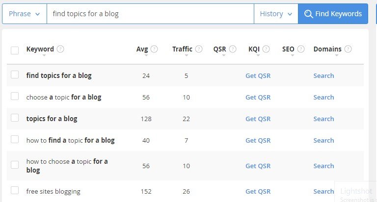
and PNG file
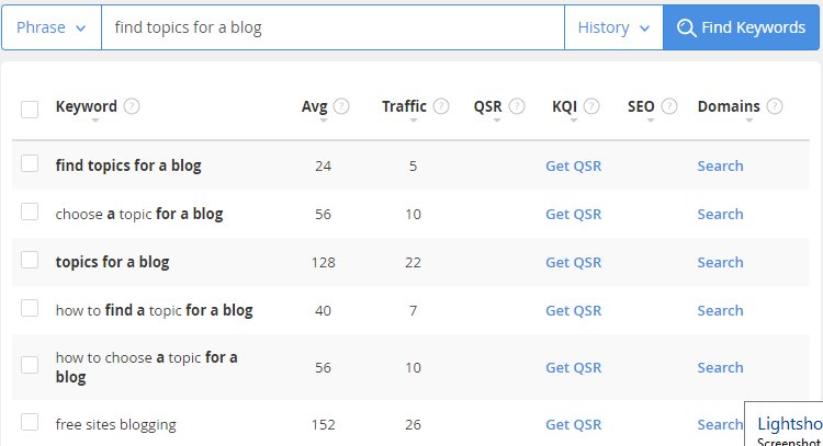
The Third showing the different file size
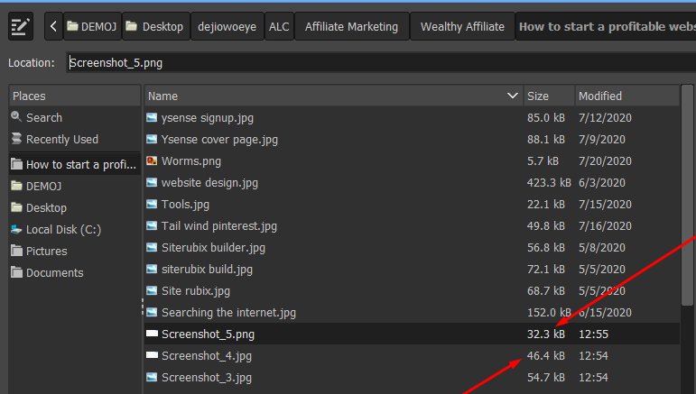
While the Jpeg goes with 46.4kB, the PNG is lighted with 32.3KB. It is obvious that for screenshots using
Considering images with very good colours, I decided to take a picture of the trays of eggs as shown below.
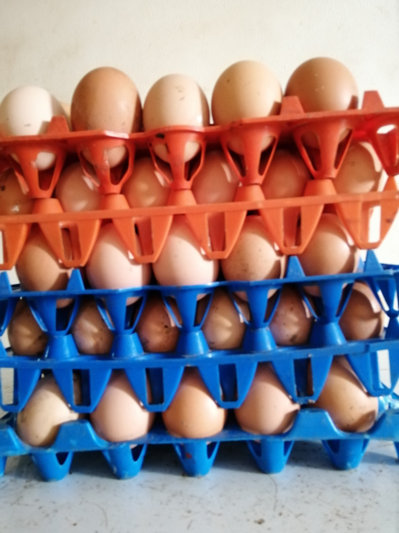
Let us head over to my image tool – GIMP. The image was saved by default as Jpeg, I simply exported the image to Png to demonstrate the image size difference. As shown in the shot below, Jpeg has an image size of 2.8KB while png comes out with an image size of 11.3KB.
In a nutshell, you should use JPEG for photos and very colourful images and use PNG for very simple images. Choosing the right image file format is the very first step in image optimization.
This is very interesting. I didn't know the difference between JPG and PNG. I always use JPG by default but I can see I should switch to PNG for many of the graphics I used are charts which will have large areas of uniform color with no, or I do use a gradient, highly predictable hue and saturation variation. I am careful to reduce the size and to crop. One other aspect that I think is important is watching how images work on our content on both desktop and mobile devices. When I first started blogging I was adding images with tall aspect ratios, i.e. much taller compared with the width because I could wrap text either to the left or to the right and it broke up the content and made it easy to read. However, this doesn't work at all on mobile devices. So almost universally I have switched to using a more landscape format as standard extending across the whole column width. Thanks for another great article.
Best regards
Andy


