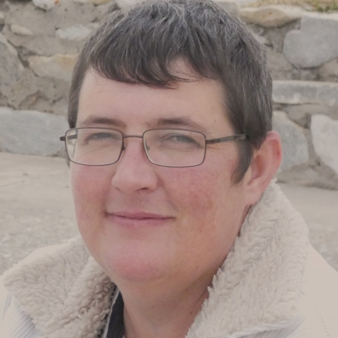
1. Profile Image
Your WA profile image (photo) is a personal choice, but you have to upload something. Please don't keep it blank.
Do you want to show your face or not?
I personally have no problem if you don't want to show your face. I respect everyone's privacy and there are plenty of good reasons people don't want to show their face online.
With that said, research and stats indicate that people who show their face get more and better response. It establishes more trust.
Other good alternatives for profile images are:
- Logos (to represent your brand)
- Animated images
- Anything that is not too generic
Profile Image Tips - Be Clear
Here is a list of profile images (photo) features I would NOT recommend:
#1: Blurry and out of focus images and photos are no good. This usually happens when you try to enlarge a small image. It is better to have a larger than required image and then make it smaller. From large to slightly smaller will generally keep the quality.

#2: Stay away from scary, intimidating and inappropriate images.

#3: Generic images- WA has a few images you can use, but if you use one of those, change it as soon as you have a chance. You want to build your own unique brand and those are not unique.

#4: Fake photos. This is where you use a picture of someone else as your profile image. No one might know, but imagine you starting to become successful online and have to reveal yourself at some point.

It won't be very pleasant to try to explain why you suddenly look completely different. Fake photos are a terrible choice.
If you want to use a picture of someone else (maybe someone important in your life like family, friends, etc.) mention it in your profile description and make sure you have that person's consent.
I will hate it if someone else uses my face without my permission.
Need help with out of focus photos?
Drop me a comment below if you need help with blurry or out of focus images.
Next: How to Optimize Your Wealthy Affiliate Profile Description
This is a very valuable lessons.
Here's to making it happen in 2021 and beyond
Jennifer


