AI Image Prompting - Color Part 2 - How Color In an Image Makes us Feel!


Published on August 9, 2026
Published on Wealthy Affiliate — a platform for building real online businesses with modern training and AI.

Color Creates Emotion Before We Notice It
Have you ever looked at an image and immediately felt peaceful, cheerful, uneasy, lonely, or excited—even before you really thought about what you were seeing?
Color may have had a lot to do with it.
We often respond emotionally to color before we consciously analyze the subject, composition, lighting, or details of an image. Warm golden colors can make a scene feel welcoming and nostalgic. Cool blue-gray tones can make that same scene feel quiet, mysterious, or even lonely.
That's why color is much more than decoration in an AI image prompt.
Color helps tell the AI how you want the image to feel.
Warm Colors and Cool Colors
In Part 1, we looked at the basic difference between warm and cool colors. Now let's take that idea a step further and look at how those colors can affect the emotion of an AI-generated image.
Warm colors such as red, orange, amber, and gold often bring feelings of energy, warmth, excitement, comfort, or passion to an image.
Cool colors such as blue, aqua, violet, and blue-green often create feelings of calm, peace, distance, mystery, or loneliness.
But there is an important point to remember:
Color doesn't have just one emotional meaning. Context changes everything.
A warm orange glow from a fireplace can feel cozy and comforting. That same orange surrounding a raging forest fire can communicate danger.
A soft blue lake beneath a clear morning sky can feel peaceful. A dark blue-gray lake beneath storm clouds can feel cold, threatening, or lonely.
Try It in a Prompt
Instead of simply telling the AI:
Create a cabin beside a lake at sunset.
We can tell it what we want the color to do:
Create a cozy cabin beside a lake at sunset. Use warm amber, soft gold, and burnt orange throughout the scene to create a welcoming, nostalgic feeling. Warm golden light glows from the cabin windows and reflects across the water.
Then we could create the same basic scene with a completely different emotional direction:
Create a solitary cabin beside a lake at twilight. Use cool blue-gray, muted violet, and slate-blue tones to create a quiet, mysterious, slightly lonely atmosphere. A faint cool light reflects across the darkening water.
Same cabin. Same lake. Different colors. Different story.
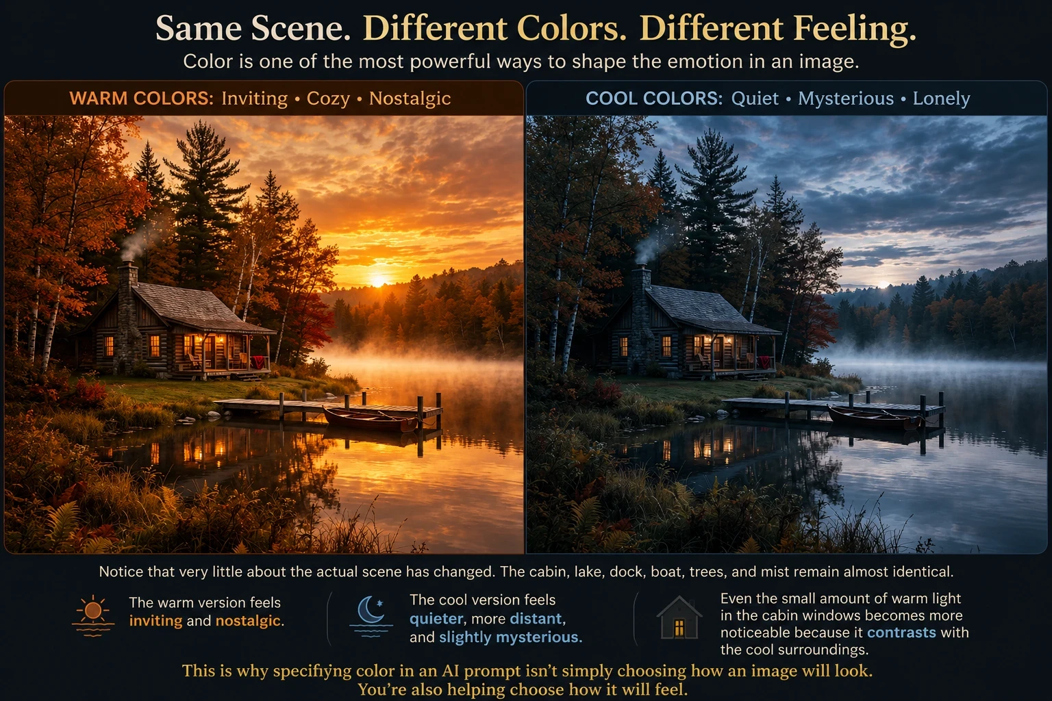 Color can change the emotional story of an image without changing the subject.
Individual Colors and Their Emotional Associations
Individual colors can also help suggest an emotion or mood in an AI image. But think of these associations as possibilities, not rules.
Red might suggest passion and romance in one image, but danger or urgency in another. Green can feel peaceful and natural—or, with different lighting and surroundings, strange and unsettling.
Some common associations include:
- Red — passion, energy, romance, urgency, danger
- Orange — warmth, enthusiasm, friendliness, autumn
- Yellow — optimism, sunlight, cheerfulness, caution
- Green — nature, renewal, tranquility, growth
- Blue — calm, trust, serenity, distance, sadness
- Purple — mystery, imagination, spirituality, luxury
- Pink — tenderness, romance, playfulness
- Black — drama, elegance, power, grief
- White — simplicity, purity, openness, isolation
The important word here is context.
A bright red umbrella in a rainy gray street can feel cheerful and energetic. A red glow at the end of a dark hallway might feel threatening. The color hasn't changed—but its job in the story has.
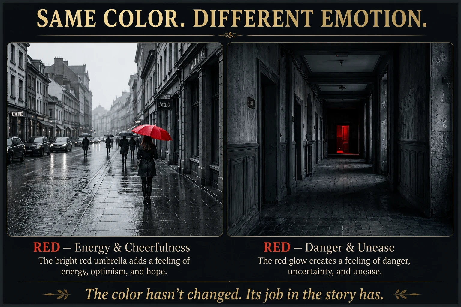 Same red. Two very different emotional messages.
Saturation Changes the Feeling
Saturation describes the intensity or purity of a color. Highly saturated colors appear vivid, rich, and strong. Lowering the saturation makes those same colors softer, grayer, and more muted.
This matters in AI prompting because saturation doesn't just change how colorful an image looks. It can change its emotional energy.
For example:
- Vibrant saturated blue + orange → energetic, bold, exciting’
- Muted dusty blue + faded peach → gentle, nostalgic, peaceful
Neither version is necessarily better. The question is: What do you want the viewer to feel?
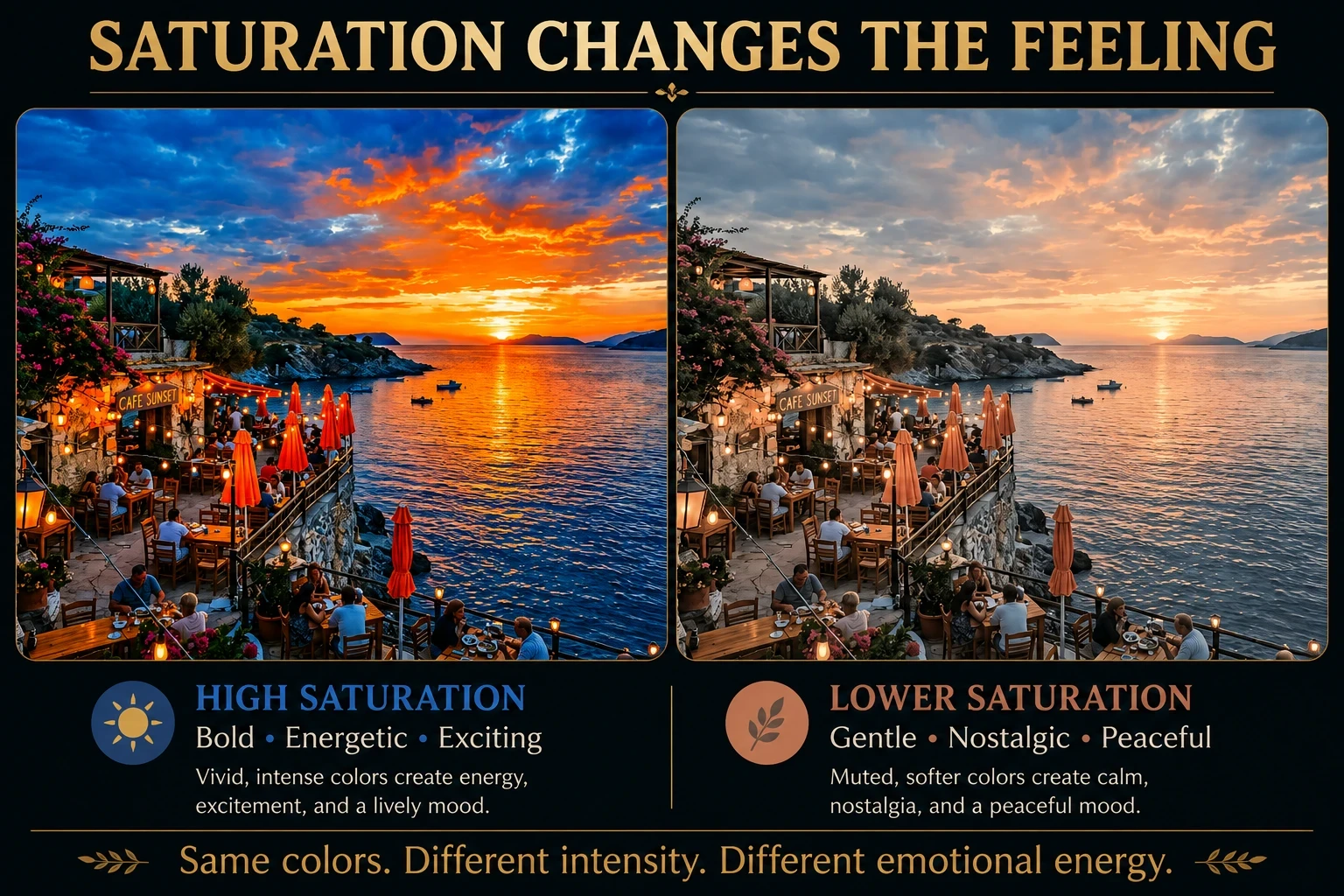 Same colors. Different intensity. Different emotional energy.
Color Harmony and Emotional Harmony
In Part 1, we looked at color harmonies—ways of choosing colors that work together. But color harmony isn't only about making an image look attractive. The relationship between colors can also influence how an image feels.
Ready to put this into action?
Start your free journey today — no credit card required.
Different color combinations create different kinds of emotional energy.
Analogous colors sit close together on the color wheel. Because they share similar qualities, they often create a feeling of harmony, tranquility, and natural flow.
Think of a misty forest using shades of blue, blue-green, and green. Nothing strongly competes for attention, so the scene can feel peaceful and restful.
Complementary colors sit opposite each other on the color wheel. Their strong contrast can create excitement, energy, drama, and visual tension.
We've already seen a good example in our seaside café. Blue and orange are complementary colors. In the highly saturated version, their contrast helped make the scene feel especially lively and energetic.
Monochromatic palettes use variations of one main color. Changing the lightness, darkness, and saturation of that color can create an image that feels unified and atmospheric.
Imagine a foggy landscape created almost entirely with shades of blue. Pale blue mist, blue-gray mountains, and deep navy shadows could make the scene feel quiet, mysterious, or contemplative.
Harmony Doesn't Always Mean Peaceful
Here's an important distinction:
Color harmony means the colors work together. It doesn't necessarily mean the emotion is calm.
A harmonious palette can be peaceful, romantic, cheerful, mysterious—or even unsettling. What matters is the colors you choose, their saturation and brightness, and how they're used within the scene.
Try It in a Prompt
Instead of:
Create a peaceful misty forest.
Try:
Create a peaceful misty forest using an analogous palette of muted blue, blue-green, and soft forest green. Keep the colors low in saturation and closely related to create a tranquil, harmonious atmosphere. Soft diffused morning light filters through the mist.
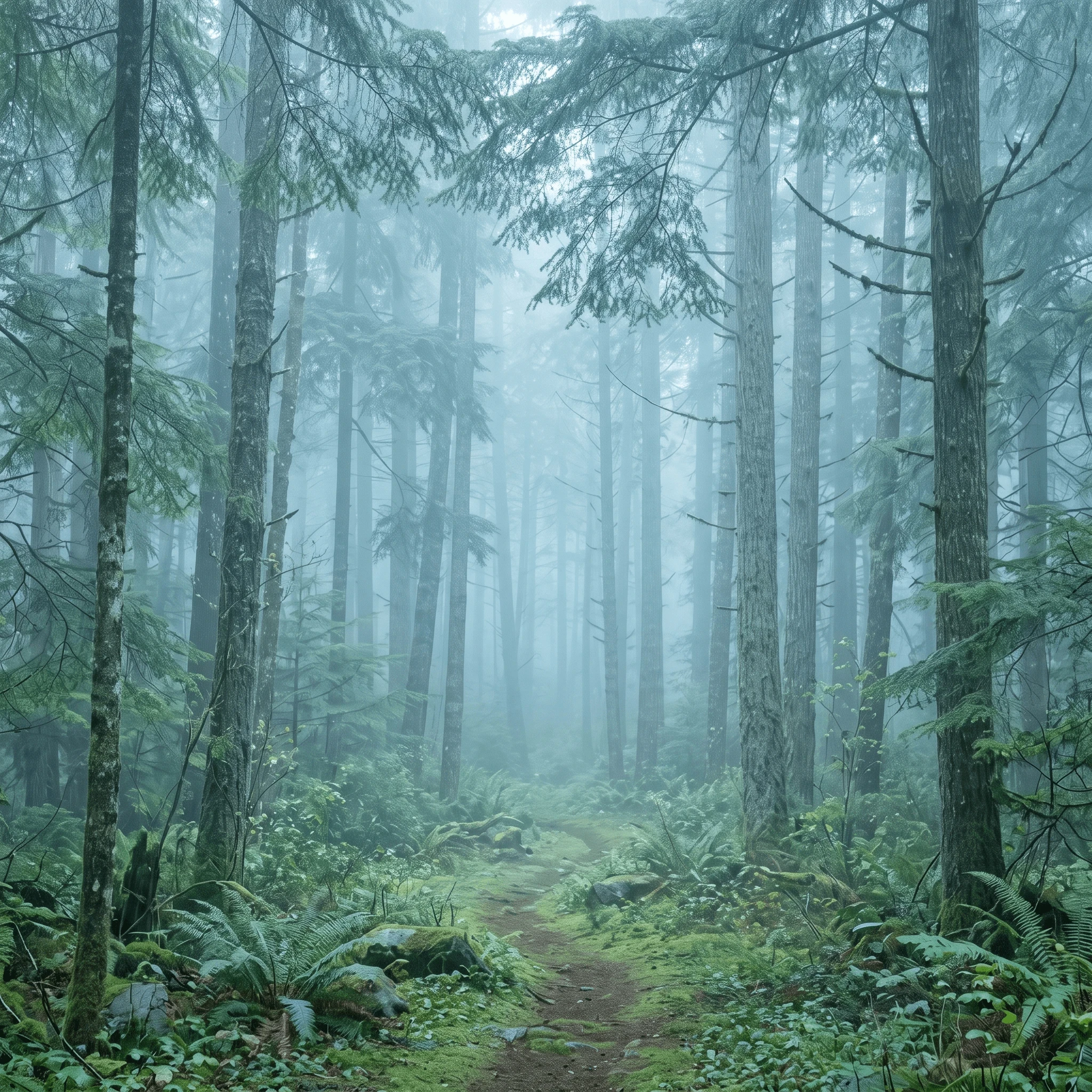 An analogous palette of blue, blue-green, and green creates a quiet, harmonious mood.
You're not just giving the AI colors. You're giving those colors an emotional purpose.
Using Color to Tell the Viewer Where to Look
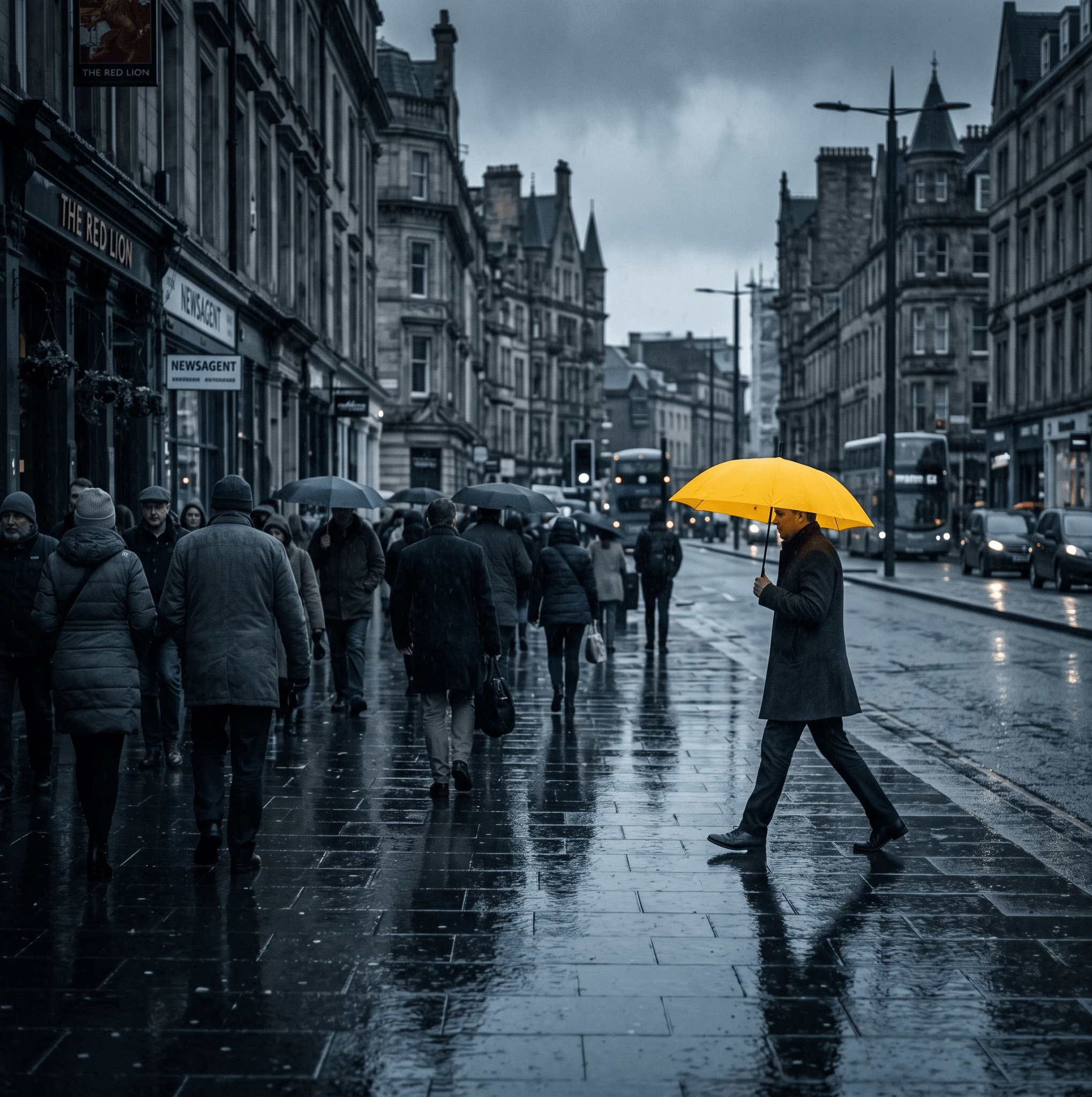 The vivid yellow umbrella becomes an immediate focal point because it contrasts with the cool, muted colors surrounding it.
Color can act almost like a spotlight.
When most of an image shares a similar color family, one contrasting color can immediately attract attention. You don't always need to make the subject larger, brighter, or place it in the center. A carefully chosen color accent can tell the viewer exactly where to look first.
And here's the neat part for our series: the umbrella is also sitting near the right third of the composition. So two things we've taught are working together — composition directs the eye, and color reinforces it.
Prompting for Emotion Instead of Simply Naming Colors
Once you understand how color influences mood, you can stop simply listing colors in your AI prompts and start telling the AI what you want those colors to accomplish.
Instead of:
“Use blue, purple, and pink.”
Try:
“Create a quiet, contemplative mood using muted twilight blues, dusty lavender, and just a trace of warm rose near the horizon.”
Notice the difference?
The first prompt gives the AI a list of colors. The second gives those colors a purpose. You're communicating the mood and creative intent behind your choices.
That is one of the most useful habits you can develop when writing AI image prompts:
Don't just tell the AI what colors you want. Tell it how you want those colors to make the image feel.
Same Scene — Different Emotion Challenge
Here's an experiment you can try yourself. Start with exactly the same subject and scene, but change the color instructions to create different emotional responses.
- Peaceful: soft blue-green, gentle gold, diffused light
- Joyful: luminous yellow, fresh green, clear blue
- Romantic: dusty rose, lavender, warm peach
- Mysterious: deep indigo, violet, charcoal
- Dramatic: deep shadows with crimson or fiery orange accents
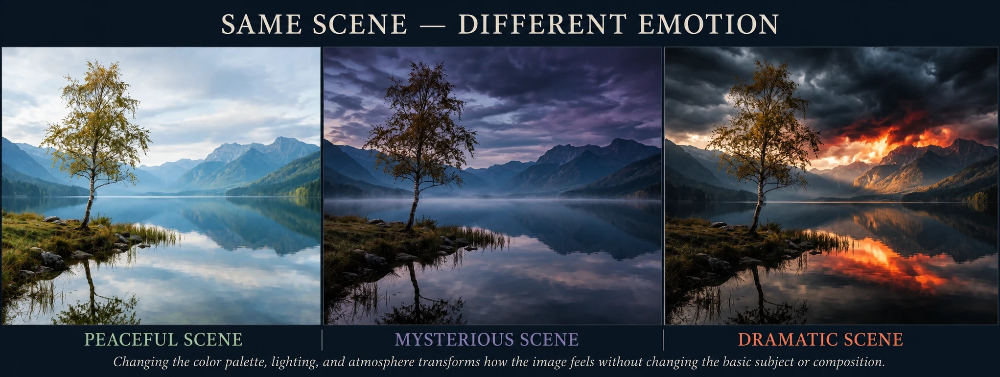
Prompts Used for This Experiment
Peaceful Scene — Starting Prompt
A lone graceful tree beside a quiet mountain lake, distant mountains on the horizon, still water with soft reflections, simple uncluttered composition. Create a peaceful, serene emotional mood using soft blue-green, gentle gold, and diffused natural light. Subtle atmospheric haze, delicate tonal transitions, tranquil and contemplative feeling, realistic fine-art landscape photography.
Mysterious Scene — Remix Prompt
Keep the subject, tree, lake, mountains, reflections, camera position, and composition exactly the same. Change only the color palette, lighting, and atmosphere to create a mysterious emotional mood. Use deep indigo, muted violet, blue-black, and charcoal tones. Darken the distant mountains and sky, add subtle atmospheric mist over the lake, and use subdued low-key lighting. Preserve realistic detail and natural reflections. Do not add or remove objects. The scene should feel mysterious, quiet, and slightly haunting, while remaining realistic fine-art landscape photography.
Dramatic Scene — Remix Prompt
Keep the subject, tree, lake, mountains, reflections, camera position, and composition exactly the same. Change only the color palette, lighting, and atmosphere to create a powerful, dramatic emotional mood. Use deep charcoal and stormy blue gray in the shadows, with intense crimson and fiery orange accents in the sky near the horizon. Add strong directional light breaking through dark storm clouds, creating dramatic highlights and reflections across the lake. Increase contrast between light and shadow while preserving realistic details. Do not add or remove objects. The scene should feel powerful, intense, and cinematic while remaining realistic fine-art landscape photography.
Notice that the Mysterious and Dramatic prompts don't ask AI to create a new scene. They specifically tell it what to preserve and what to change. This is why remixing an existing image can be so useful when you're experimenting with color and mood.
The subject doesn't have to change. The composition doesn't have to change. Yet changing the color palette can make the same basic scene feel remarkably different.
Remember: Color Psychology Isn't a Rulebook
Color doesn't communicate in isolation. Culture, personal experience, surrounding colors, lighting, subject matter, and context can all influence how we interpret a color.
For AI prompting, it's often more useful to think about the relationship between color + light + scene + story than to memorize simple rules such as “blue means calm” or “red means danger.”
And that brings us back to the central lesson of this article:
Don't just tell AI what colors you want. Tell it how you want those colors to make the image feel.
Storytelling
Color can create mood, guide the viewer's eye, establish harmony, and even begin to suggest a story. But color is only one part of visual storytelling.
In the next part of this AI Image Prompting series, we'll look at how to use storytelling in your prompts — giving your images a sense of place, purpose, emotion, and a moment that makes the viewer wonder what happened before...and what might happen next.
Because a beautiful AI image can catch someone's eye.
But an image that tells a story can make them stop and look.
-Shirley
TIPS:
Kre8or.ai is a new, state of the art image creation tool I've recently joined and I'm loving it and its becoming one of my main tools for creating images for my online businesses and also for fun. There is a FREE TRIAL there also. If you are interested in AI image creation, give it try.
Comments
I enjoy receiving questions and comments from site visitors, you can leave yours below. - Shirley
Share this insight
This conversation is happening inside the community.
Join free to continue it.The Internet Changed. Now It Is Time to Build Differently.
If this article resonated, the next step is learning how to apply it. Inside Wealthy Affiliate, we break this down into practical steps you can use to build a real online business.
No credit card. Instant access.