Visuals for social media - part 3 continuation of May 31st
Published on June 17, 2017
Published on Wealthy Affiliate — a platform for building real online businesses with modern training and AI.
I
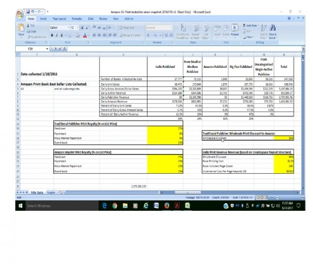
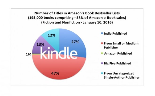
Instead, try making the data to the point and easier to grasp!

Ready to put this into action?
Start your free journey today — no credit card required.
4) Focus on an image which relates to your product. Build trust and authority by showing exactly what the customer wants to see and understand what they are getting.
5) Of course, always use actionable language to prompt the user to proceed. Example, "Click here to down load" Leads the reader to execute the last step.
If you have any other suggestions to improve conversions please feel free to comment.
Share this insight
This conversation is happening inside the community.
Join free to continue it.The Internet Changed. Now It Is Time to Build Differently.
If this article resonated, the next step is learning how to apply it. Inside Wealthy Affiliate, we break this down into practical steps you can use to build a real online business.
No credit card. Instant access.