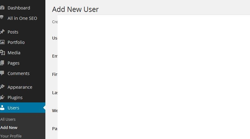
Blank Form Adding New User
In case anyone else experiences this:
I recently had a problem trying to add a new user to my website. The new user screen was pretty much completely blank, and it was impossible to located the different fields or see what I was typing.

Luckily the Support team were able to help me out. It seems this is a bug with certain Themes (this particular theme was called "Virtue"), and one solution was to try a different theme.
Whilst changing theme would have cured the problem, I like Virtue very much, so Support offered a much simpler workaround:
Zoom in onto the page to make everything bigger. That way, the white area in the middle shrinks in comparison, and you can see most of the form. Zoom out again when you've finished creating the new user.
If you don't know how to zoom in/out, on a PC hold the Ctrl key and then turn the mouse wheel. Depending which way you turn, the screen display will get smaller or bigger - you'll soon figure it out! (Macs may have some alternate way of zooming in - knowing Apple they probably do!)
Hope this helps.
Join FREE & Launch Your Business!
Exclusive Bonus - Offer Ends at Midnight Today
00
Hours
:
00
Minutes
:
00
Seconds
2,000 AI Credits Worth $10 USD
Build a Logo + Website That Attracts Customers
400 Credits
Discover Hot Niches with AI Market Research
100 Credits
Create SEO Content That Ranks & Converts
800 Credits
Find Affiliate Offers Up to $500/Sale
10 Credits
Access a Community of 2.9M+ Members
Recent Comments
2
Join FREE & Launch Your Business!
Exclusive Bonus - Offer Ends at Midnight Today
00
Hours
:
00
Minutes
:
00
Seconds
2,000 AI Credits Worth $10 USD
Build a Logo + Website That Attracts Customers
400 Credits
Discover Hot Niches with AI Market Research
100 Credits
Create SEO Content That Ranks & Converts
800 Credits
Find Affiliate Offers Up to $500/Sale
10 Credits
Access a Community of 2.9M+ Members
Thanks for sharing this, it is helpful