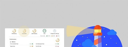
Google Lighthouse - Color Contrast Checker
I tested my website using Google Lighthouse and, among other things, checked my score for accessibility. It seems that my color choices provided poor reading quality for some people. The foreground text didn't show up well enough with the background colors I was using.
I found the WebAIM Color Contrast Checker and used it to tweak the colors on my site.
I ran a new Lighthouse audit and the issues were gone. Check out the WebAIM site on your colors. It looks like they have a lot of other information on accessibility that might be worthwhile but I haven't reviewed it yet.
Join FREE & Launch Your Business!
Exclusive Bonus - Offer Ends at Midnight Today
00
Hours
:
00
Minutes
:
00
Seconds
2,000 AI Credits Worth $10 USD
Build a Logo + Website That Attracts Customers
400 Credits
Discover Hot Niches with AI Market Research
100 Credits
Create SEO Content That Ranks & Converts
800 Credits
Find Affiliate Offers Up to $500/Sale
10 Credits
Access a Community of 2.9M+ Members
Recent Comments
2
Join FREE & Launch Your Business!
Exclusive Bonus - Offer Ends at Midnight Today
00
Hours
:
00
Minutes
:
00
Seconds
2,000 AI Credits Worth $10 USD
Build a Logo + Website That Attracts Customers
400 Credits
Discover Hot Niches with AI Market Research
100 Credits
Create SEO Content That Ranks & Converts
800 Credits
Find Affiliate Offers Up to $500/Sale
10 Credits
Access a Community of 2.9M+ Members

Thank you for sharing this Gem!
Shaunna
Glad it's useful for you.