Getting it Done!
I'm working away at the Super Affiliate Challenge tasks. I already had a website (although I haven't put a ton of time into it yet) so I have been focusing on going back through the training and completing all of the tasks that I may have missed.
I have also revamped a couple of old posts and created three new posts since the challenge started. I will have to step it up to maintain a 2 post per week pace. It will definately be a challenge for me. Time is hard to come by some days.
I saw someone else in the challenge blogging about how tough it is to find a theme they like. I agree wholeheartedly! I have tried out tons of themes. It might be time to consider Thrive Themes to get something I can really work with.
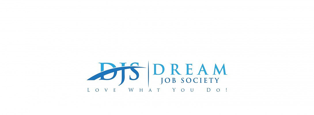
Now I'm at a point where I need your help. I have two logos and I need to choose one. I would also like input on my website name. Don't hold back - I can take whatever you have to say, I think, lol.
The image above is a logo option and the image below is another option. What does everyone think. Top option or Bottom?
Good luck to all of you Super Affiliates. I can't wait to watch as everyone gets going!

Join FREE & Launch Your Business!
Exclusive Bonus - Offer Ends at Midnight Today
00
Hours
:
00
Minutes
:
00
Seconds
2,000 AI Credits Worth $10 USD
Build a Logo + Website That Attracts Customers
400 Credits
Discover Hot Niches with AI Market Research
100 Credits
Create SEO Content That Ranks & Converts
800 Credits
Find Affiliate Offers Up to $500/Sale
10 Credits
Access a Community of 2.9M+ Members
Recent Comments
4
Not even a question for me. The top option much more professional for a business. The bottom one very cute for a personal blog.
I would also make sure the colors you use match your theme colors.
One more thing I would offer is, "a picture is worth a thousand words". You might want to consider using a featured image for each post. It would fill that empty square next to each post.
You have very good writing skills and that will help you reach your goals sooner rather than later.
See more comments
Join FREE & Launch Your Business!
Exclusive Bonus - Offer Ends at Midnight Today
00
Hours
:
00
Minutes
:
00
Seconds
2,000 AI Credits Worth $10 USD
Build a Logo + Website That Attracts Customers
400 Credits
Discover Hot Niches with AI Market Research
100 Credits
Create SEO Content That Ranks & Converts
800 Credits
Find Affiliate Offers Up to $500/Sale
10 Credits
Access a Community of 2.9M+ Members

The first one. Much more professional and eye friendly.
Mark
Thank you Mark!