The importance of a good logo and good graphics

ArYeh Feingold Logo Design
Hello, People I'm here to talk about the importance of good quality of graphics and logos in your business. When you enter in a website and see good to great graphic or an amazing logo you stare at them and say wow, that's nice or cool and start to navigate and stay a while exploring its content. Its happen to me almost all the time, but when I visit a page without a logo or graphics just plain text I don't motivate myself may be read the first line of info and then go super fast the same goes for a sites with very small and bad graphics. It gives me the feeling that the page is not so good because of the bad quality and make me think how good or real the site content it is and that go for almost everyone who visit a site like that they won't stay long and that is bad for traffic, PR-Page Rating and worst for a business.

Mercy and Grace Design Logo
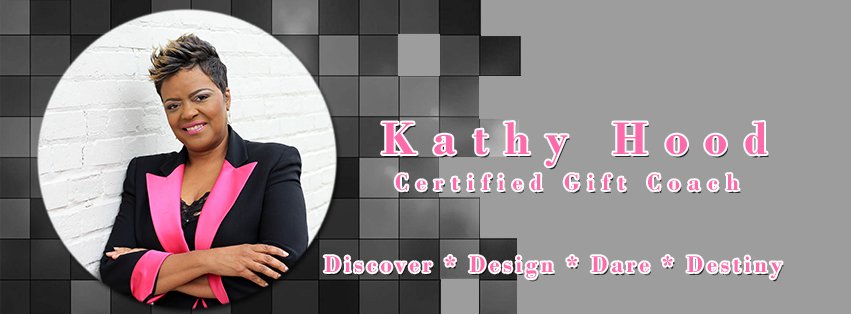
The logo and graphics are one of the most important things in your website because it is part of the content itself. They represent the brand, the image of your business. People tend to like other by the image too for example people don't want to hang out with someone that don't dress well, but if dress well people will hang out without a problem if they dress well. Sometimes people stare at you because you are well dressed and say I like that person's style and not stare and say Jesus! that's the worst custom ever! So that kind of effect can happen to a site with good or bad graphics you can have a really good impression or a really awful one, That's the way it is very important. Here are other samples of my work:


Well I think this is well for know, In case you need of my services dont hesitate in contacting me to my inbox here at WA to my Skype is gabrielmrpr or my email at gabrielmendez.pr@gmail.com
Join FREE & Launch Your Business!
Exclusive Bonus - Offer Ends at Midnight Today
00
Hours
:
00
Minutes
:
00
Seconds
2,000 AI Credits Worth $10 USD
Build a Logo + Website That Attracts Customers
400 Credits
Discover Hot Niches with AI Market Research
100 Credits
Create SEO Content That Ranks & Converts
800 Credits
Find Affiliate Offers Up to $500/Sale
10 Credits
Access a Community of 2.9M+ Members
Recent Comments
4
Join FREE & Launch Your Business!
Exclusive Bonus - Offer Ends at Midnight Today
00
Hours
:
00
Minutes
:
00
Seconds
2,000 AI Credits Worth $10 USD
Build a Logo + Website That Attracts Customers
400 Credits
Discover Hot Niches with AI Market Research
100 Credits
Create SEO Content That Ranks & Converts
800 Credits
Find Affiliate Offers Up to $500/Sale
10 Credits
Access a Community of 2.9M+ Members
Mercy and Grace could use a bit more contrast in the Text.
Kathy Hood might benefit from a different font. The small text at the bottom is difficult to read in that font.
I know I told her but she insist on having it that way, I send her various sample with different font type and strokes colors with a better contract but she says didn't like it and sends me the fonts and hex code for the colors she wants. It's happen to me sometimes that people have other taste, and even when I told them its looks better this way they say I want it my way and just say sure you're the boss you paid for it. I just want my clients happy and satisfied. But Thanks for the comment and yes I agree with you.
Rule 1: The customer is always right.
Rule 2: When the customer is wrong, see rule 1.
That's Right, I like the way you put it!