Common Aspect Ratios to Pixel Sized with the Image Studio and in General


Published on November 19, 2025
Published on Wealthy Affiliate — a platform for building real online businesses with modern training and AI.

As we are all now are enjoying WA’s Image Studio, I have seen questions that I also thought about myself.
Areas like: What are the differences between the Aspect Ratios and the Pixel Sizes?

As we know, when creating a WA Blog post, the minimum size is in Pixels, which is 545:200 pixels, but within the image studio, it shows a different ratio to Pixels, which can be confusing.
So I went to my favorite AI, which is Co-Pilot, and ask some questions, both on the differences and also about WA’s minimum Pixel and which Aspect Ratios is best to use.
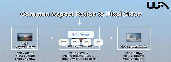
However just note: that aspect ratios don’t lock you into one exact pixel size; they’re proportions.
In general, WA and other platforms (including Facebook, X, etc.) tend to use standard pixel dimensions for each ratio.
So here is a clearer breakdown to help you further understand the differences and then some more.
Common Aspect Ratios to Pixel Sizes – In General
Note:
When creating other images be it here in WA or elsewhere note that this is just a guide, you make the final choice which works best for you.

WA Featured Image Minimum vs. Common Ratios
Wealthy Affiliate’s featured blog image minimum size is 545 × 200 pixels. That’s a wide rectangle (close to a 16:6 ratio), which makes sense because WA wants banner-style images that stretch across the top of a post without looking blurry.
However 16:6 in not in the aspect ratio in the Image Studio, but very close to it.
So you may either need to make an adjustment elsewhere if really needed.
If it is that important then make sure the main aspects of the featured image is closer to the top when generating your image and when you move the featured image up or done what you want your readers to see shows there.
The other thing you could do is just crop from the original image you have for the featured part and after your intro paragraph have the full image there.
Not a major issue just a personal choice for you to make.
Here’s how the ratio’s fits into the bigger picture for WA Blogs:

Note:
Wealthy Affiliate’s featured blog image minimum size is 545 × 200 pixels. That’s a wide rectangle (close to a 16:6 ratio), which makes sense because WA wants banner-style images that stretch across the top of a post without looking blurry.
Ready to put this into action?
Start your free journey today — no credit card required.
So the 16:9, may at times, depending on your image, slightly overlap when you make the final adjustments when scrolling the image up or down.
- Keep in mind: Featured images are cropped horizontally, so avoid putting text or key details near the edges or at the bottom or too wide and away from top and bottom if texts are used.
Ads, Memes etc
For ads and memes, I suggest 1:1 (1080×1080) for memes and 16:9 (1920×1080) for blog featured images within WA and you can also test that out on your website as well.
Those two should cover most needs and this should make is look polished.
Tips for WA featured images:
Wealthy Affiliate’s featured blog image minimum (545 × 200 px) is a wide banner format.
That ratio is roughly 2.7:1, which doesn’t exactly match the standard ratios WA’s Image Studio lists (like 16:9, 4:3, etc.). But here’s the trick you can use:

Best Choice
- Use 16:9 or 21:9 in WA Image Studio for blog featured images.
- 16:9 (1920 × 1080) is the most universal, works across WA, Facebook, YouTube, and X.
- 21:9 (2560 × 1080) is closest to WA’s 545 × 200 minimum ratio, so if you want a perfect wide banner look, this is the winner.
Just test it out and see which works best for you.
Difference Between 1080×1080 and 1200×1200
When AI gave me the differences between the aspect ratio vs Pixel sizes I noticed it gave me two pixels in the chart at the top.
So I asked it: "what is the difference between the two?" in this case, the 1080×1080 and 1200×1200
Here is the response I got:
- 1080×1080 px
- Standard for Instagram posts.
- Smaller file size, loads faster.
- Still sharp enough for most social media.
- 1200×1200 px
- Slightly higher resolution.
- Better for blogs, desktop viewing, or when you want extra crispness.
- Larger file size, but more detail.
Think of it like two canvases: both are square, but one is a bit bigger, so you can fit more detail in.
Rule of Thumb
- Social media (Instagram, Facebook, X) using 1080×1080 is plenty.
- Blogs, WA posts, or anything that might be viewed on larger screens, go bigger (1200×1200 or even 1920×1920).
- Always aim for at least 1080 px on the shortest side, that’s the modern “safe minimum” for sharpness.
So, when you see the list or two sizes under one ratio, this is showing you the common standards people use for that shape.
They’re not different ratios, just different resolutions of the same ratio.
Think of it like this:
- Same aspect ratio: Still a perfect square (1:1), rectangle (16:9), etc.
- More pixels: Sharper detail, especially on larger screens.
- Slightly bigger file size: Takes up more storage and bandwidth, but usually not a problem unless you’re uploading hundreds of images.
Think of it like printing a photo:
- A small print (1080×1080) looks fine in a photo album.
- A larger print (1200×1200 or 1920×1920) looks sharper when framed on the wall.
For WA and social media:
- Minimum safe size: 1080 px on the shortest side.
- Better quality for blogs/desktop: 1200 px or higher.
- Featured images/banners: Go wide (1920 px or more) so they don’t blur when stretched.
There you have it, the differences between the Aspect Ratio in the Image Studio vs the Pixels we are most used to.
Hope this has helped clear the mud, and continue to enjoy using the Image Studio we have here, and adjust where or when needed according to your needs.
As Always
 ,
,
Share this insight
This conversation is happening inside the community.
Join free to continue it.The Internet Changed. Now It Is Time to Build Differently.
If this article resonated, the next step is learning how to apply it. Inside Wealthy Affiliate, we break this down into practical steps you can use to build a real online business.
No credit card. Instant access.