Changing The Header In Flexibility 3

The header of a website is the first thing someone sees when they visit your site. It is kind of like a sign outside a store or business. It's your chance to welcome your customer and introduce them to your brand name. The importance of this should not be understated nor should it be obsessed upon.

Make it simple and neat so a person remembers the name and feels like they know who's store they're in and it should be fine.

Starting out, your header will look something like this.


The first option you will see in the Header tab is "Transparent header." Leave this set to know if you like it the way it is or adjust this to yes if you want to keep the text but lose the background of the header. It will look something like this. Don't worry about the navigation menu; we will address that on the next page.


If you do choose to keep the default header, there is an option to adjust the color of the header. The header background color option allows you to either enter the alpha-numeric color code (if you already have it) or you can choose from the color selector. This option only applies if the "Transparent header" option is set to "no."

I know these colors are hideous but I wanted something that would show up well for demonstration purposes in this tutorial.


Next is the Header background image. There are a number of default background images to choose from to help you customize your site. Follow the link in the description to the right of the drop down menu.
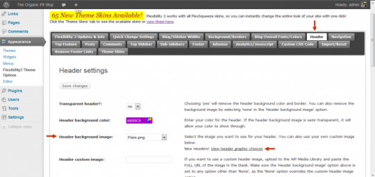


Once you decide which one you like, go to the drop down menu and select it. Save the changes and, voila. I chose the sunflower image because it's the best match for a site based on the organic niche.

Keep in mind when choosing your background that only the ones like the sunflower will negate the color formatting you have already applied. Other background header options will retain the color you picked.


You can also add a custom banner and even adjust the height and width of the banner area. Simply upload the image to the WordPress media library and copy and paste the Image URL into the Header custom image area. This option is if you have an entire header image.

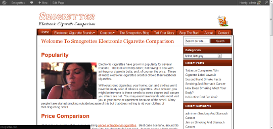
If you want to make the background clear and just use a custom font, do the same thing in the Blog logo area. This is what I did on Smogrettes.

There are a number of other options for the header but most are very easy and self explanatory. Spend some time playing with all of the options to see what suits you the best. Flexibility offers an immense amount of options and flexibility so you can have a very custom blog with a free theme.


Join the Discussion
Write something…
Recent messages
williamhall Premium
Hi Ty, Thank you for your help. I found the button I needed to find to upload the file. With my vision impairment, the file was difficult to see and changing the colors and the size of the image finally brought it to light. But now I have a question on the flexibility 3 bile. I downloaded the folder flexibity3 but it is not a zip file. How do I find the zip file? Thanks for your help.
Reply
Ty Johnson Premium
When you download flex 3 it comes in a zip file, don't try to open it or install it just upload the file directly to wordpress and it will do the rest for you.
Reply
Shawn Martin Premium
Bookmarked, thanks Ty!
Reply
Ty Johnson Premium
Your very welcome!
Reply
Teacup108 Premium Plus
Thanks for the tutorial. I actually downloaded this theme and put it on a website that I am planning to build but have not had the time yet to figure out the the adjustments. You have saved me a ton of time. Now I just need to get my content together.
Reply
Ty Johnson Premium
I'm glad to here it. I know I get people asking all the time about a good free theme and so far this is the only free one I have been really happy with. I also like it because the owner is helpful if you have questions or if something is acting up in the theme.
Reply
anindochk Premium
A very flexible theme indeed. Header area had lots of variations.
Reply
Ty Johnson Premium
yeah you can do all kinds of things with the header. I recently acquired Thesis theme and I am looking forward to using it. I want to see the difference between the two so I can do a review of the two and point out the advantages and disadvantages of both.
Reply
anindochk Premium
Ty, I have a page line theme.The functionality is very powerful but the they have followed a structured approach to program the theme. The customizations are difficult to make in such a theme. Just a thought for you. I believe a theme that follows a default twenty eleven theme coding standards should be more helpful for starters who want to customize inch by inch with their codes.
Reply
Ty Johnson Premium
I try to stay away from having to coding as much as possible. To me coding is slow and tedious work and it's time that could be better spent doing something else like creating new content.
Reply
yessharon Premium Plus
I do like this theme and I was thinking about using it last week. Thanks for showing us how to work with it.
Reply
Ty Johnson Premium
You're welcome. It does have many more options that is shown in this tutorial but I think I hit all of the major stuff. Let me know if you have questions about anything
Reply
Top